
Exploring Gansai Tambi: The Graphite Colors
Dark. Moody. Luxurious.
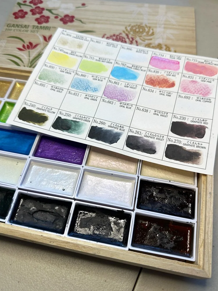
Gansai Tambi 100 Pan set with original swatch card.
That’s how I would describe the Gansai Tambi graphite watercolors. The changing seasons are almost always reflected in my watercolor palette. In the height of fall, I crave bright golds contrasting against dark greens. As the weather starts to turn towards winter, my palette often takes a moody turn. As I evaluated my painting supplies, I found myself pulling out my 100 pan set of Gansai Tambi watercolors. These are not my usual paints, namely because the colors are much more vibrant than I typically work with, but there is a set of six graphite colors that I thought might match the painting mood I was in.
What are Gansai Tambi Watercolors
Kuretake Gansai Tambi paints are traditional Japanese watercolors. They are known for being especially vibrant. They are highly pigmented, which allows you to achieve quite opaque results that remain vivid even after they dry. They are also lightfast, just like your typical professional grade watercolor. While the paints do mix together well, from my research, it seems like artists typically use them straight out of the pan. I have also seen that they are very popular to use with an aquabrush. My 100 pan set is divided into four different layers, with the paints organized based on color. Each layer comes with its own swatch card, which I filled out when I first received the set of paints. The paints are also organized into full pans, which are quite a bit larger than the half pans I use in my other watercolor palettes. The pans also easy to remove from their organizational tray. The tray has labels for where each pan is supposed to sit and each pan is also labeled on the back for easy organization if you like to remove the pans from their holding tray.
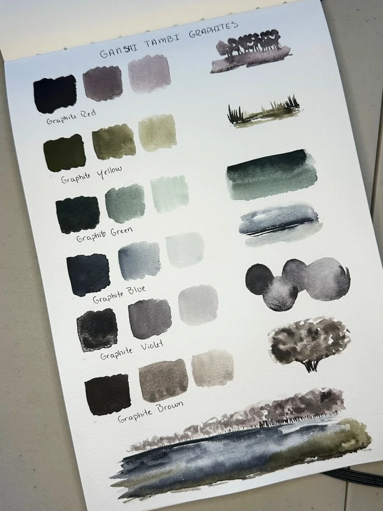
Sketchbook Swatch Page
Gansai Tambi Graphite Watercolors
There are six graphite colors in the Gansai Tambi lineup:
Graphite Red
Graphite Yellow
Graphite Green
Graphite Blue
Graphite Violet
Graphite Brown
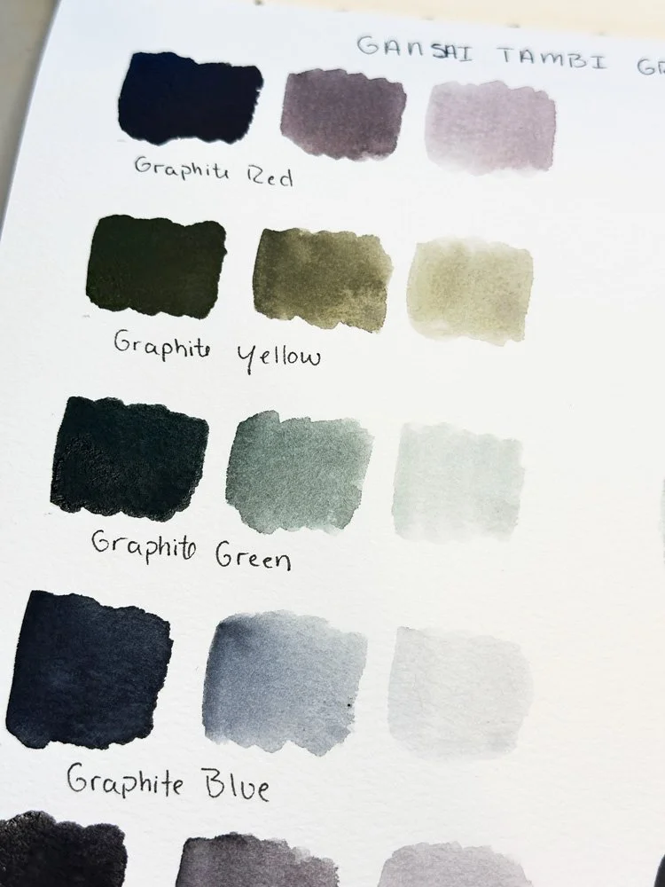
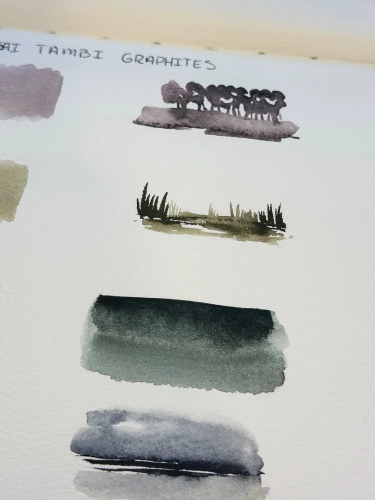
To refresh myself with these colors before diving into a painting project, I decided to do a simple swatching exercise in my Etchr Mixed Media sketchbook in size A4, which has 110lb coldpress paper. Swatching can be a great way to experiment with a set of colors in a low pressure environment. You can create a reference for the different colors you want to use and experiment with how they respond when adding water and on different painting surfaces. In swatching out the colors, the amount of water drastically changed the appearance of the paints. When loading up my brush with paint, the swatch dried very opaque with a dark matt finish. This was a nice feature, though it would be hard to layer another color on top. With much more water, you could achieve very transparent results that would lend itself to easy layering if needed. The colors when diluted also have a nice granular texture, especially when trying to achieve a medium shade.
Color swatches
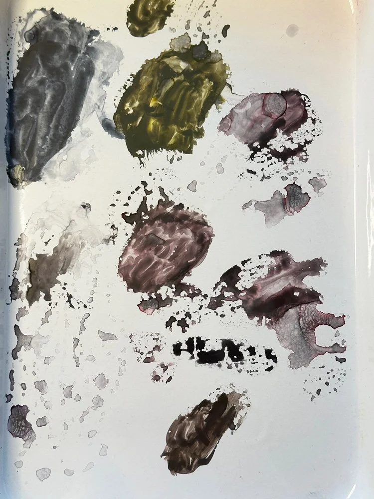
Testing paint
Combining colors
Next to each swatch, I wanted to test how the paints responded to water. In my sketchbook, the paints seemed to have quite a bit of flow once you added water, but you could also direct the pigment where you wanted it. To finish up, I did a very quick watercolor sketch at the bottom of my page to see how the paints would flow and mix with each other. In my sketchbook, I would say that overall the result when dry was quite a smooth finish, which I felt had more to do with the kind of paper in my sketchbook more than anything else. Aesthetically, I really enjoyed the shades and how they complemented each other. I suspected that with the right amount of water you could still achieve good contrast despite how similar the shades were in tone.
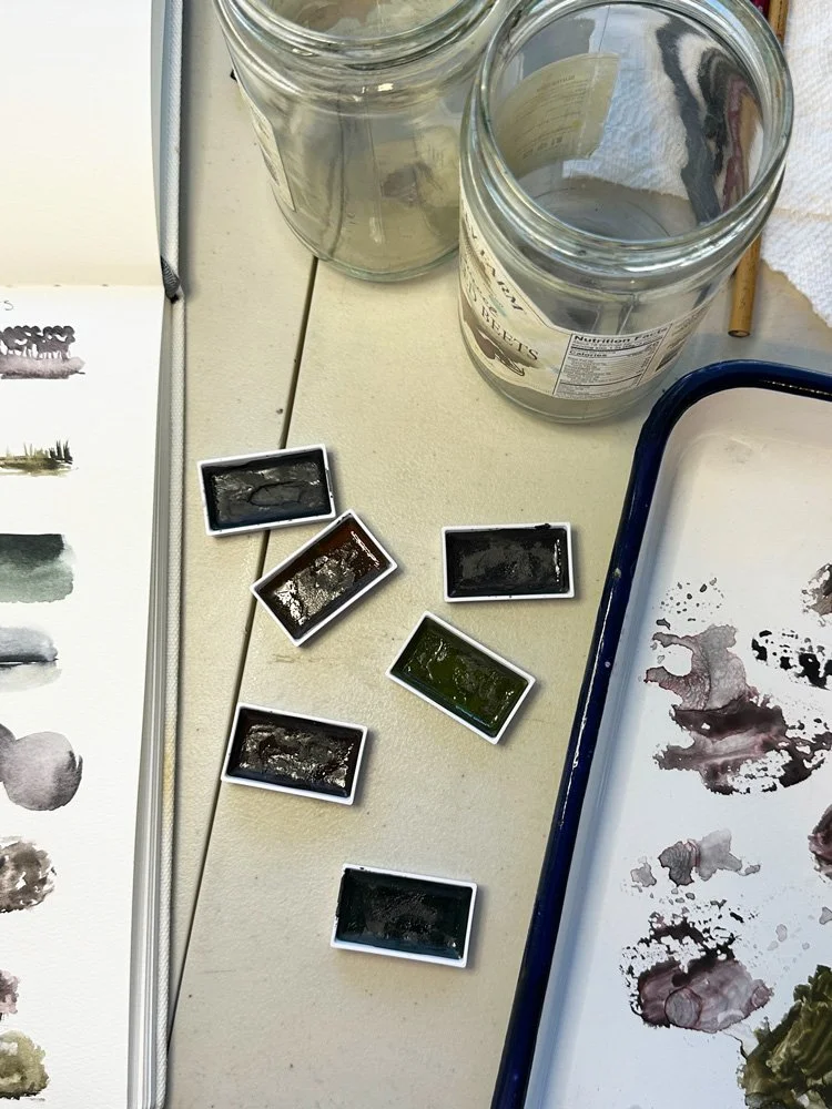
Graphite colors removed from their storage tray.
Butcher Tray Palette
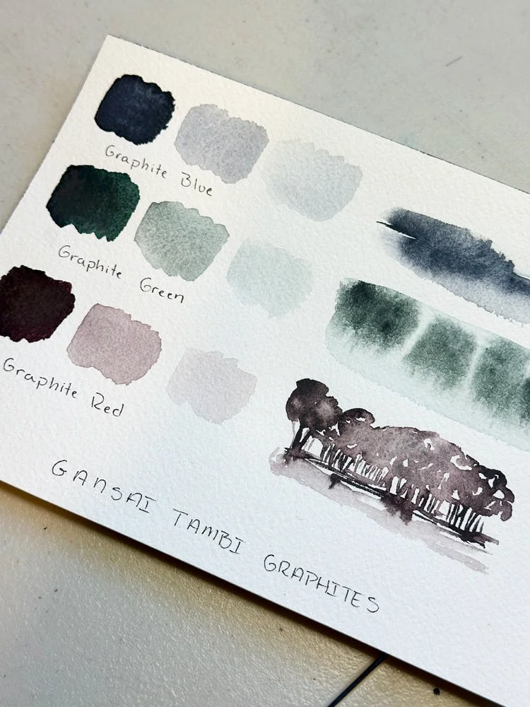
Second swatch card on Arches watercolor paper.
With this swatch page complete in my sketchbook, I created a smaller swatch card on my preferred painting paper, which is Arches 140lb coldpress paper. For this swatch card, I only chose to use the blue, green, and red shades. I followed a similar structure, creating three different swatches adding more water each time and then creating a small text painting using the shade. I would say that the results on the nicer paper were similar, but I enjoyed that the granulation appeared a bit more pronounced on the rougher paper and it seemed like paints flowed even more when adding water. Overall I loved the results and wanted to continue the experimentation process.
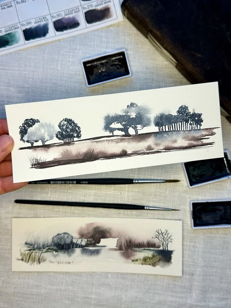
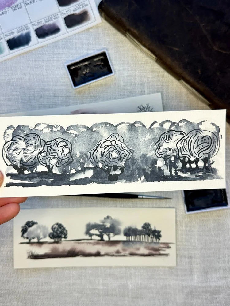
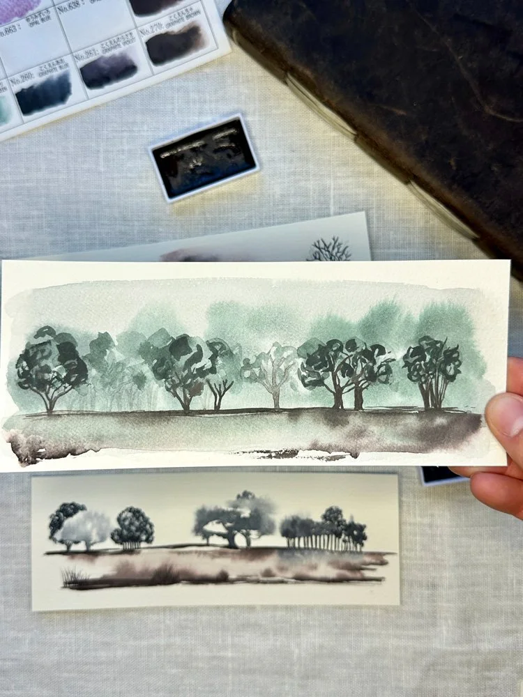
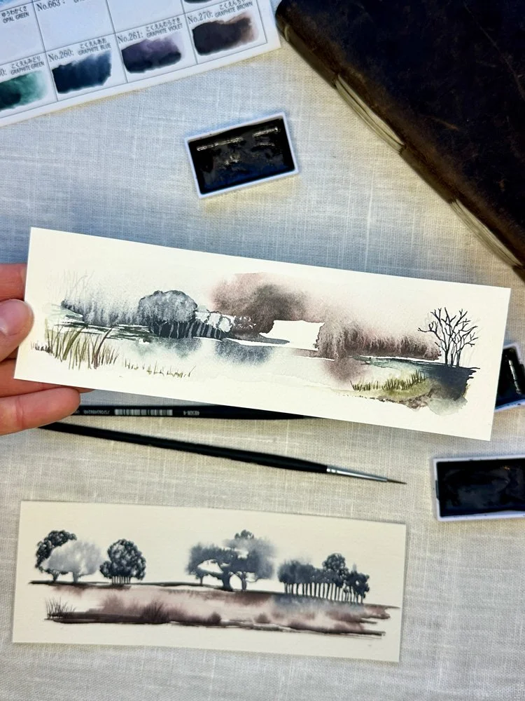
My Graphite Studies
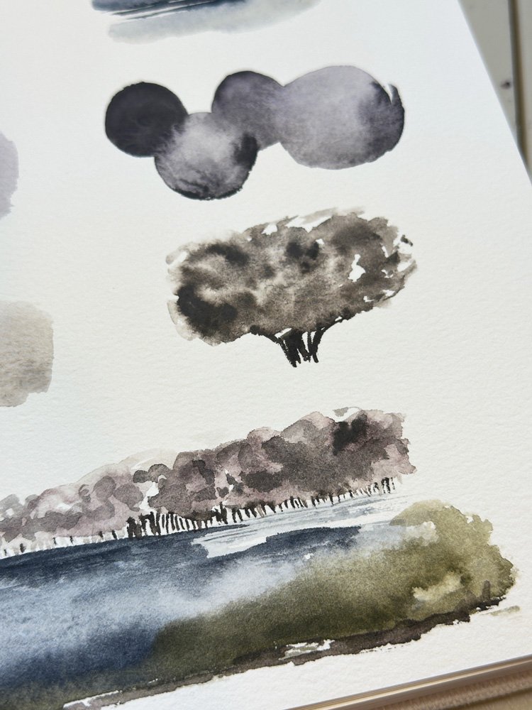
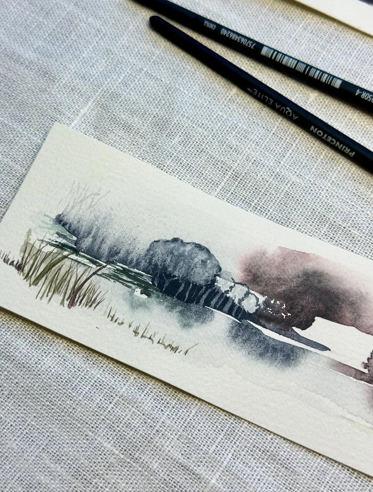
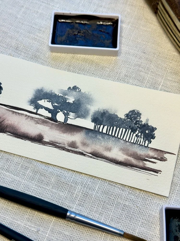
I decided to move onto a series of studies. From my swatches, I really enjoyed playing with how the paints responded to water. I knew that I wanted to create some small landscapes, but I wanted to approach them more intuitively with an emphasis on the process of painting rather than having a clear end result in mind. I want to soak up a lot of pigment on my brush and then use a clean brush loaded with water to see what shapes and textures I could make. I wanted to work quickly wet on wet and see how the paint would move on the page. I wanted to see if I could turn abstract shapes and marks into recognizable elements such as trees, grass, and water, but I wanted them to have them have a loose or surreal quality to them. I wanted you to know you were looking at a tree, but have it not be any kind of tree you have ever seen before.
🎨 Want a daily peak at what’s happening in the studio? Follow me on Instagram for a first look at new work, outdoor adventures, and more. I’d love to meet you.
For these experiments I went for my second favorite paper, my Fabriano 140lb Coldpress paper. I decided I would make long horizontal landscapes. Since painting intuitively is not my comfort zone, I also told myself that in the worst case, maybe I would get a few new bookmarks from it. From start to finish, this whole process was extremely meditative. I found myself getting lost in painting. It was fun to just let watercolor do its thing with unexpected results.
Favorite Part: The Negative Space
Favorite Part: Mark Making
Favorite Part: Background Layering
Favorite Part: Watercolor Textures
The first layers were usually my favorite, because that’s when the most movement seemed to happen with the paint. At times, I almost didn’t want to move onto the second layer, thinking that the first pass was interesting enough without adding more detail. The results were very different paintings than I think I have ever created before. What I enjoy most about these small landscapes is the experimentation. The marks are messy. There is a lot of white space. There is a lot of texture, especially where the paints are especially granular. There are spots where I added a lot of details and then other spots, where I just let the watercolor shapes and textures speak for themselves.
Final Thoughts & Next Steps
Perhaps the most challenging part of this experimentation is that I have no idea how I actually achieved some of my favorite marks and techniques in the painting. I worked so quickly and without spending too much time thinking about how a brushstroke would turn out. I was often surprised by how much I liked the final result without quite knowing what I did to get there. While I admit that this is a bit frustrating, it has also made me eager to continue this exploration. I want to keep using this limited color palette. I want to try creating bigger pieces. I want to experiment with different and larger brushes to see what effects I can create. I already know that for me the biggest challenge will be to continue to stay loose. To not overthink the marks I am making and to just see where the painting process takes me. This will most likely mean that I have several bad paintings for each one I truly love, but that is probably my favorite part of watercolor, you never quite know what the paint is going to do.
If you want to learn more about Gansai Tambi Watercolor, check out my post Exploring Gansai Tambi: Japanese Watercolors, where I swatch out all 100 of my Gansai Tambi watercolors.