
Blush and Bloom: Designing Outside My Comfort Zone
Blush and Bloom reminds me of the freshness of spring, when everything is coming alive in color. This collection is feminine, romantic, and a little bit vintage.
There are collections that feel effortless and aligned from the very beginning. And then there are collections that feel like a test. Blush and Bloom was a test. I wanted to see if I could design something that was intentionally outside of my usual aesthetic and still make it feel cohesive, beautiful, and complete.
This collection began as a submission for a design brief centered around the theme “Coquette Spring.” The motifs requested included pastels, bows, tea sets, tiny florals, tulle, and Easter imagery. The colors were all pastels: soft pinks, pale blues, cream, and peach.
If you know my work, you know this is not the theme or colors I naturally gravitate to. Instead of passing on this licensing brief challenge, I decided that I wanted to create a collection for this brief because it was not my style.
Starting With Someone Else’s Vision
Unlike some of my other collections, Blush and Bloom did not begin with a notebook full of brainstormed words or personal preferences. The mood board came directly from the brief. The company's vision for this collection featured roses, bows, delicate tea sets, tiny flowers, and soft pastel colors. The audience was clearly defined: women who sew, women who quilt, women who make clothing for little girls, and creators who lean toward timeless, feminine, and romantic aesthetics.
Rather than reinterpret the theme through my own lens and style, I made a decision early on: I would stay as close to the brief as possible. This project became an experiment in constraints.

Because the theme and palette already felt outside my comfort zone, I simplified my design process.
No brainstorming 20 words.
No thumbnail sketches.
No additional inspiration gathering.
Instead, I sat down with watercolor paper and one pan of watercolor paint and made a rule for myself: I would create all the marks for this collection on a single sheet of paper. Whatever roses, bows, leaves, florals, and filler elements appeared on that page would be the only motifs I could use.
Why did I establish these constraints? The first was to save time. I did not feel I had the capacity to dedicate all of my creative energy to this pattern collection. I wanted to see the simplest viable collection I could create in the least amount of time. I also wanted to see what I could create with less. With 30 motifs instead of 100s. When the collection was finally finished, I think these restraints helped me to work more efficiently and with a lot more clarity.
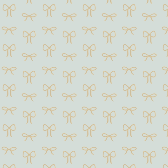
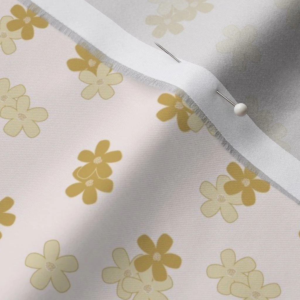
I painted roses in different stages of bloom. Some flowers were tight and structured, while others were more open. I painted roses from different perspectives. I painted tiny flowers that reminded me of daisies and tiny rose buds. I painted loose leaves and vines. While not my favorite element, I also painted bows because the brief specifically mentioned them. Working this way limited my options, which ultimately made the design phase easier.
Want this content delivered straight to your inbox? Join my newsletter list and you'll never miss a thing.
Designing My Hero Print
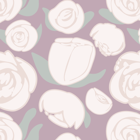
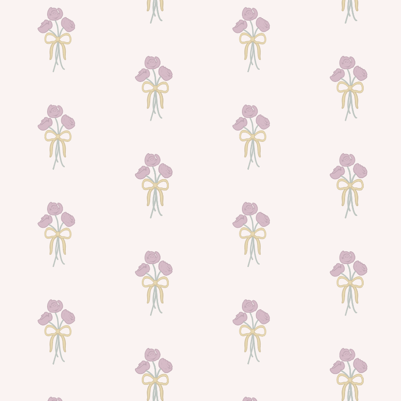
From those motifs, I knew that I wanted my main print, the hero, to feature the roses in a scatter pattern. I wanted the roses to feel large and make a statement. I didn’t want them to be delicate or tiny ditsy florals, but something that could stand alone on a pillow or tote bag. In the supporting prints I experimented with layouts:
A half-drop featuring rose bundles
A bow half-drop pattern
A small daisy-like floral used as a polka dot-style scatter
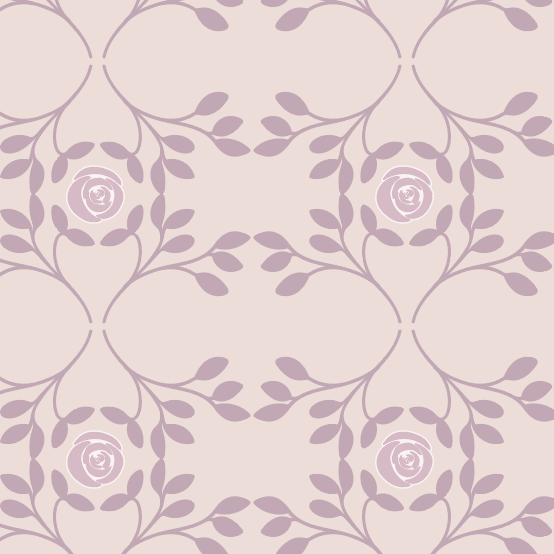
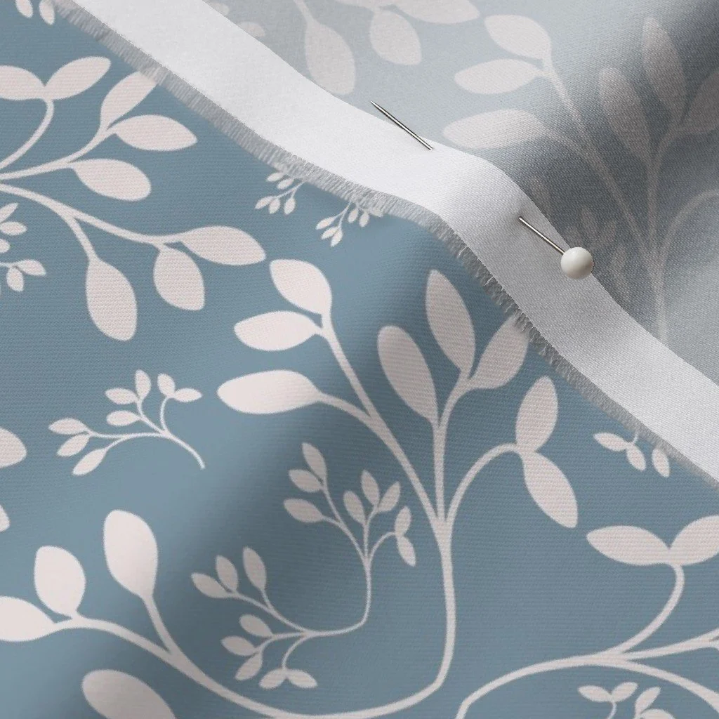
A geometric vine pattern with a rose element
At this stage, the palette was entirely pastel and pulled directly from the brief’s mood board: pale pink, soft cream, powder blue, gentle green, a muted yellow. It felt cohesive, delicate, and soft. It was also, if I’m being honest, a bit flat.
My Hero Print
Half-Drop Bows
A Vine Geometric
Submitting and Stepping Away
I submitted the collection in October, and I expected it wouldn’t be chosen. Similar to my approach with all of these design briefs, and most recently designing my Sweet Provisions fabric collection, I am looking for experience and practice when I work on these projects. Design briefs are the standard of the industry. With any job, you are not always going to love what you are working on. I keep trying because I know that with each collection I submit, I get a little better and a little more experienced. If my Sweet Provisions collection also taught me that when I eventually got to the revision stage, I would suddenly notice all of these ways that I could improve.
I was happy with the collection I submitted; at a certain point you have to stop tweaking the patterns and let them go. It felt like a strong product, but it also didn’t feel fully resolved. I had worked quickly and intentionally within constraints. The goal was to complete the collection and not to overwork it. When it didn’t get picked, I set the collection aside while I finished up yet another submission, knowing I would come back to it at some point.
And that space was exactly what it needed.
Revisiting With Fresh Eyes
When I returned to Blush and Bloom in early February, I could see it differently. The first thing I noticed was the hero print. What I had originally thought was a pretty good random scatter of roses was actually creating almost a vertical stripe of roses when you zoomed out a bit. Once I saw it, I couldn’t unsee it. So I rebuilt the layout.
I varied the sizes more dramatically. I adjusted the positioning. I tried to make the scatter more organic. I added additional shading to give the flowers more depth and I added a subtle speckled texture to the background to make the pattern feel less flat.
Original
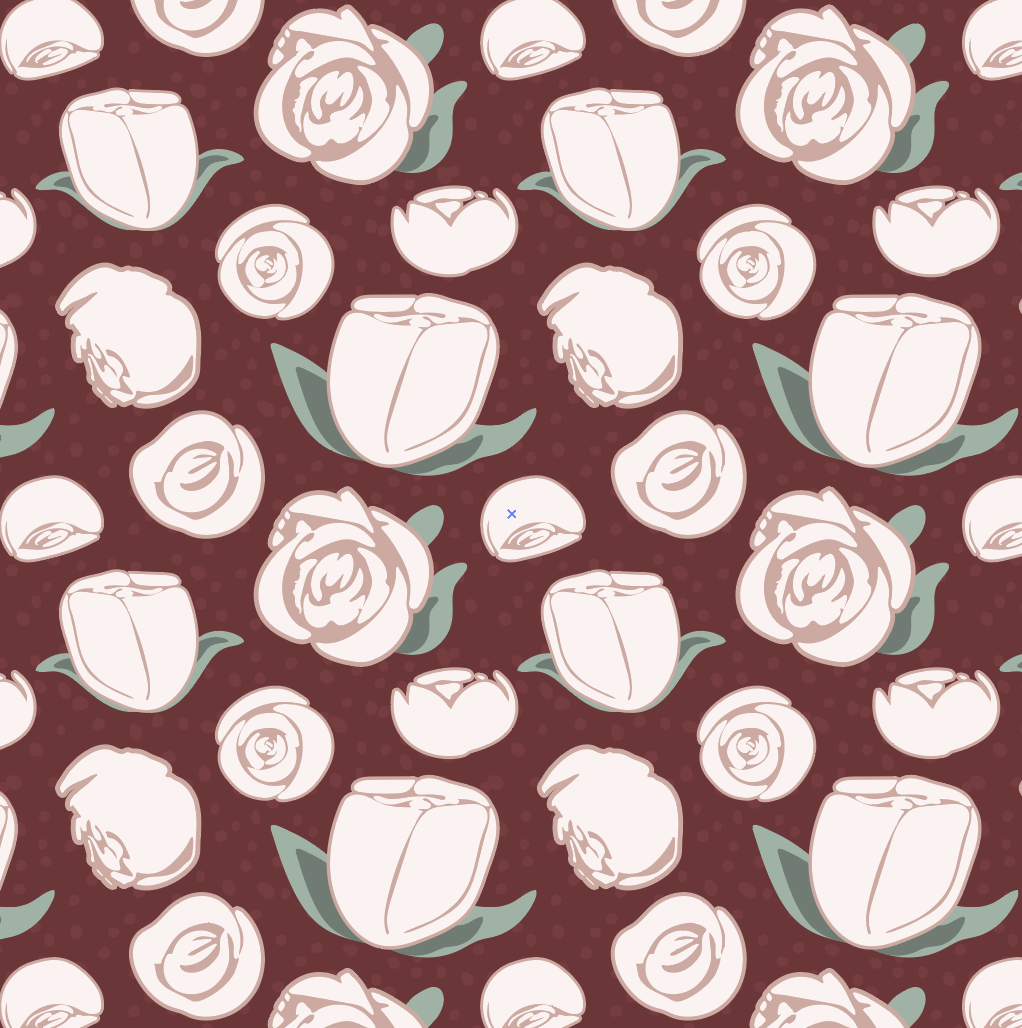
Revision
I applied a similar approach to the small floral “polka dot” print. I added more flowers and increased the complexity of the scatter so that your eye moves across the surface instead of finding patterns or “rivers” in the pattern.
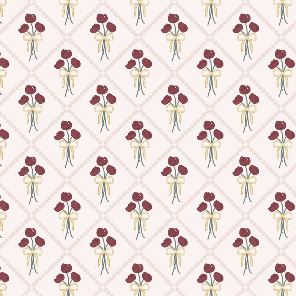
I still really loved the half-drop rose bundle pattern, but I wanted it to feel more sophisticated. I created a diamond framework using one of the smaller flower motifs to frame the bouquets. I think that small structural addition elevated the design completely. I could now picture this design on wallpaper, on dresses, even curtains.
Original
Revision
🎨 Want to see what my daily life is like from studio peeks, outdoor adventures, books, recipes and more? Follow me on Instagram. I’d love to meet you.
Letting Go of What Wasn’t Working
There were elements I removed entirely. The bow patterns, although included in the original submission because the brief specifically called for them, never quite felt right to me. In the revision phase, I allowed myself to remove them.
Instead, I introduced:
An additional half-drop floral pattern
An improved version of my geometric vine
A simple speckled blender print inspired by the hero background texture
A new half drop of the roses.
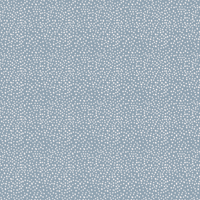
A simple speckle.
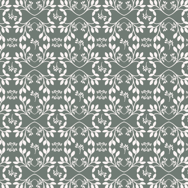
And updated geometric.
A New Color Palette
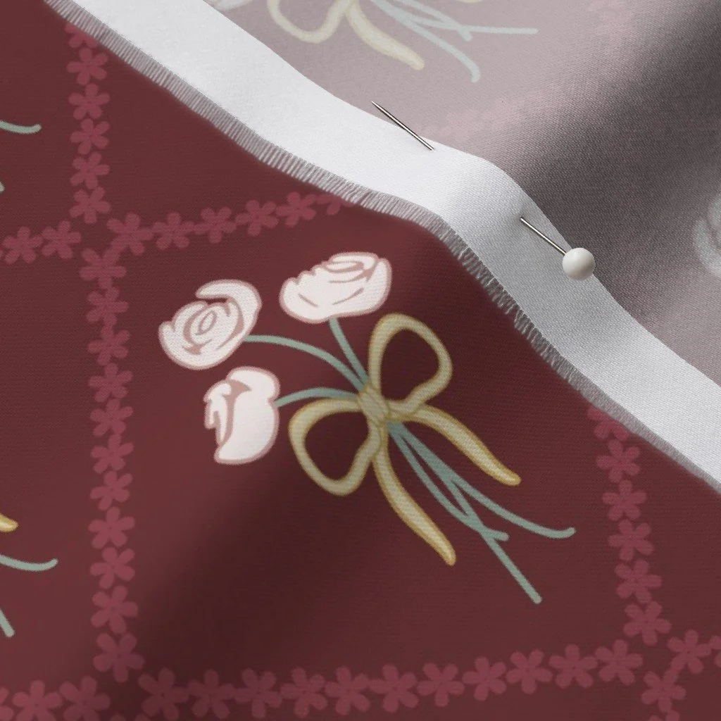
The most dramatic change, however, was color. The original palette was entirely pastel. It was soft and low contrast, pretty, and completely in line with the design brief, but it was really me. So while there were colors I wanted to keep, the pinks and creams, I wanted everything to be a bit darker. I wanted there to be more contrast. For my new palette, the greens became richer, the blues slightly darker, and I introduced a deep burgundy red.
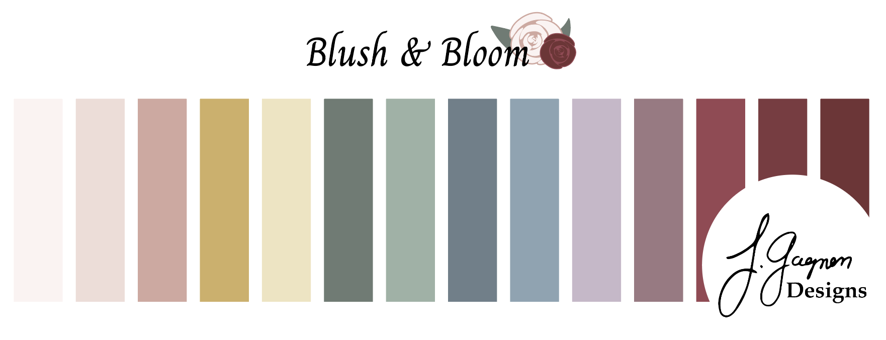
Updated Color Palette
The shift added contrast and dimension. It also made the roses feel more classic, almost reminiscent of period dramas like Bridgerton. The collection still feels calm and delicate, but it is now a bit more bold.
Personal Threads
Even though this collection began from someone else’s mood board, there are still pieces of me in it that I didn’t really think about until sitting down to write this blog. I’ve always loved roses. My husband gives them to me almost every year around our anniversary. I love their structure: how tightly wound some are, how loose others become as they open, how they can be small and delicate or large and robust. I like that this collection has a variety of rose elements.
The tiny rose print also carries a more subtle memory. I had a dress when I was little, covered in tiny roses. I wore it as a flower girl at a family wedding and then I kept wearing it until it was frayed and thin and probably kept well after it should have been retired. That small-scale rose pattern in this collection feels like an homage to that dress, albeit upgraded to my millennial tastes.

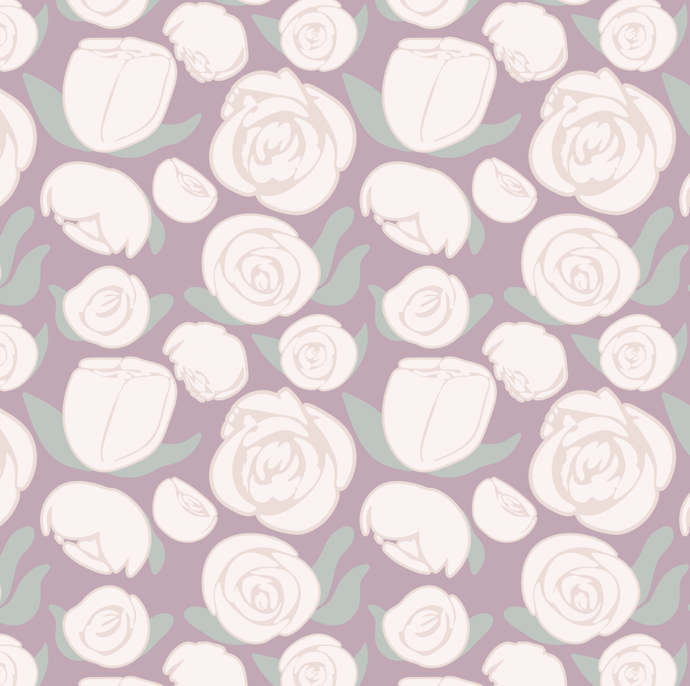
Blush & Bloom Final Collection
What This Collection Taught Me
Designing Blush and Bloom was not a dream project, but it was a test of my skills. It taught me that I can:
Design efficiently under constraint
Work from a single page of motifs
Follow a brief closely without overcomplicating it
It also reinforced something I’m learning repeatedly: time away improves my work. The gap between submission and revision made a notable difference in the final product.
Imagining It in the World
I can see these prints in a few very specific places:
A structured tote bag in the bold rose scatter
Curtains in the diamond bouquet print
A little girl’s dress in the tiny rose pattern
Baby onesies in the floral polka dot pattern
Quilts that mix the patterns together in unique ways
Pillows and wallpaper in the geometric vine
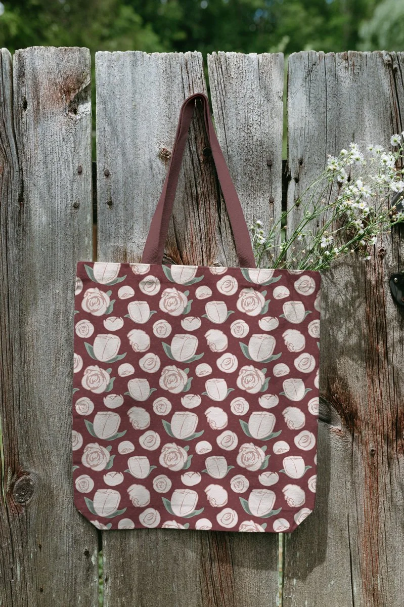
The rose pattern mocked up on a tote bag.
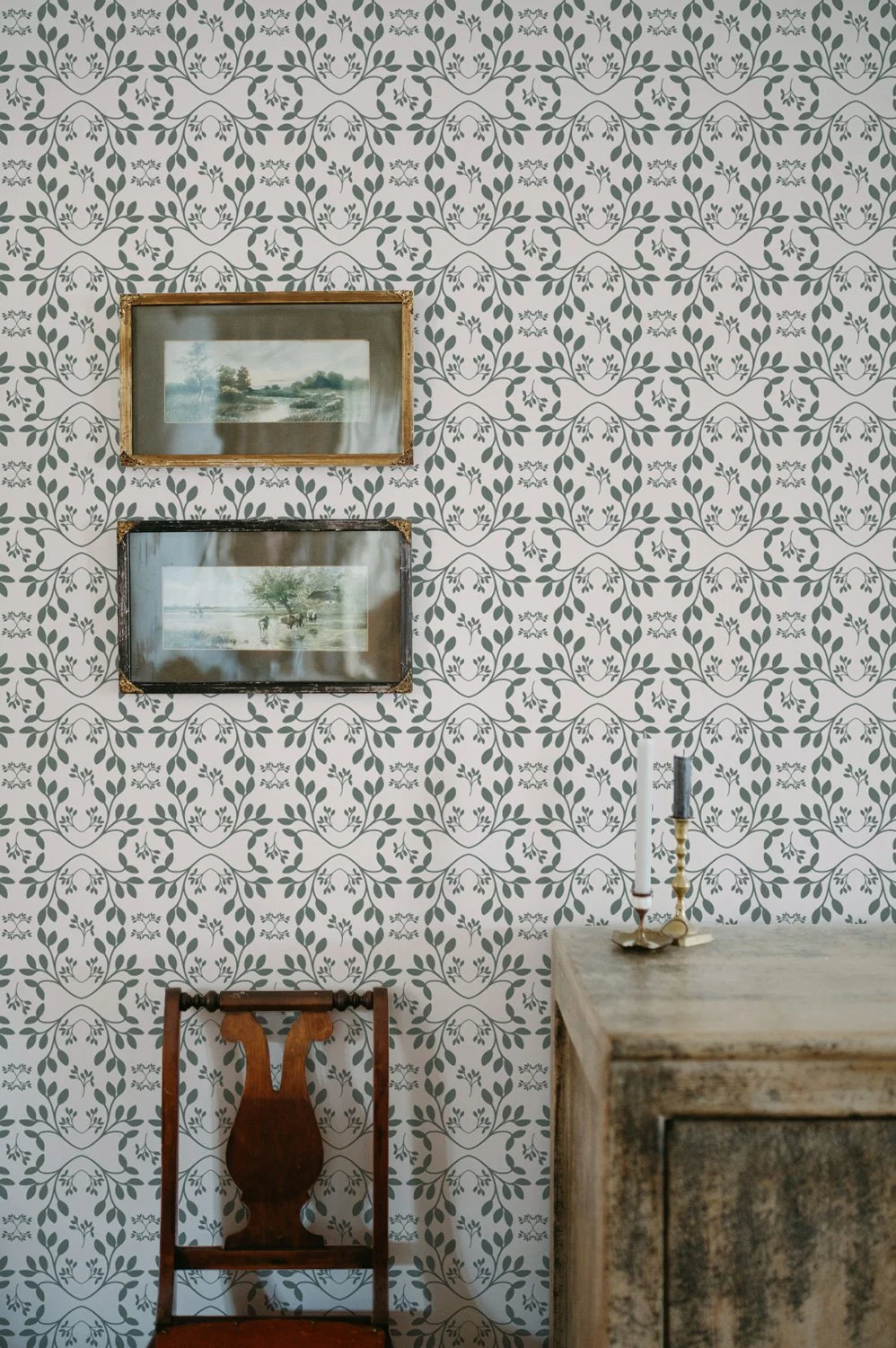
The geometric vine mocked up on wallpaper.
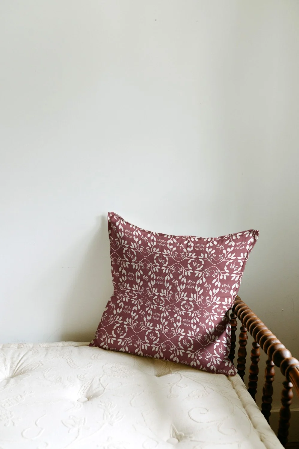
A different color of the geometric vine on a pillow.
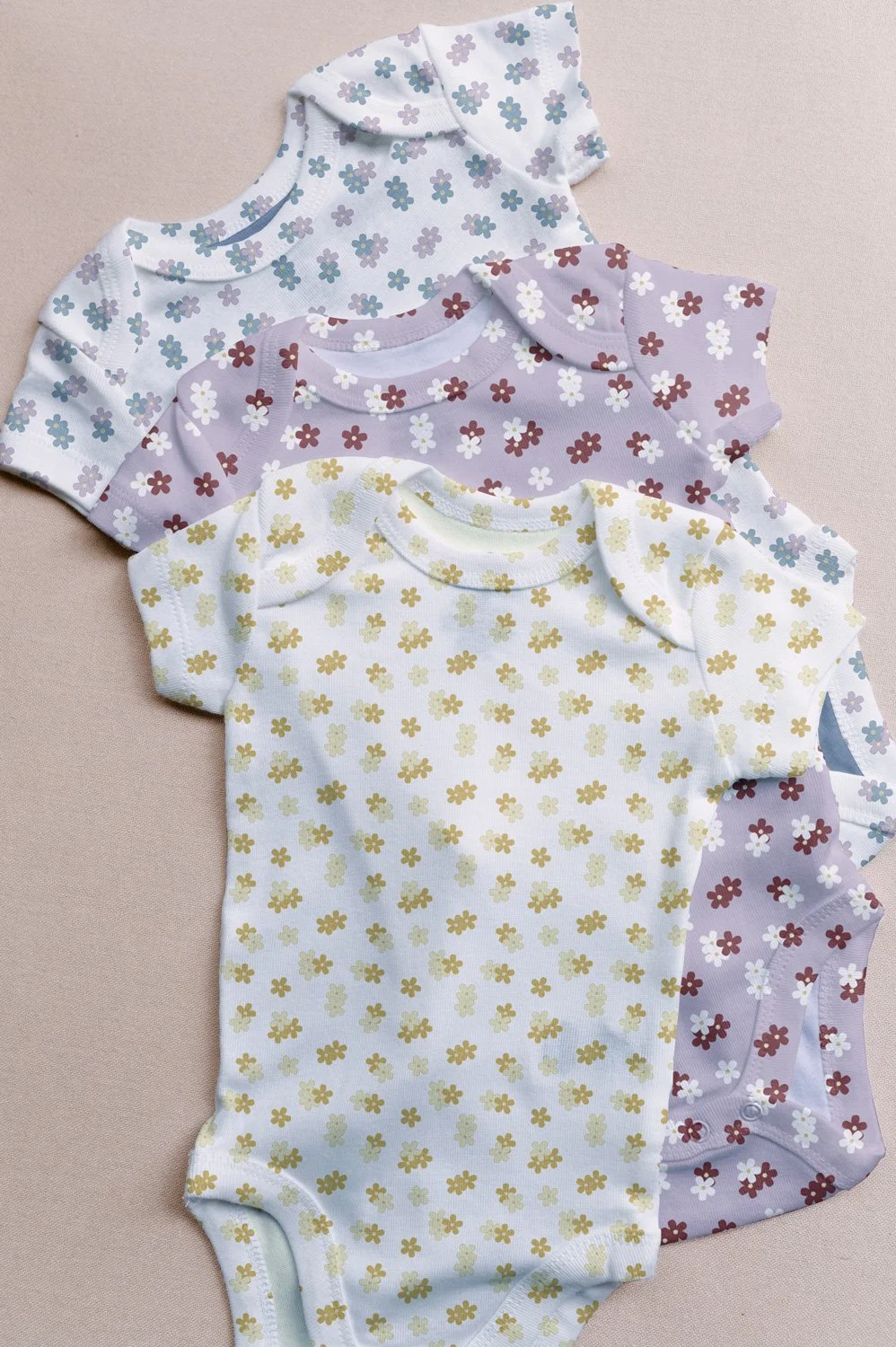
the flower polka-dot pattern on onesies.
It’s feminine, vintage-inspired, and versatile enough for home decor, clothing, and quilting.
Where to Shop
Blush and Bloom is now available on Spoonflower, whether you want a test swatch, a yard for your next sewing project, or to upgrade your curtains or pillows. There you’ll also find all the different color variations for each print. You might even have trouble deciding which ones you like best.
If you have a favorite print, I would love to know which one it is. Let me know in the comments.
You Might Also Like
On the Blog: Designing a Farmstead-Inspired Fabric Collection: The Story Behind Sweet
On the Blog: My First Fabric Collection: Why Immersion in 2024?
Pattern Tuesday: Each week I share a bit about what I am working on when it comes to surface pattern design over on Instagram.