
Designing a Farmstead-Inspired Fabric Collection: The Story Behind Sweet Provisions
Sweet Provisions reminds me of drives down dirt roads, small town farmer’s markets, and quiet moments alone out in nature. I imagined outdoor picnics and leisurely tea times with friends, homemade preserves in vintage jars, and wildflower bouquets.
The Challenge
Sweet Provisions started as a submission to a design challenge. As part of my Pattern+ Surface Pattern Design membership with Bonnie Christine, members are allowed to participate in monthly design challenges with actual companies. The challenge that inspired Sweet Provisions was to design a quilting fabric collection centered around the theme of farmstead: a celebration of slow-living and countryside charm. This was my first time diving back into designing patterns after a six month break. I was coming off a hard summer where I barely created anything at all. To get back into designing, deep down I knew that I needed to just rip the bandaid off and get started, no matter how awkward, so I decided that this challenge would be it, and with a quick four-ish week turnaround time, there was little time to procrastinate or overthink what I was designing. The idea was to just design something. Did I have any delusions that this first collection out of the gate was going to get picked for the challenge, absolutely not, and spoiler alert, it didn’t. But I needed something to break my creative rut and decided to dive in and see what I could create.
Gathering Inspiration
To get started, I simply started to brainstorm all of the words I could think of that would mean farmstead to me in my notebook:
Farmer’s market, booth, jam, glass jars, containers of fruit, strawberries, peaches, burlap, wooden crates, twine, chalkboard signs, handwritten labels, velvet ribbon, picnic basket, tea time, vintage, nostalgic, blankets in the grass
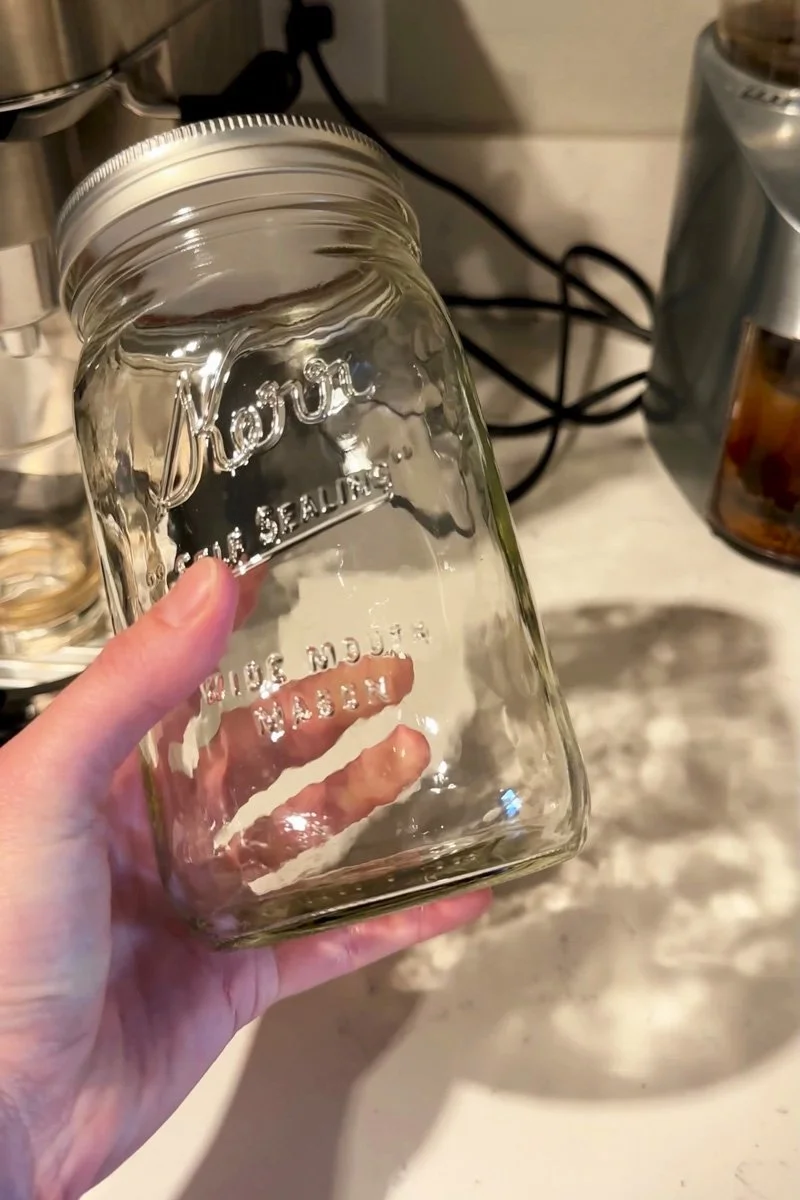
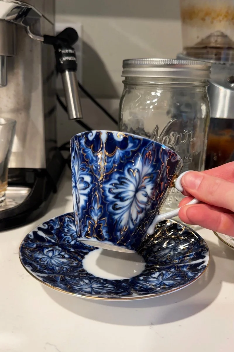
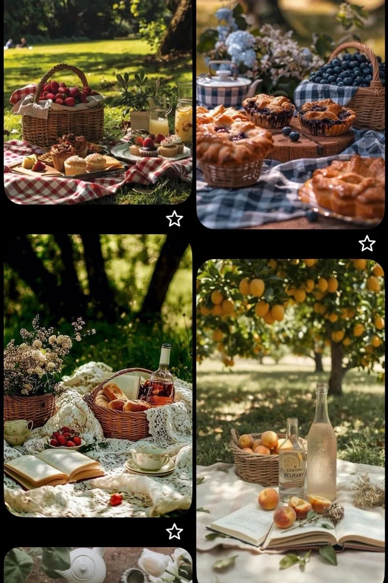
With my list of words, I started to assemble the visuals that resonated with the words I chose. When gathering inspiration, I try to assemble a collection of physical items if I can. Around my apartment I found glass canning jars, a fancy tea set that we were gifted for our wedding (a Russian tradition from my in-laws), and a handmade tablecloth from my grandmother. I also created a digital moodboard by taking my list of words and typing them into Pinterest, where I created a collection of photographs and home decor shots that felt aligned with the vibe I was hoping the collection would have. These visuals included lots of photographs from farmer’s markets, different jam displays, elaborate outdoor picnic scenes, and for a bit of a nostalgic feel, scenes from Downton Abbey and a collection of vintage advertisements related to fruit.
Creating the Artwork
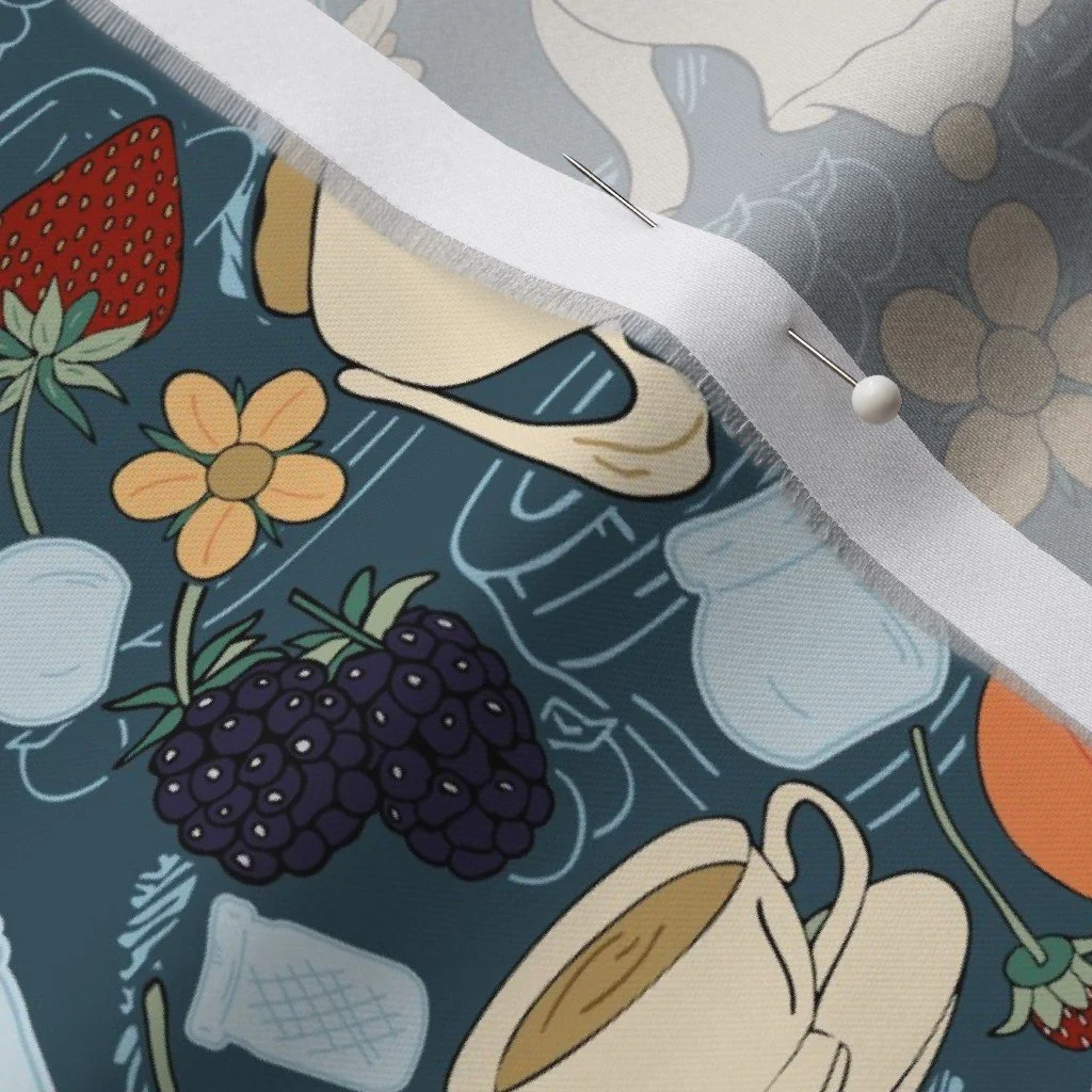
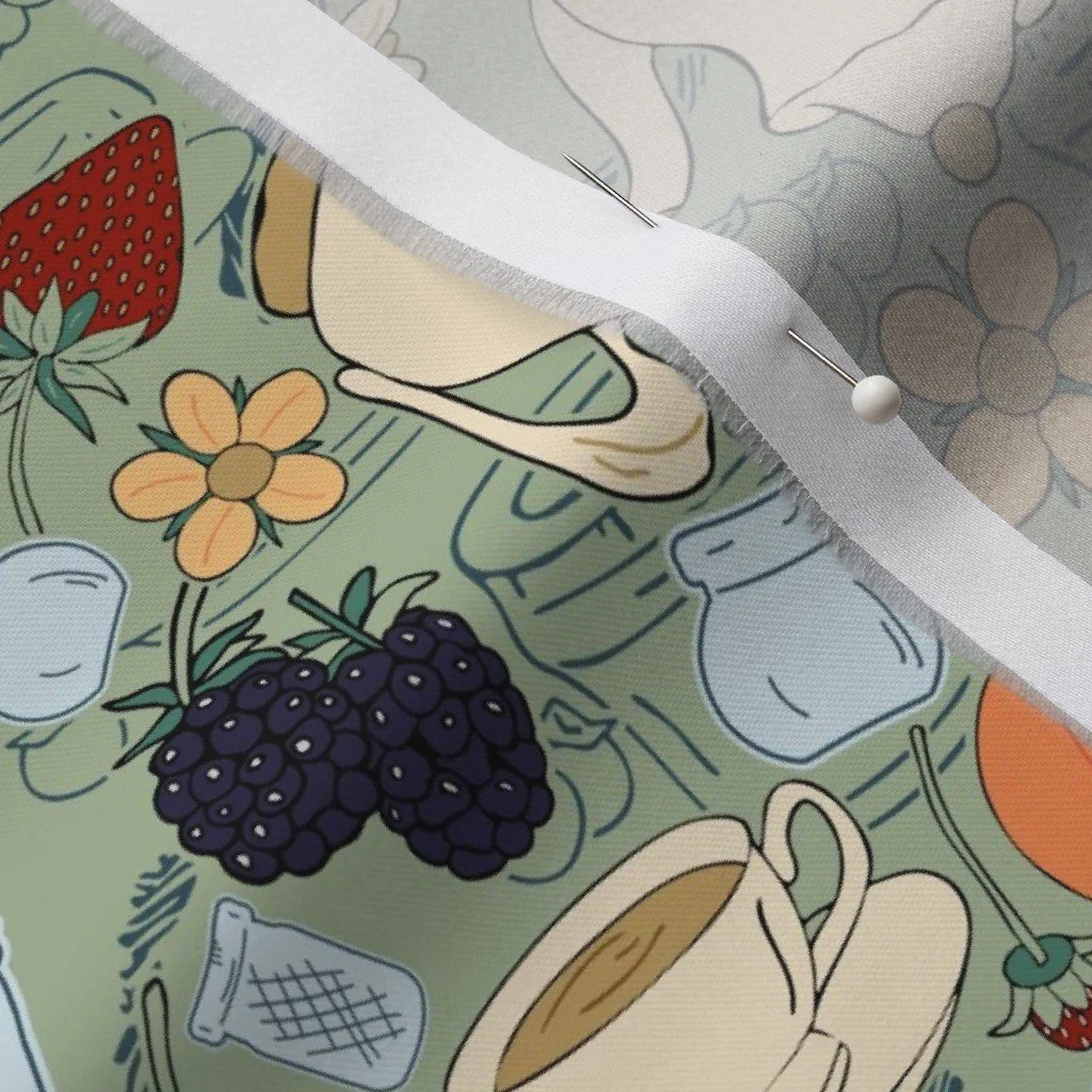
For this collection, I wanted to combine hand-drawn motifs and watercolor marks. I started in pencil in my large sketchbook drawing different shaped glass jars, tea cups and saucers, fruits such as strawberries, blueberries, and peaches, flowers and bits of greenery, cookies and crackers that I could imagine as part of a picnic scene, decorative bows, tags to add handwritten labels, and even a whole page of cursive handwriting. Once I was happy with the sketches, I traced over everything in pen so that it would be easier to scan later on. For my watercolor marks, I was focused on simulating jam textures, like what you would create when spreading jam on a piece of toast. I wasn’t entirely sure what I was looking for, so I simply created two pages of watercolor marks hoping that something would capture my attention once I brought it into Adobe Illustrator.
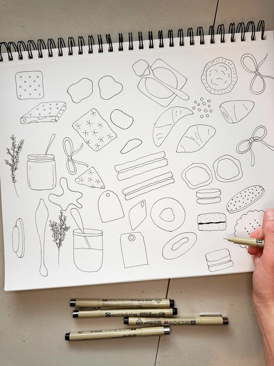
Drawing cooking and other picnic and tea motifs.
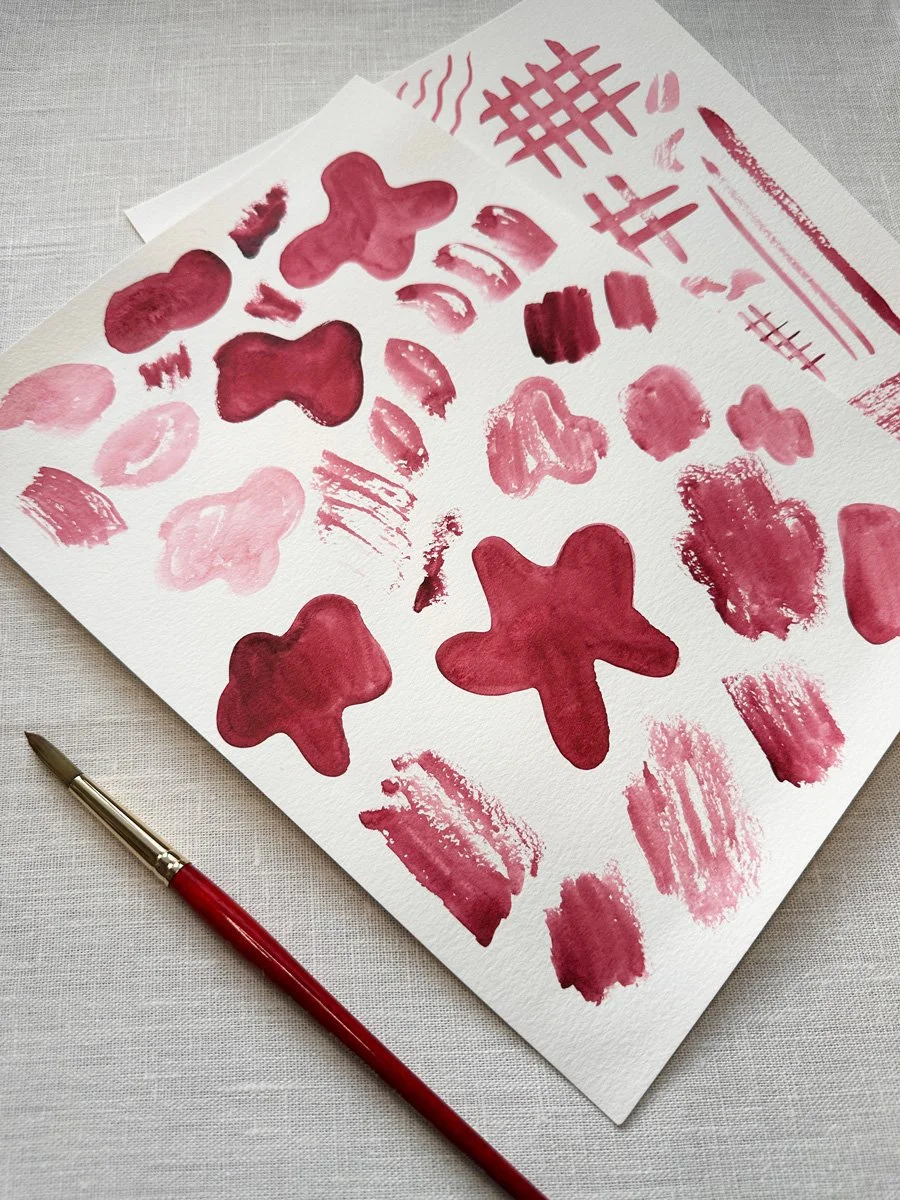
Watercolor mark making to create textures.
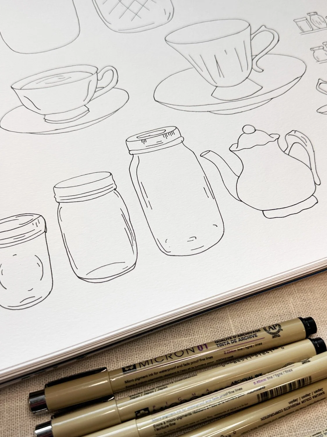
Drawings of mason jars, tea cups and tea pots.
Enjoying this read? Join the Collector's Club to have new posts delivered to your inbox as part of my monthly Studio Notes.
Putting Together the Patterns: Round One
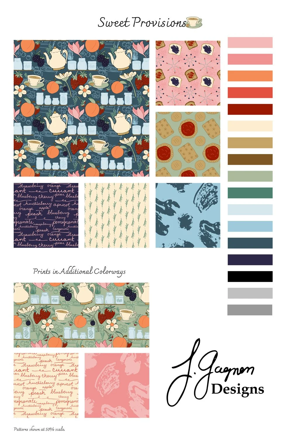
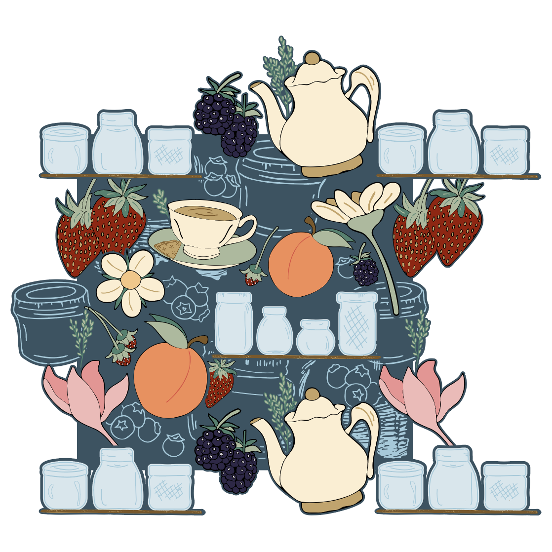
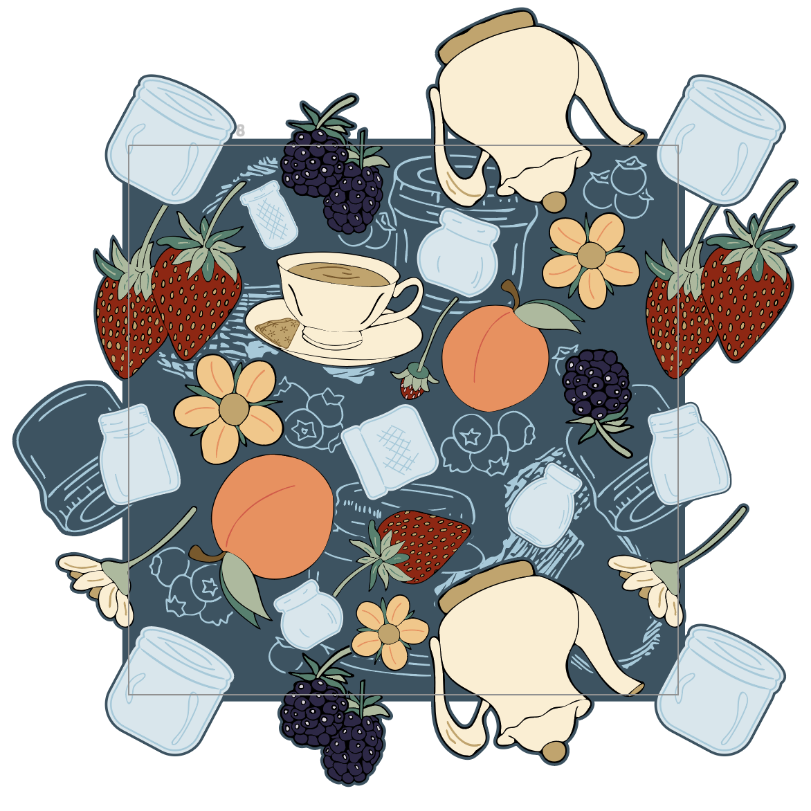
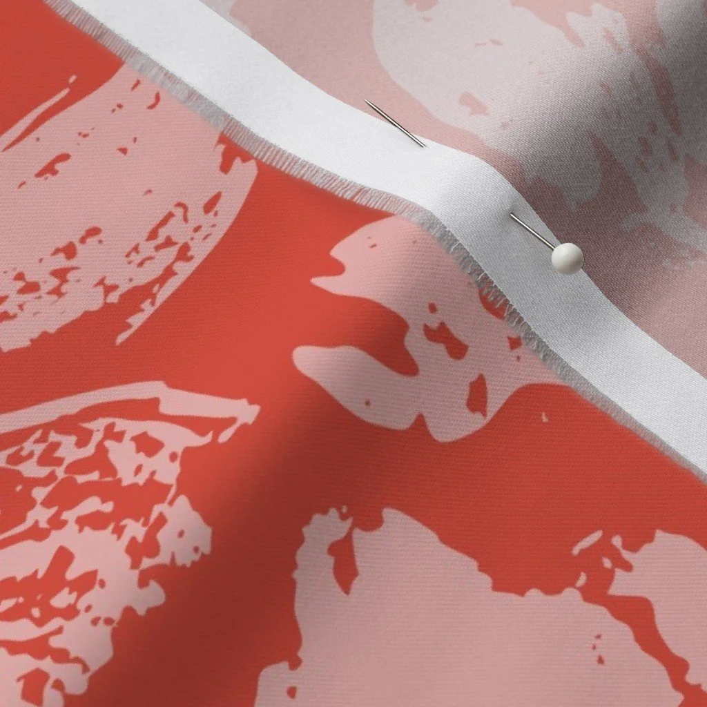
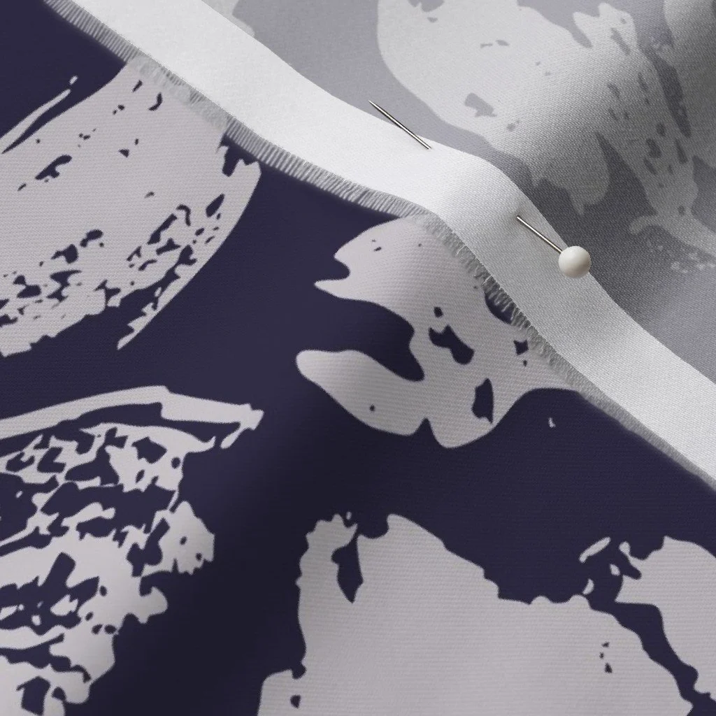
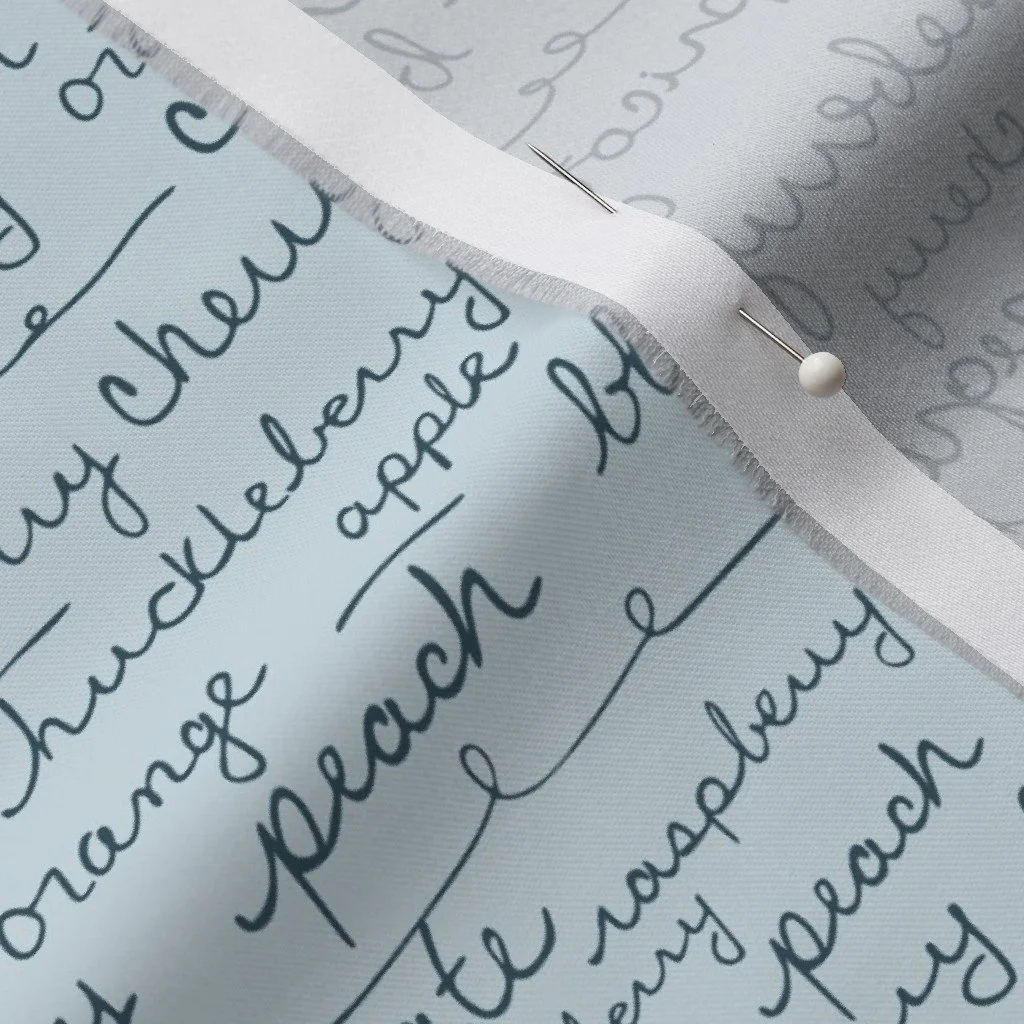
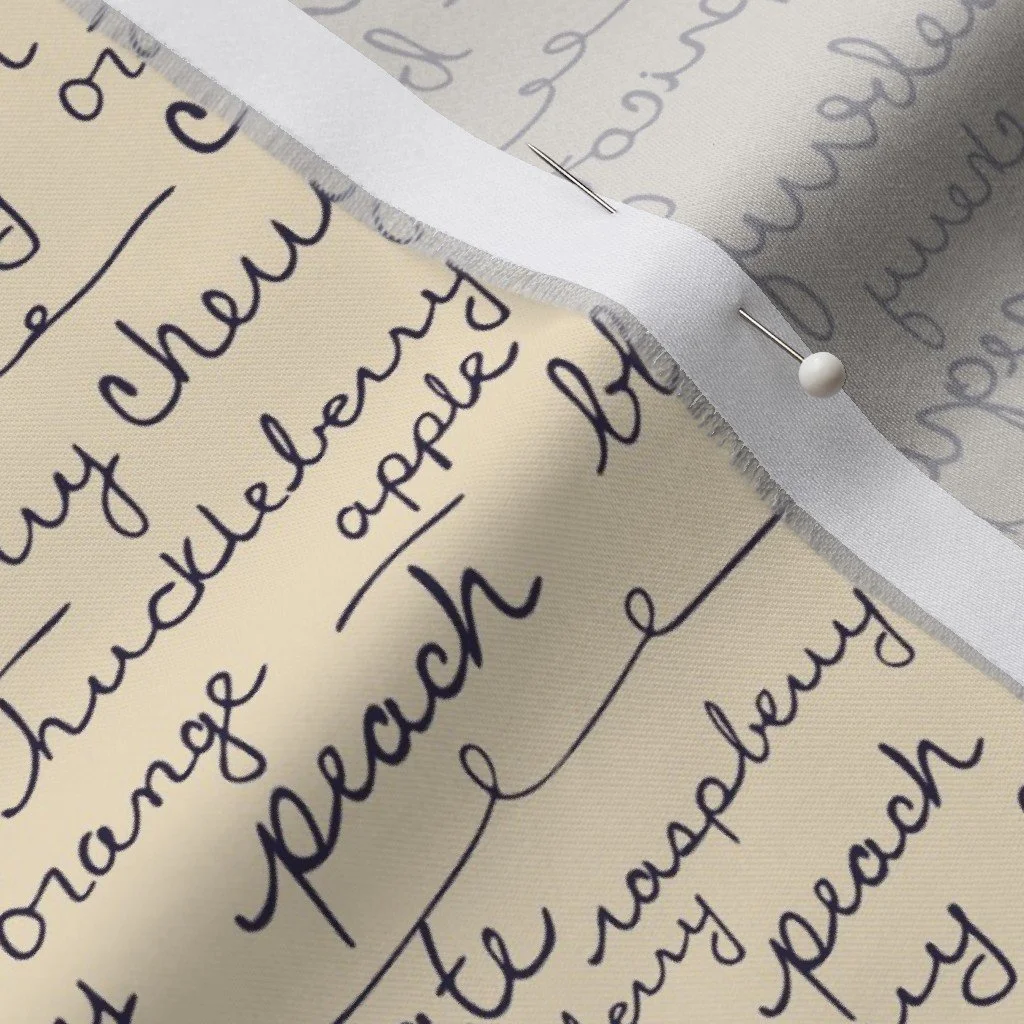
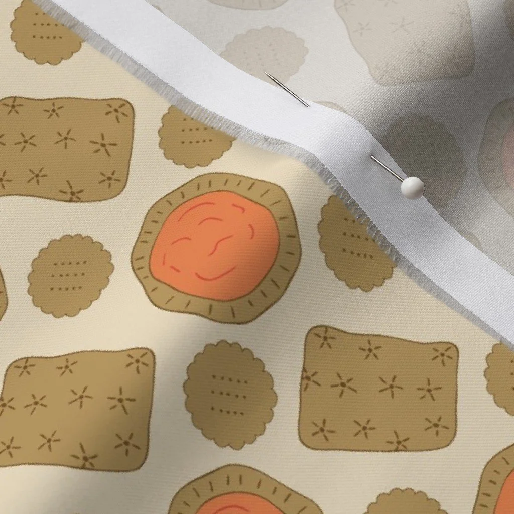
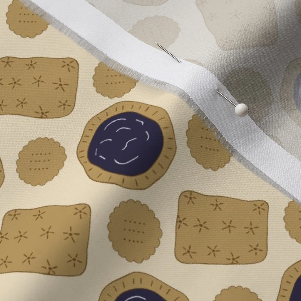
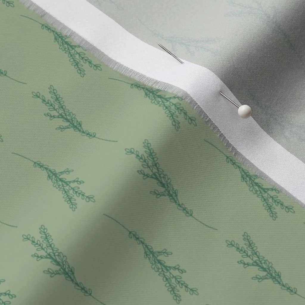
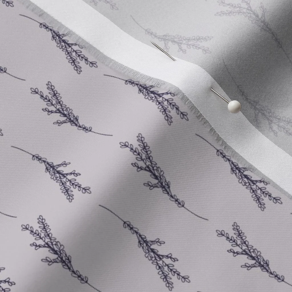
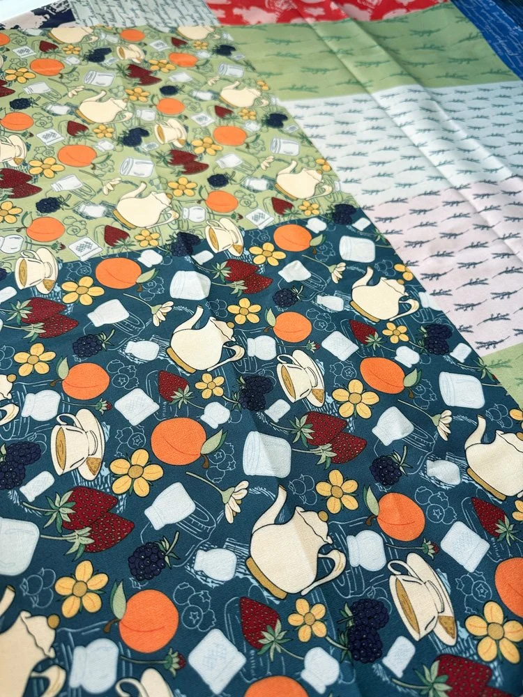
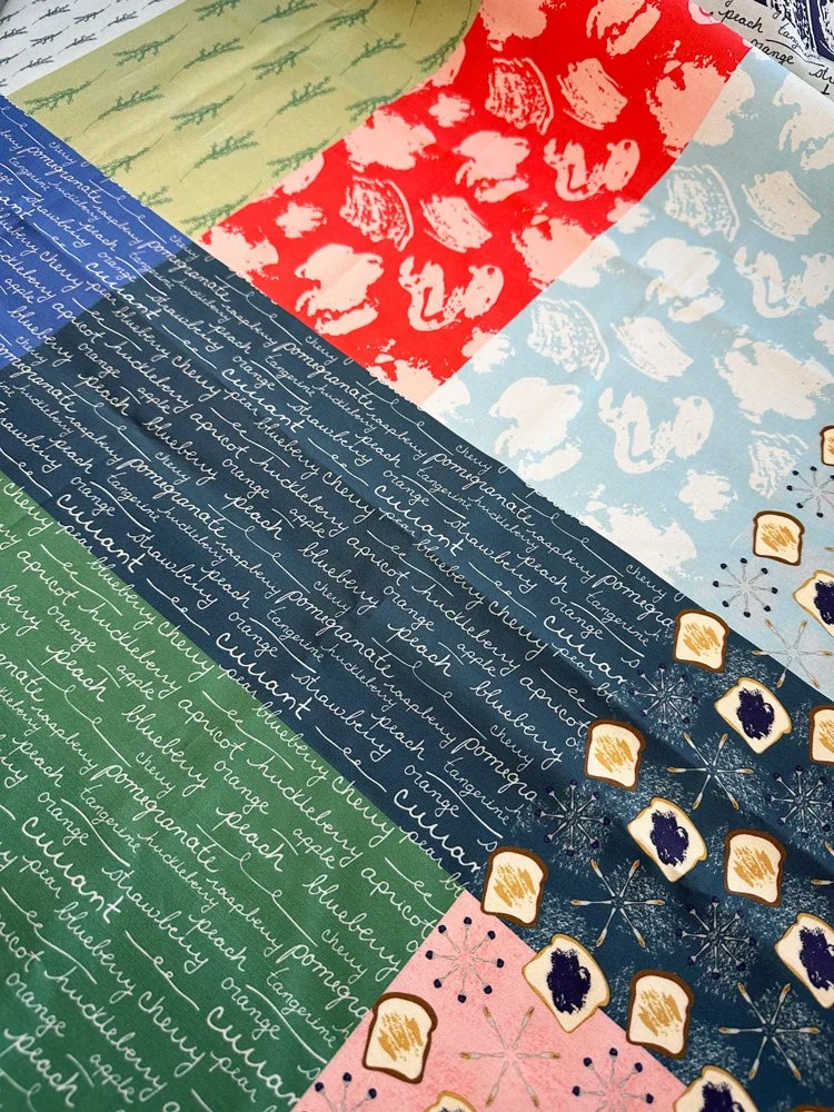
Working in Adobe Illustrator, I started to add color to my hand-drawn designs. I wanted the patterns to be bright, colorful, and playful. They were designs that I imagined on kitchen aprons and tea towels. The color palette that emerged was bright and cheerful, full of blues, greens, oranges, and reds. As I experimented, tweaked, and refined my patterns, favorites emerged. A simple handwriting print evoked ideas of handwritten recipe cards and vintage produce labels. My most complex print combined a large variety of hand-drawn elements that felt playful and almost Alice in Wonderland-esque. Finally, with the watercolor textures that I painted, I created a subtle scatter pattern that I liked so much on its own that I abandoned using it as a background texture for a pattern and kept it simple and two-toned to stand on its own. With six patterns identified as sufficient for the collection, I also experimented with a few of the patterns in different colorways and found that I couldn’t decide if I liked my hero print in blue or green better.
Version of the Sweet Provisions collection submitted for the design challenge.
Collection Rejection
I submitted the final collection, complete with a logo and sat back and waited. Ultimately this collection did not get chosen as a challenge winner, but it got me back creating again. It reminded me that I need to create regularly to develop my style and my skills. These design challenges could provide the perfect opportunity to build up my body of work in order to create my first portfolio, something that I still do not have. With renewed motivation and the benefit of a few months away from this collection, when it was finally time for me to revisit it, I was full of ideas for how to improve it.
If you want to know what my day-to-day life is like in the studio and beyond, come and find me on Instagram.
Collection Revision
While of course the dream is for one of my collections to get chosen as part of a design challenge, which would mean an actual licensing contract with a company, my short-term goal is to build up a body or work and to consistently create new pattern collections that I can put up for sale on Spoonflower, a print on demand company, that specializes in fabric, wallpaper, and home decor items. When reviewing this collection, here are things that I knew I wanted to tackle:
I loved the overall concept of the hero print, but it felt almost stiff with all of the motifs going in one direction.
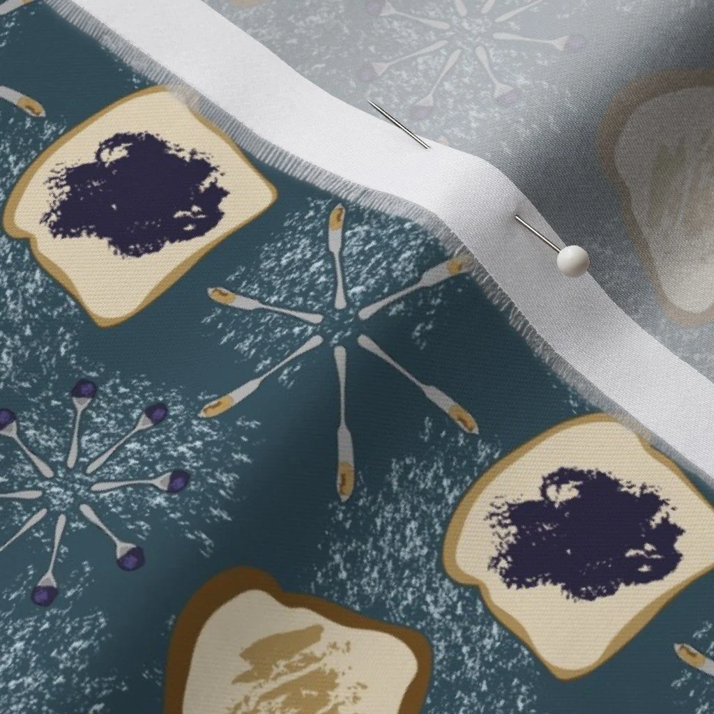
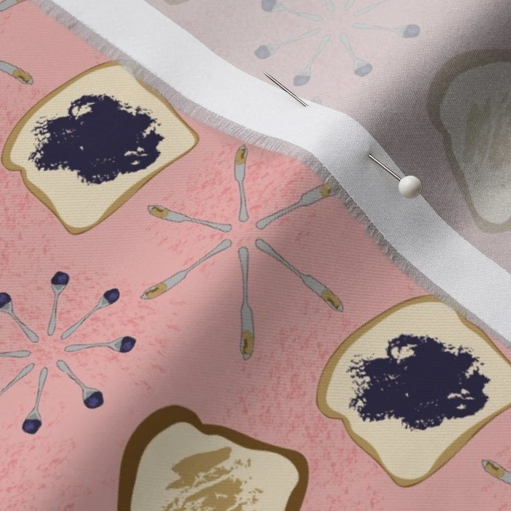
Is the jam, spoons, and knives print really the direction I want to go?
Is the scale actually appropriate for if I was creating a quilt, where you are often cutting pieces that could be as small as one to two inches wide?
With these thoughts in mind, I went through each pattern and revised them.
I standardized the scales of each of the patterns, making them either a 2.5 inch or 5 inch repeat, which seemed like the best size if somebody wanted to cut the fabric for a quilting project.
I refined the patterns. For my hero print specifically, I incorporated more movement by making sure that the motifs were going a variety of directions. For the jam pattern, I tweaked it just slightly so that it was a peanut butter and jelly print rather than just jam and toast.
First Draft
Final Draft
I adjusted the colors and created patterns in additional colorways. This means that I double checked that the patterns all used the same color palette. I also played with the recolor artwork tool to create different color variations for each pattern.
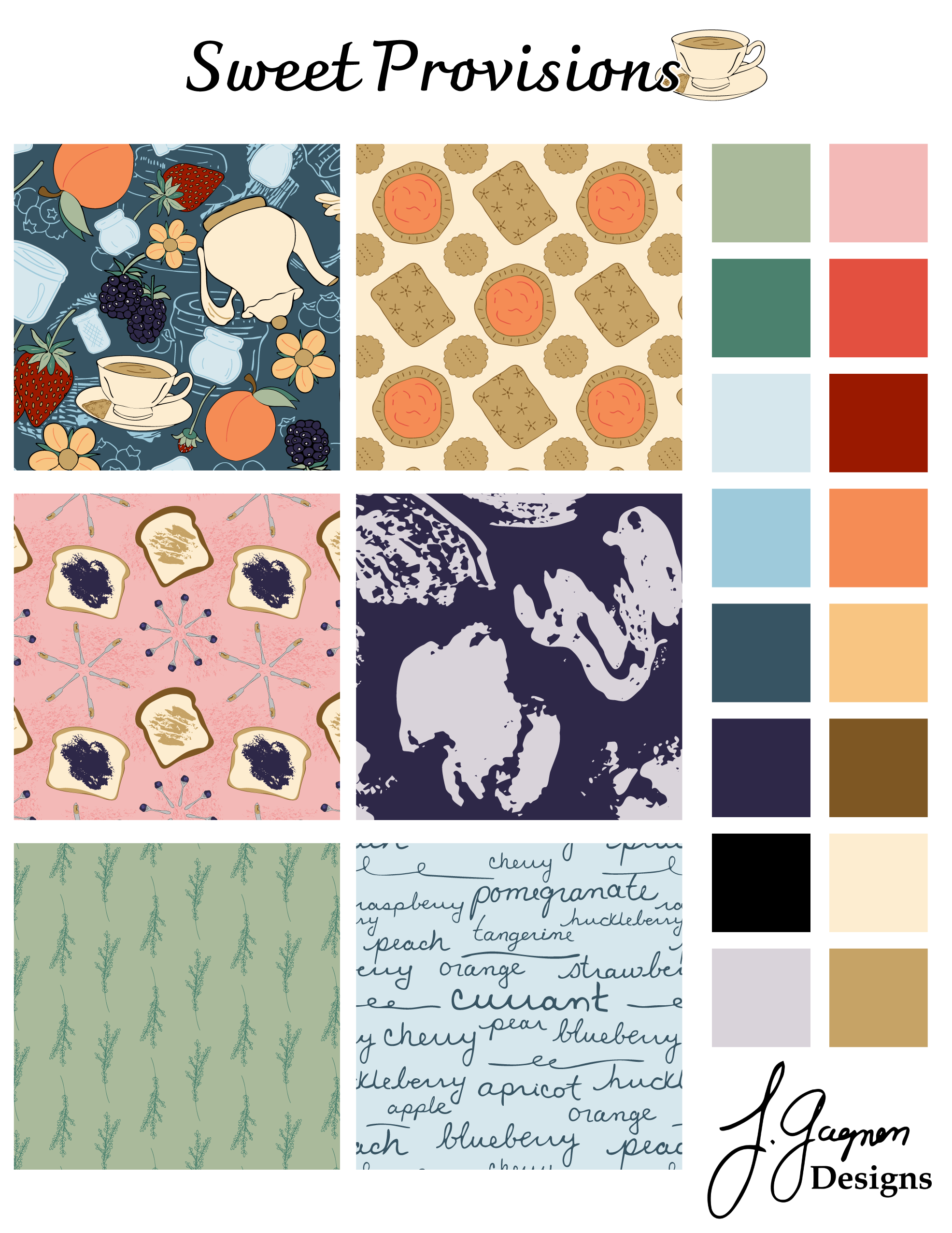
Sweet Provisions Final Updated Collection
Spoonflower Debut
With my final adjustments complete, it was time to do the time-consuming task of creating all of the files to upload to Spoonflower, proofing the patterns online, creating SEO optimized titles, descriptions, and tags, and ordering samples to further confirm that the designs are the way that I want them to be. And now this collection is available online for people to use in their quilting and home decor products. I’m partial to the tea towels and I am convinced that Picnics & Tea Time will make an adorable apron fabric. If you have a favorite pattern, I would love to know.
Printed samples of Sweet Provisions
A “cheater quilt” from Spoonflower of Sweet Provisions fabrics.
You Might Also Like
On the Blog: From Doubt to Design: Embrace Being the Least Experienced in the Room
On the Blog: My First Fabric Collection: Why Immersion in 2024?
Pattern Tuesday: Each week I share a bit about what I am working on when it comes to surface pattern design over on Instagram.
This Reel where I show you my Spoonflower samples for Sweet Provisions.