
Gathering Inspiration: Week 1 of Immersion 2026
I officially started the 2026 session of Bonnie Christine's Immersion Course this week. Module 1 focused on inspiration: gathering references, defining a theme, and starting to brainstorm my collection. Over the course of the week I spent about 14 hours on Immersion-related work, including watching lessons, attending the live opening ceremony, and completing exercises in my workbook. As an alumni, I knew that inspiration was where we would start, so I already spent several hours over the last couple weeks going through my photo archives and pulling reference images I thought might be useful. Even with that preparation, the first week still brought a full range of emotions.
The First Wave of Overwhelm
By Monday morning I was already wondering what I had gotten myself into. The overwhelm wasn’t really about the course itself. It came from realizing, again, that I can’t do everything at once. If Immersion is my primary focus for the next several weeks, then other things need to shift into maintenance mode. That means less painting, less time experimenting with new ideas, less attention to platforms like Instagram. Logically, I thought I had already overthought my time management to death. But my anxiety spike on Monday was a clear sign that I needed to simplify my task list even more significantly.
There was also a moment early in the week when imposter syndrome showed up unexpectedly. I tried sketching a few initial ideas for the collection and everything felt awkward and clumsy. For a brief moment I questioned whether I was even capable of becoming a surface pattern designer at all. That feeling didn’t last long, but it was a reminder of how easy it is to spiral when you are starting something new, (even if that new thing, you have technically already done).
Productive Procrastination
Midweek I found myself painting instead of working through one of the workbook exercises. I was definitely procrastinating, but it also further reinforced that I probably can’t work on Immersion all day, every day. Even though the course is my priority right now, I still need time for creative rest. For me that might mean painting, hiking, riding my bike, or simply stepping away for a bit.
My working framework at the moment is that about 80% of my creative energy has to go toward Immersion if I want to complete Immersion in real time over the next 12 weeks total. The remaining 20% should be used for rest or lighter creative activity. So while the painting session technically delayed my progress when it came to completing course exercises, it also helped me reset and come back to my task list with new focus the next day.
Join my newsletter list so that you don't miss the next post in this series! This is the first post in my series documenting IRL my experience taking Surface Pattern Design Immersion.
Choosing a Collection Theme
The first major step in the module was deciding on a theme for the collection. The first time I took Immersion I needed a long idea exploration stage. This year, I wanted to show up at the start of the course with a clear direction. When I originally thought about taking Immersion again, I had considered building a collection around rock climbing gear. It’s a subject I’ve been interested in for a while and something I think could be really fun on athletic apparel. But once I learned that this year’s version of the course places a much stronger emphasis on analog techniques and organic inspiration, that theme started to feel slightly out of sync.
Instead I chose something closer to home. My rough collection idea is to focus on summer in the Colorado mountains. This theme fits naturally with the reference photos I’ve taken over the years while hiking and exploring the Front Range, and it aligns closely with the landscapes I’ve been painting this winter. It also happens to coincide with a personal milestone. 2026 will mark ten years since I moved to Colorado, and spending time in the mountains has shaped the person and the artist I have become.
Gathering Visual References
One of the early lessons in the module emphasized paying close attention to the world around you and collecting inspiration from many sources. For this collection my references come from two main places:
My Personal Photographs
These include landscapes, wildflowers, mushrooms, alpine lakes, and wildlife I’ve photographed while hiking.
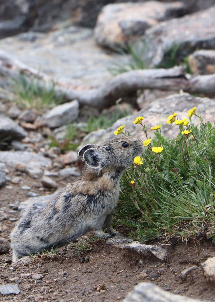
Pikas are one of my favorite animals and I want them to be a feature in this collection if I can get the artwork to work.
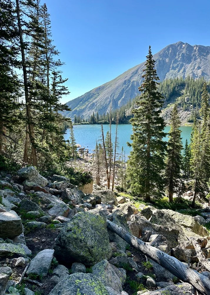
The mountains have become such an important part of my identity over the last decade. It’s hard to imagine living anywhere else now.
Historical Materials
Because my day job is at a history museum, I’m drawn to historical imagery. Early maps, travel journals, and botanical illustrations often have a lot of character in their colors and textures. Many of them were painted or hand-rendered, and the artists had to simplify complex landscapes into shapes that could be easily communicated.
For example, I found:
Wild flowers of Colorado by Emma Homan Thayer from 1895 that included these lovely watercolors of wildflowers from Thayer’s travels throughout Colorado.
Colorado Outings by James Steele from 1898 published by the Chicago, Burlington, and Quincy Railroad Company that featured photographs and maps of early Colorado.
A 1908 postcard from Estes Park, Colorado.
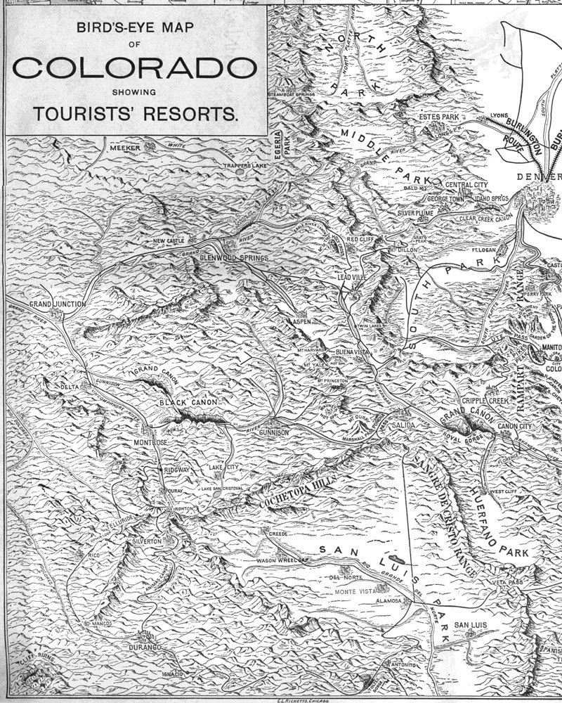
Map detail from Colorado Outings, 1898.
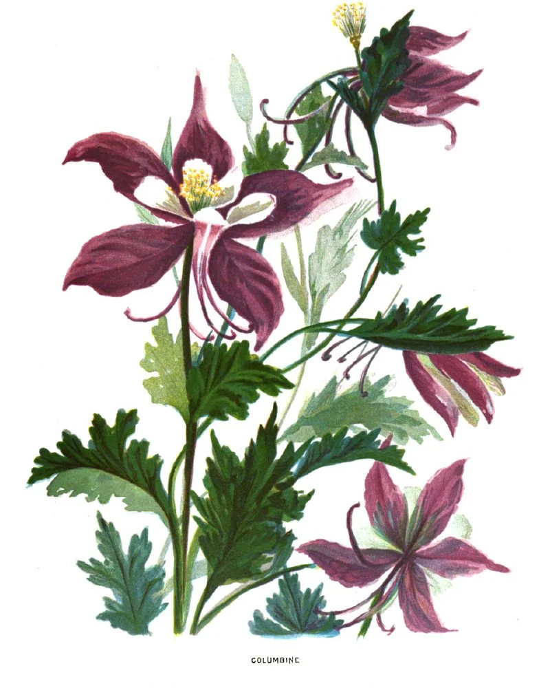
Colorado Columbine from Wildflowers of Colorado.
I love these types of historical references because they always feature interesting textures and interesting ways of simplifying large concepts such as mountains, trees, and the terrain.
🎨 Want a daily peak what I’m creating for Immersion as I create it? Follow me on Instagram for a first look at new work, outdoor adventures, and more. I’d love to meet you.
Brainstorming the Collection Story
One of the workbook exercises asked us to brainstorm a list of words connected to the theme.
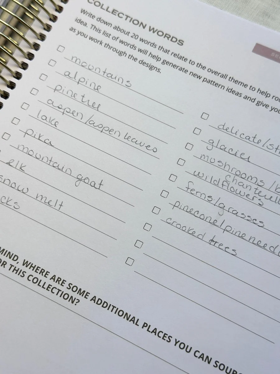
The initial goal was to come up with twenty descriptive words related to the mountains in summer. After expanding that list, several ideas started to stand out as possible motifs for the collection.
A few of the strongest included:
mountains
pikas
mushrooms
wildflowers
pine trees
These words started to form the foundation for potential motifs and pattern ideas.
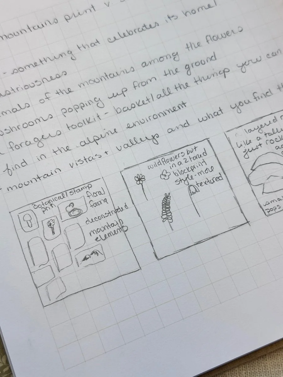
Sketching Pattern Ideas
Another exercise focused on quickly brainstorming potential prints. The goal wasn’t to produce polished sketches, but to doodle, consider layouts, pattern complexity, identify motifs that might go together, and write anything and everything that could eventually turn into a pattern. By the end of the exercise I had about 15 possible pattern concepts, including a mix of hero prints, coordinates, and simpler blender patterns.
A few early ideas include:
Hero Pattern: A pika in the foreground smelling wildflowers, with scattered flowers in the mid-ground and mountains in the distance.
Botanical: A dense, busy pattern of Colorado wildflowers.
Texture Pattern: A simplified interpretation of mountain shapes repeated to create a textured background.
Abstract Blender: A loose pattern inspired by mushroom gills.
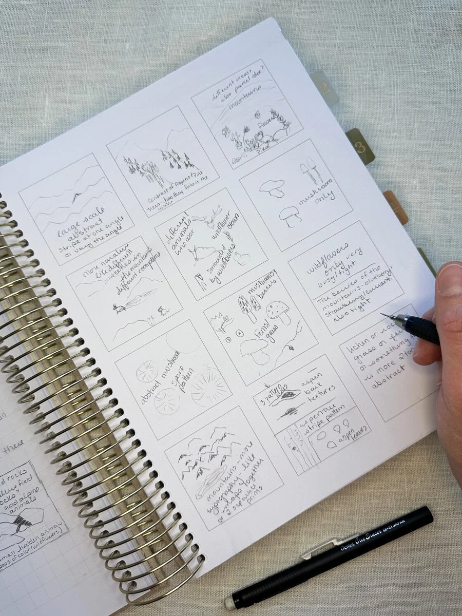
Some of these ideas may evolve quite a bit before they become final designs, but the point of this exercise is to have a place to return to when we become unsure of what to do next or when we are in the messy middle of designing and everything just seems terrible. This exercise also gave me a little bit of confidence. It helps you feel like your idea might actually have legs.
Building my Mood Board
The final step for the week was creating a mood board.
I’ll admit that this part of the process didn’t come naturally to me at first, both when I took the course in 2024 and this time around. My OCD tends to take over and I start to get too focused on the mood board being “good” rather than just another way of expressing my ideas. But I told myself when I signed up for Immersion this year that I would treat the course as if I was a beginner, which meant no skipping steps. To prepare I:
Chose my backing board. I decided to use an old exhibit panel from the museum.
I printed out my favorite images from my gathering inspiration exercises: my favorite photographs from my travels and some of the historic references I enjoyed the most.
I printed out color swatches that I felt resonated with the photographs I picked out.
With all of my supplies organized, I started arranging. It felt a bit awkward at first, but once everything was arranged on my board, it felt like maybe I did know what I was doing after all.

Full view of my mood board for this collection.
The layout of my board roughly mirrors the landscape of the mountains themselves. I didn’t initially set out to organize the images in this way; it’s just what happened. At the top are large landscape images and color swatches of cool blues and grays representing the sky and distant peaks. In the middle are animals and trees: pikas, mountain goats, elk, aspens, and pine forests, along with deeper greens, reds, and browns. At the bottom are ground-level details like wildflowers and mushrooms, with richer greens, purples, and earthy tones. Seeing all of these references in one place made the collection feel far more tangible than it had earlier in the week. I took multiple pictures of my mood board to reference as I moved into the artwork creation stage.
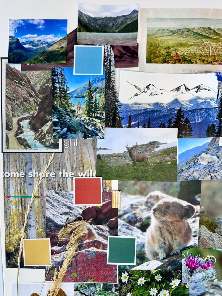
The top of the board features more dynamic landscape images.
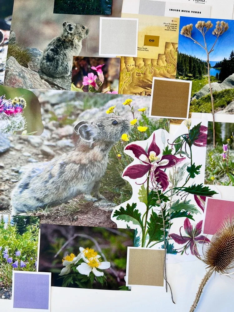
The bottom of the board features those details you might find at ground level.
Looking Ahead
Week one included 13 video lessons, workbook exercises, and a live call when the module opened. By the end of it, the overall direction of the collection feels much stronger than when I started. The next Module will focus on creating the artwork itself. I anticipate that I will be drawing, painting, and refining the motifs that will eventually make it into my patterns. This Module is reimagined from the previous course, so I’m looking forward to seeing what it entails.
I’m excited to begin that process, even though I know it will involve a lot of iteration. I told my husband that I’ll probably have to draw a pika fifty times before I end up with four or five versions I actually like. I’m reminding myself that’s just part of the process.
You Might Also Like
On the Blog: Why I’m Retaking Surface Pattern Design Immersion in 2026
Studio Notes Volume 4: Starting at Zero - Retaking Surface Design Immersion
Instagram: This reel showing a timelapse of putting together my mood board for this collection. Or this reel of Immersion Diaries Day 2 where I talk about finding focus.