
Making A Lot of Artwork: Immersion Module 2
At the start of Module 2, I had a few pages of artwork, my thumbnail sketches, and a clear list of motifs and themes I wanted to explore. By the start of Week 3—the implementation week—I still felt like I had about 50% of my artwork left to create. (If you missed my first post, Gathering Inspiration, you can check it out here.)
This phase of Immersion is simple: make the artwork. Over the course of these two weeks, I spent just under 27 hours focused on this part of the process: watching the videos of Module 2 and lots of artwork creation. The goal wasn’t to make finished pieces but to create a large volume of work, explore ideas, and build a library of motifs I could use later once I brought everything into Adobe Illustrator.
Primary Goal: Create a Lot of Artwork
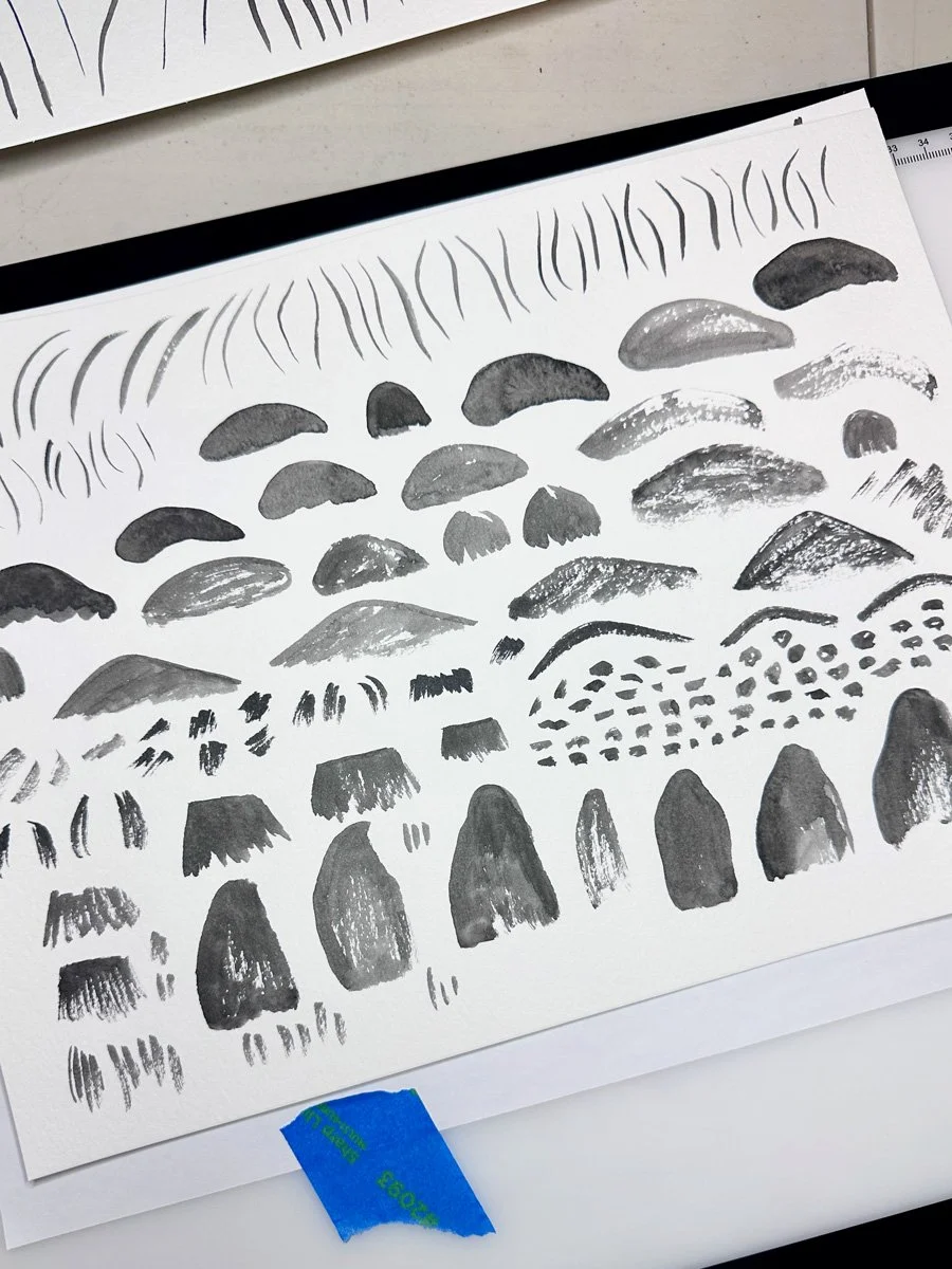
The first time I took Immersion, I probably had around 50 motifs to work with when I got to the pattern making stage. This time, I wanted significantly more. My goal was to create at least 200 usable elements that could be combined in different ways. Instead of aiming for perfectly polished images, I focused on filling pages with marks. If I was drawing pine trees, I filled an entire page with different variations. If I was painting mushrooms, the whole page became mushrooms: different shapes, angles, textures, and levels of detail. Some pages have only single sketches, some have 25 elements, others closer to 100 depending on scale. By working this way, I think I have over 500 individual marks and drawings that I will have to narrow down.
Why My Goal Was Volume
I knew when I started creating artwork that I wanted to have more options once I got into the designing stage. Filling a page of marks along a particular theme seemed to be the easiest way to reach that goal. What I didn’t realize was how much the repetition and quantity led to better results and more ideas. I found that it takes me about half a page to loosen up and stop thinking about whether my marks will be “good” or “useful.” By the time I was halfway through a page of mark making, I was much more relaxed and I found it easier to explore my ideas through new shapes, new textures, and better variations. The focus on quantity meant that my work improved as a result.
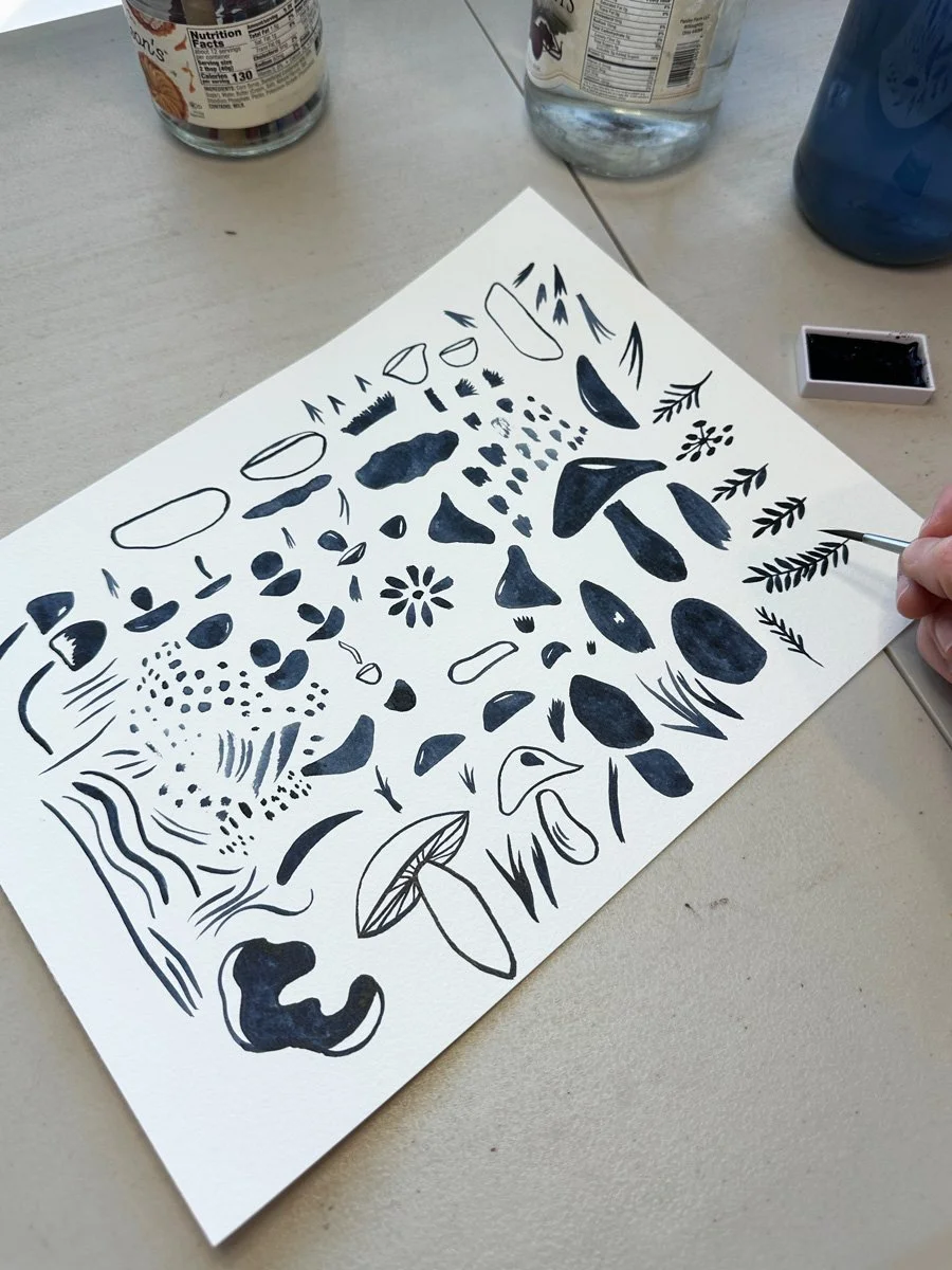
A page of mushroom marks.
Mushroom textures.
Making Art for Patterns is Different Than Creating a Painting
Creating artwork for patterns is a much different process is from painting. When I’m painting, I’m thinking about composition, color, and the image as a whole, When I’m creating artwork for patterns, I’m thinking about the component parts of my idea, things like:
outline
interior shapes
texture
how elements can be separated and recombined
Instead of creating a finished image, I break down an idea or object into smaller pieces. For example, with mushrooms, I didn’t just paint whole mushrooms. I painted caps, stems, and textures separately so they can be recombined later in Illustrator. The same applies to flowers, trees, and other motifs.
Join my newsletter list so that you don't miss the next post in this series! This is the second post in my series documenting IRL my experience taking Surface Pattern Design Immersion. Check out the first post Gathering Inspiration.
Exploring Different Art Techniques
As I created artwork over these two weeks, it was fun to notice that I have more of a style than I thought. My primary ways of creating art are through sketching with pencil and pen and painting using watercolor. Increasingly, I notice that I like my patterns best when I am combining all of these techniques in one pattern.
During this round of Immersion, I also wanted to take advantage of the course’s emphasis on analog methods of creating and I wanted to embrace any new ideas from the course. Course exercises had me experimenting with:
pencil and tracing paper for more complex subjects (like animals)
breaking drawings into layers (outline, texture, color)
experimenting with how different materials translate digitally
Since my ultimate goal was to create a volume of work, I tried not to worry about whether something would necessarily “work” once I got into Illustrator. I just wanted options.
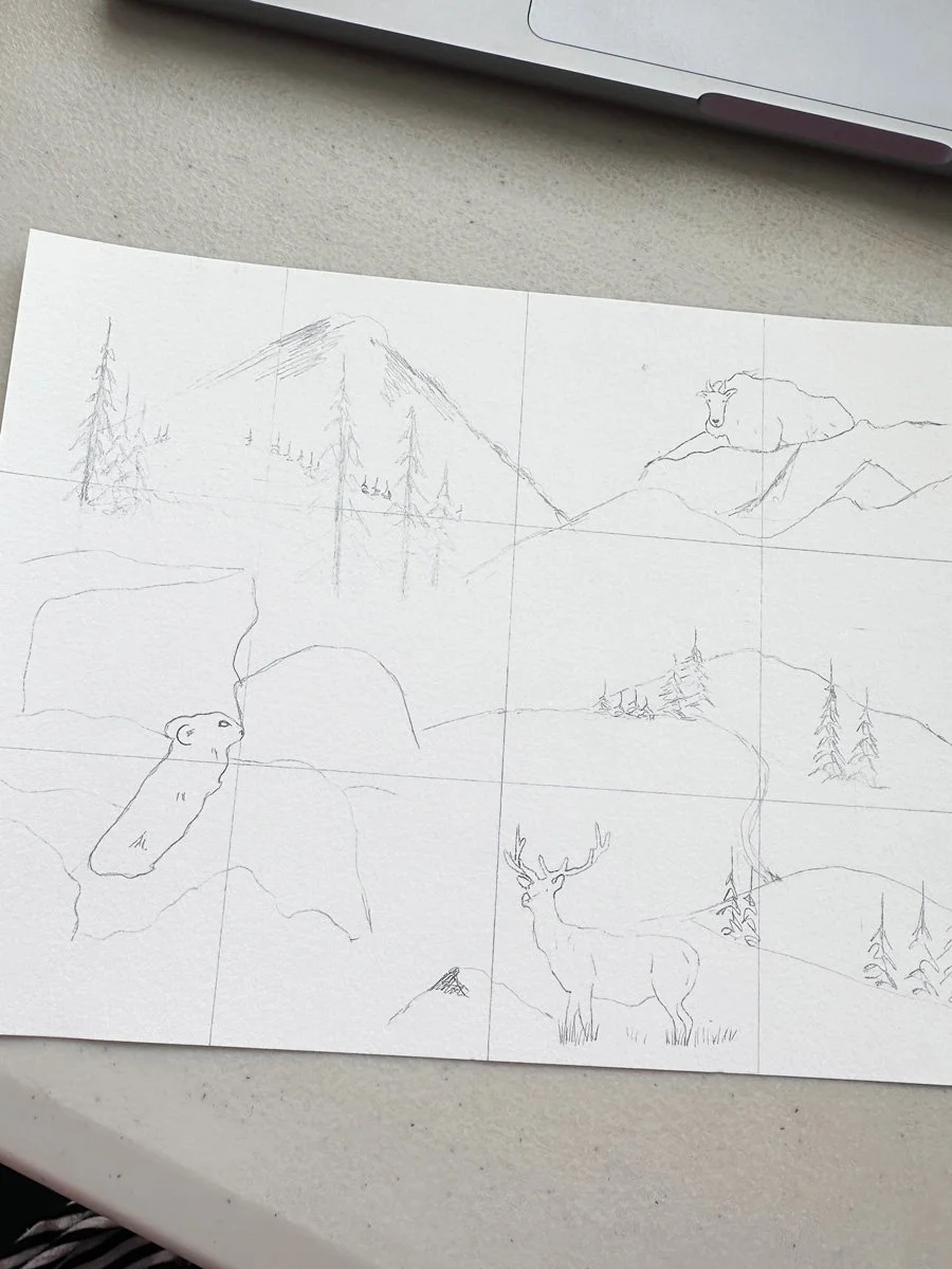
Focusing on Motifs: The Pika and Beyond
As I leaned into the artwork creation phase, I had thumbnail sketches and my list of motifs to guide me. Most of my motifs fall into a few core categories: alpine animals, mushrooms, trees, wildflowers, and mountain terrain. One of the main focal points is the pika, a small alpine animal that fits the core idea of the collection: small, resilient life in a harsh environment. To explore this animal, I gathered a variety of reference photos of this animals from our many hikes in Colorado. I wanted to experiment with not only different versions of the pika, I also wanted to explore this motif using different techniques. I often translated the same photograph in multiple ways.
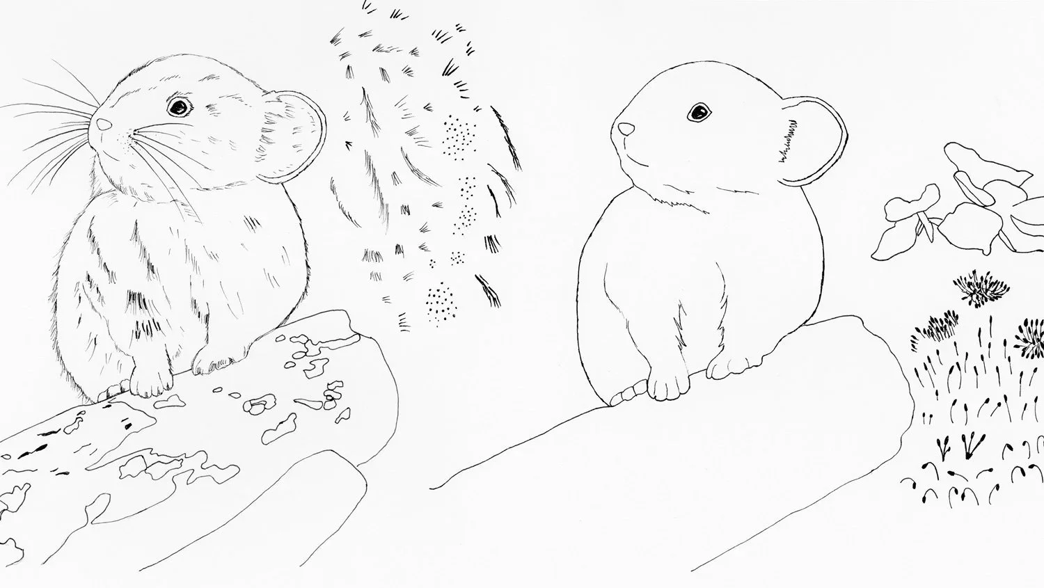
Two versions of the same pika.
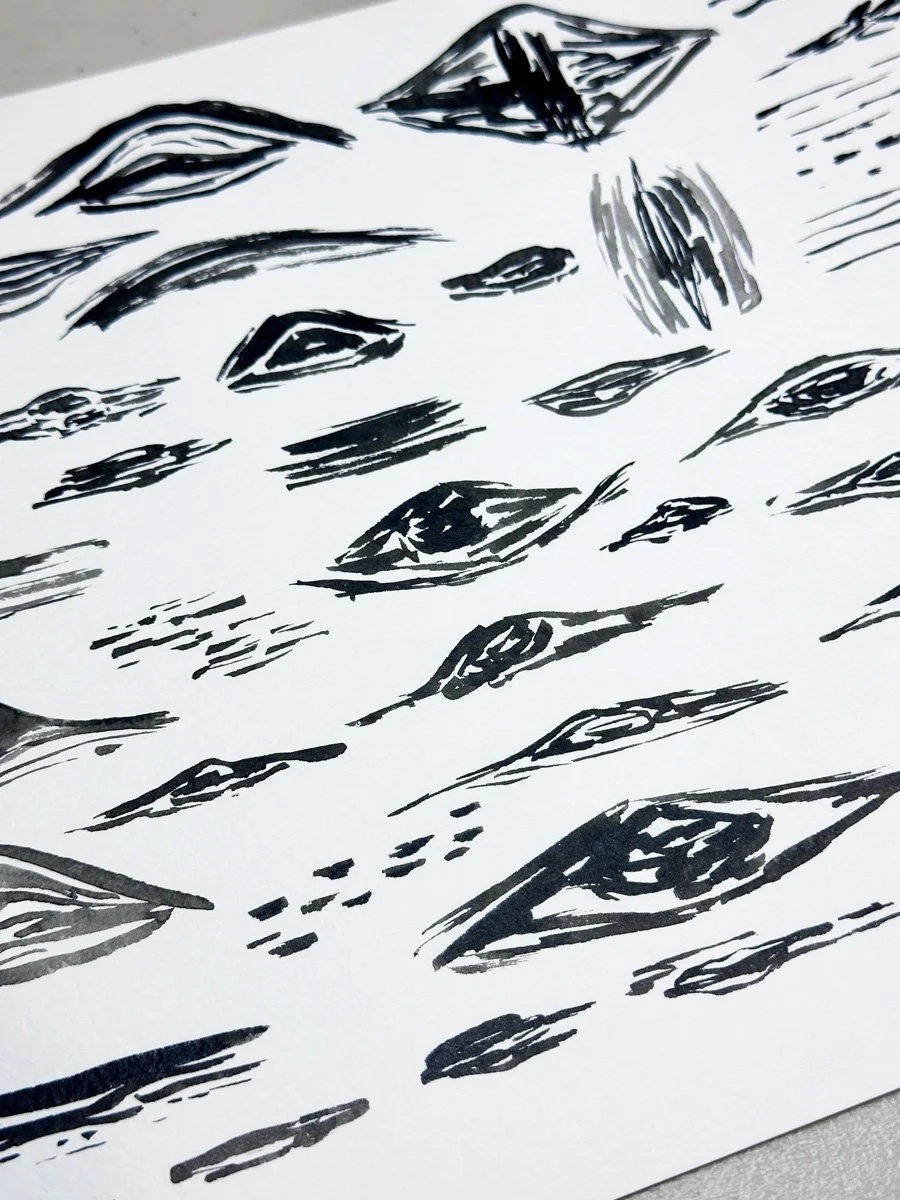
This same approach carried across other motifs, especially trees. For example, I filled entire pages with pine trees in both pen and watercolor, experimenting with shape, mark-making, and texture.
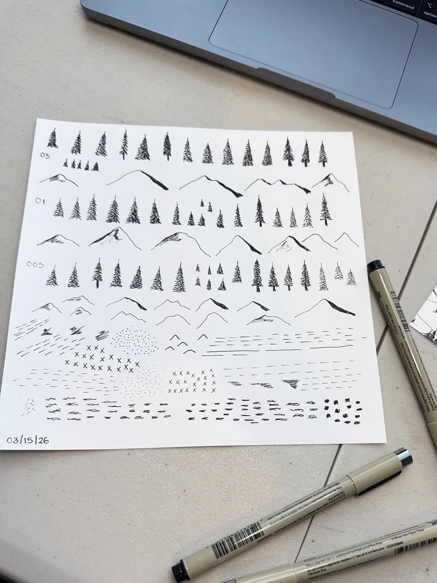
Trees in pen.
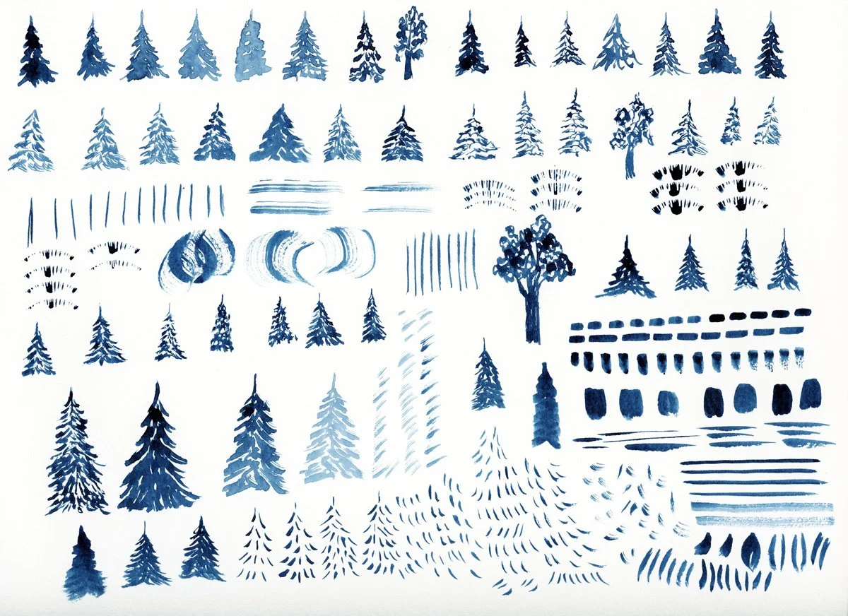
Trees in Watercolor
Making Room for New Ideas
Even though I started with a clear list of motifs, I was surprised by how many new ideas I got while I was working. One example was aspen trees. Pine trees are going to be a central theme in a few of my patterns. As I started to draw pine trees, I started to think about how I could also include aspen trees, another iconic element of the Colorado mountains. This led me to think about the distinctive markings and scars on aspen tree trunks. After filling a page with tree inspired textures, I also decided to try to paint full tree trunks, which I think could make an interesting stripe pattern. That idea didn’t exist at the start. It only emerged through repetition and exploration. This happened repeatedly: one idea leading directly to the next.
Aspen tree textures.
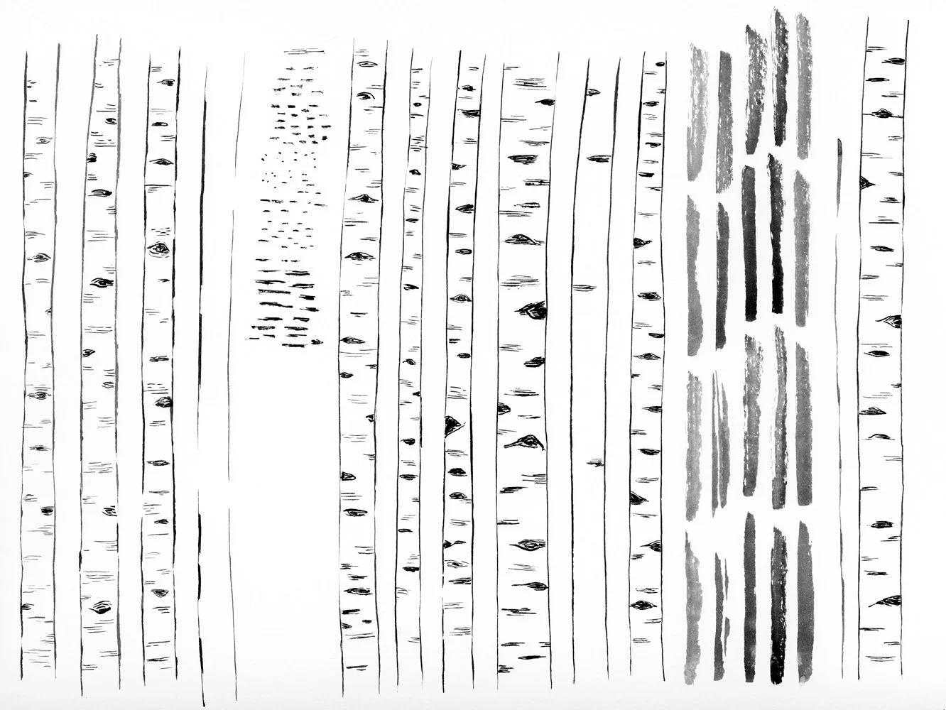
Full Aspen tree trunks.
🎨 Want a daily peak what I’m creating for Immersion as I create it? Follow me on Instagram for a first look at new work, outdoor adventures, and more. I’d love to meet you.
Experiment: Analog Repeat Pattern
One of the more unexpected exercises from Module 2 was to create a repeating pattern by hand. This was accomplished by drawing a design within a rectangle or square, cutting it apart, and rearranging it to form a physical analog repeat. My first attempt didn’t work. The idea was too complicated and just was not lining up the way I wanted it to. My second attempt was much simpler: pine trees, mountains, and landscape lines. Even though I feel like I have a pretty good understanding of repeats in Illustrator, this exercise clarified how a more complex, landscape-style pattern might be constructed digitally. It’s something I’ve struggled with before, and this analog exercise made me think of how I might be able to add a landscape pattern to this collection.
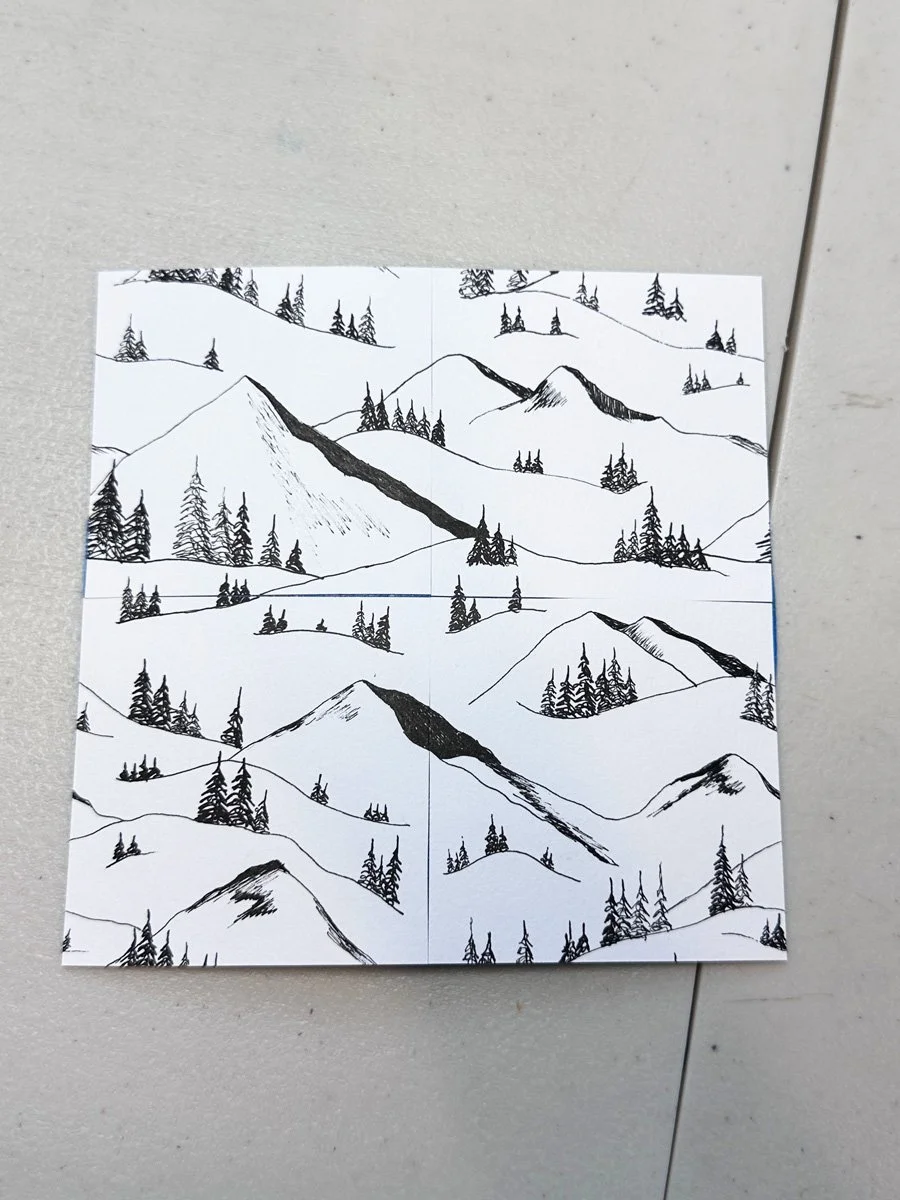
The analog pattern that worked.
The analog pattern that didn’t work, but it gave me ideas for new drawings.
Scanning and Organizing
The final step was scanning everything and prepping the files to use in Illustrator during Module 3. This process took me about 3 to 4 hours and did not feel like a very creative part of the process. But it is an important step. Poor scans and images of your work will make it harder to create final motifs in Illustrator. I again wanted to make sure that I had a variety of options to work with once I got into Illustrator. I often scanned my pages of artwork more than once, experimenting with things like resolution, contrast, and file type. While this essentially doubled my files, it will give me more flexibility when I start working in Illustrator and I’ll be able to learn which settings work best for my style of artwork. At this point, my scans are as good as they can be, and I will have to see how everything will translate when I turn them into vectors. I know not everything is going to be usable, but that’s part of the process too.
Final Thoughts
By the end of this phase, I have 28 sheets of artwork and over 500 individual marks and motifs. The challenge for Module 3 will be to narrow it down. I want enough variety to build a strong collection, but not so much that it feels unfocused. A common issue for newer designers is either too little variation or too much without a clear point of view.
At this point, I’m excited to move into Illustrator. I want this collection to be more technically sophisticated than my previous collections. Last time I took Immersion, I knew hardly anything about Illustrator. Now I’ll get to see how far I’ve come in the last two years. This is where I’ll find out:
what translates well from analog to digital
what needs to be reworked or discarded
which technical skills I have—and which ones I still need to develop
I have more than enough to work with. The question now is what makes the cut and whether I can shape all of this into a clear, cohesive collection.
You Might Also Like:
On the Blog: Gathering Inspiration: Week 1 of Immersion 2026
On the Blog: Why I’m Retaking Surface Pattern Design Immersion in 2026
Podcast Recommendation: The Analog Renaissance, Episode 1: The Wake Up Call
On Instagram: This reel where I show you all of the artwork I created for this pattern collection so far. This reel where I walk you through my scanning process.