
Digitizing the Work: Immersion Module 3
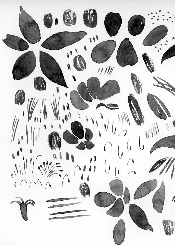
At the end of Module 2, I had 28 sheets of artwork scanned and over 500 individual marks and motifs. The next step was bringing all of it into Adobe Illustrator and figuring out what actually worked. This was the entire focus of Module 3. (If you missed my first post, Gathering Inspiration, you can check it out here.)
From Scans to Vectors
The Immersion course is almost entirely focused on using Adobe Illustrator. It is really the industry standard when it comes to surface pattern design. One of the benefits of working in Illustrator is that it is a vector based program rather than a raster based one. A raster-based program like Adobe Photoshop is the standard for photography and most fine artwork. But the size of your artwork is restricted based on the resolution of your image. Vectors on the other hand are infinitely scalable. This means that I can take a scan of one of my mushroom paintings, even at only 300 dpi, turn it into a vector, and then that 3 inch mushroom can infinitely scale. I could put it on a billboard if I wanted to.
The quality of your vector though still depends on the quality of your artwork and the quality of your scans. One of the reasons I created so much artwork in so many different mediums (watercolor, pencil, pen) was that I wanted to create a lot of variations of the same idea. I wanted to see which marks turned into the kind of vectors I wanted for my collection. Even though my style is constantly evolving, every day I figure out more about what I like and what I don’t like. I’ve discovered that I like to build motifs with lots of layers. So I did not just draw one mushroom shape. I drew lots of mushroom caps, lots of stems, lots of textures, lots of smaller shapes so that once I got into Illustrator, I would be able to layer all of those elements together to create more sophisticated motifs for my patterns.
As I was vectorizing all of my scans, I learned that a higher resolution worked better for line drawings and pencil sketches. I also learned that if a drawing was very detailed, that a TIF file often provided more digital information than a JPEG. Sometimes things just didn’t vectorize as well as I wanted them to. The contrast wasn’t high enough or the marks were too sketchy. Some things vectorized pretty well, but I wonder if I will be able to use them as I intended. Pencil was usually the hardest medium to translate. The marks are lighter, the edges softer, and they don't always hold their form once vectorized. I kept some pencil work, but there are a few sketches I may go back and redo in pen or watercolor if I find I need them later. For example, I did a pretty detailed pencil drawing of a pika smelling flowers. I actually really like how the sketch vectorized, but I wonder if I will be able to color it in a way that will look the way I want it to.
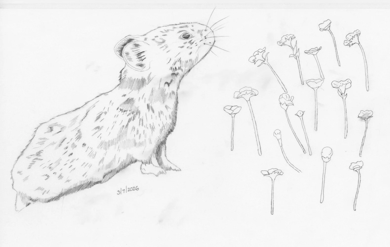
Pika pencil sketch.
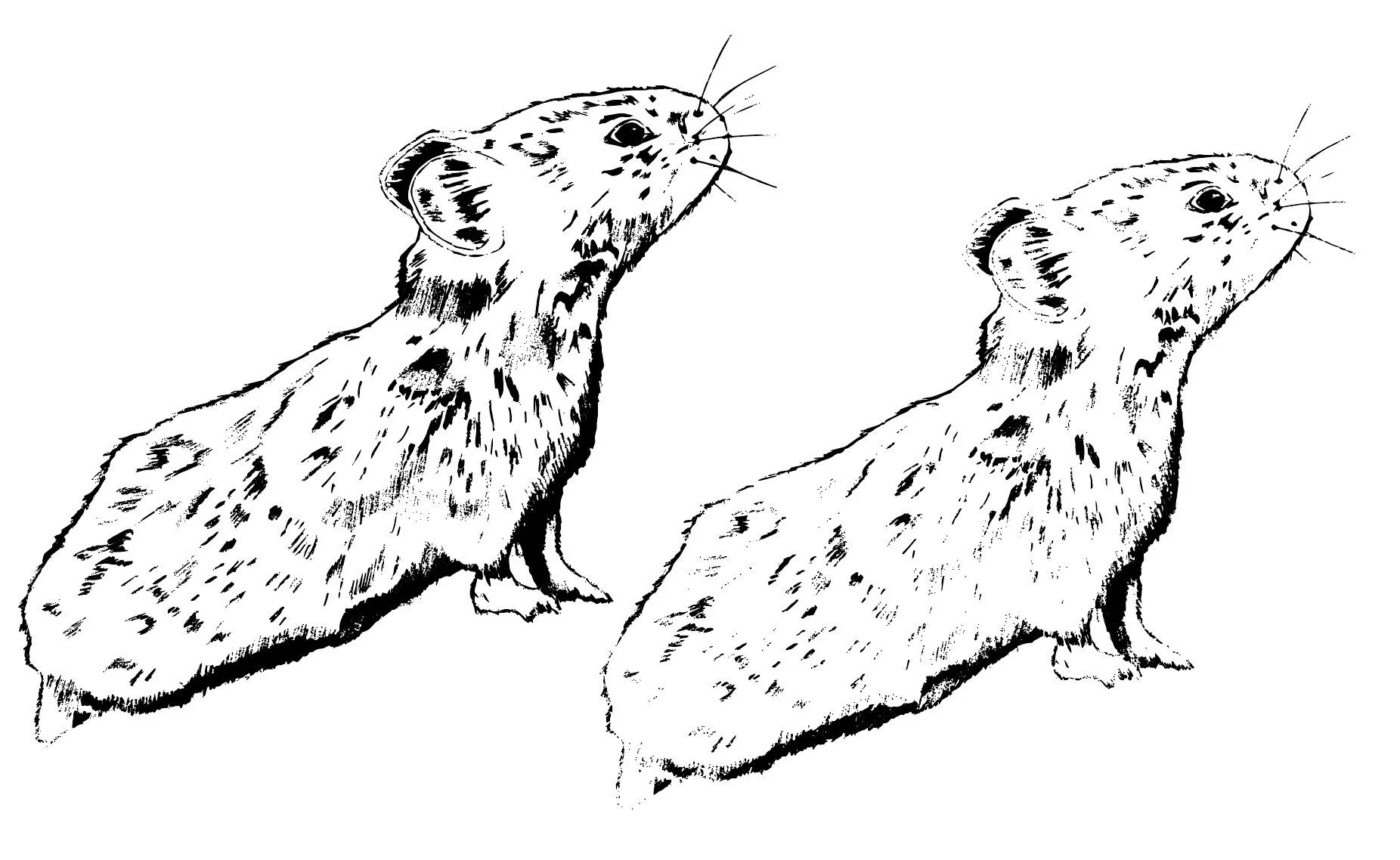
Pika after vectorizing.
One thing I didn't anticipate was using photographs as source material. One lesson in Module 3 was all about texture and while I do use a lot of texture in my work, I often build them from scratch. I might take rough watercolor lines and turn them into a stripe background texture or take watercolor blobs and create a large polkadot, but I didn’t have any large textures as part of my motif library. I decided to experiment with some photographs. For one, I took a closeup photograph of wildflowers and removed the background so that I only had the flowers. I then vectorized just the flowers. I also took a photograph of my mountain goat sitting on a rock and vectorized the entire photo. I think I might be able to use the actual rock texture as a background texture in a pattern or a texture on top of an individual motif. I’m excited to see how I can use this set of organic, real-life textures in my pattern work.
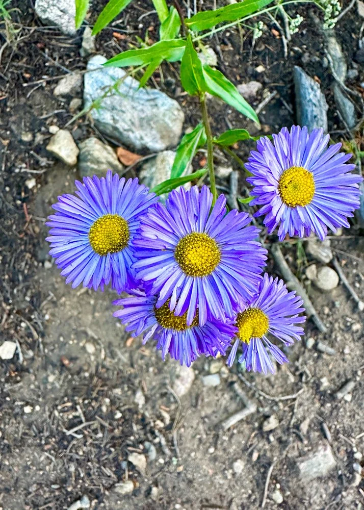
Original photograph.
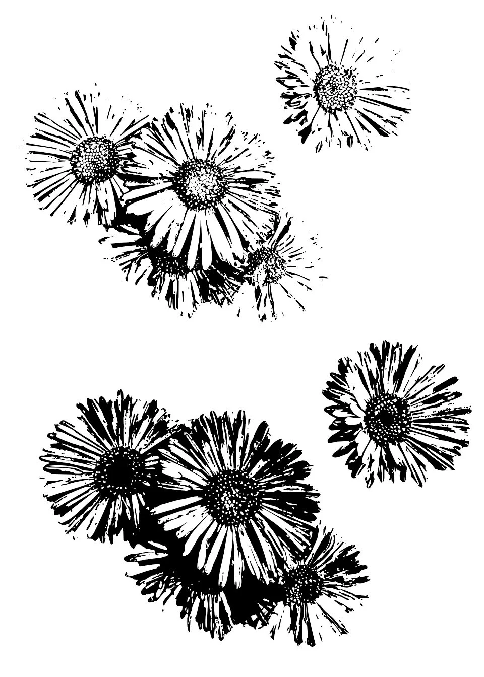
Flowers as vectors.
Building the Motif Library
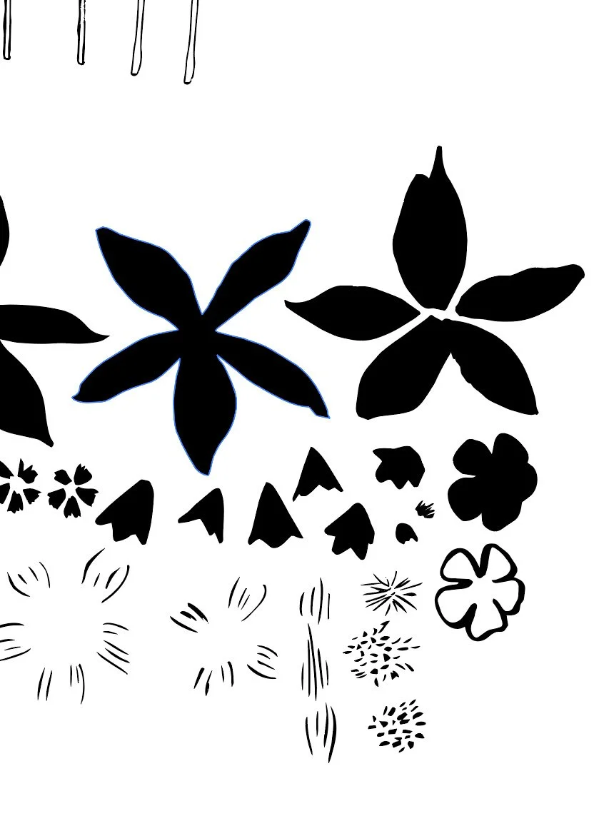
Once everything was vectorized, I kept roughly 40% of what I had created. The decision wasn't complicated. Either the vectorization worked or it didn't. Either the mark had the shape, the form, or the texture I was looking for, or something better existed on the same page. I created so much artwork specifically so that I would have options and could choose the best pine tree from a page of pine trees rather than having to make do with only one. I vectorized one page of artwork at a time, creating groupings of motifs that I then pulled into a new Illustrator document to create a motif library that I will use to build out my patterns.
Original watercolor marks for my Columbine flowers.
Vectorized motifs.
Join my newsletter list so that you don't miss the next post in this series! This is the second post in my series documenting IRL my experience taking Surface Pattern Design Immersion. Check out the first post Gathering Inspiration.
Some of these motifs are pretty much ready to go: I have trees, grasses, and mountain shapes that vectorized cleanly and may only need some smoothing, color, and offset paths ( subtle outline) before they're ready to use. Others require more intense building. Some motifs aren't a single drawing, they're a collection of smaller components that have to be reconstructed in Illustrator. My Colorado columbine flowers are a good example. I didn't paint one complete flower. I painted the background petals, the foreground petals, the stamens, the petal textures, and the leaves as separate elements that now need to be combined into the actual complete flower. The reason I work this way is that it gives me much more control over the final motif. A basic Columbine silhouette would work in a pattern and the first time I took Immersion, this would most likely be my process. But I have a better idea of what I want to create and I have more of the technical skills to execute my ideas. Working this way definitely takes longer, but I think the end result will be more sophisticated. Even though I am excited and ready to dive into making patterns, I know that slowing down and taking the time to really build out my more complicated motifs will help me make better patterns later. I will follow this same process to build out my mushrooms and animals.
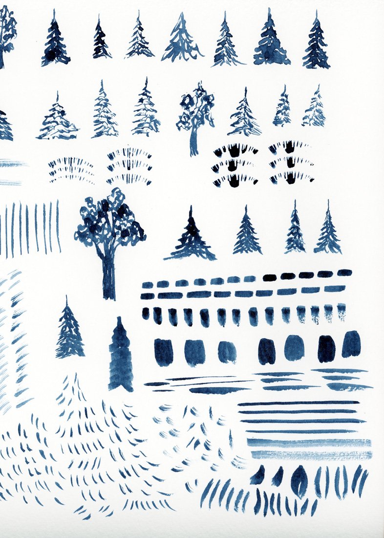
Original watercolor trees.
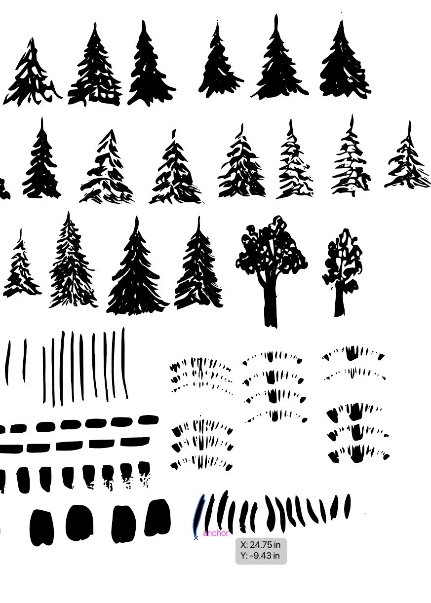
Vectorized trees.
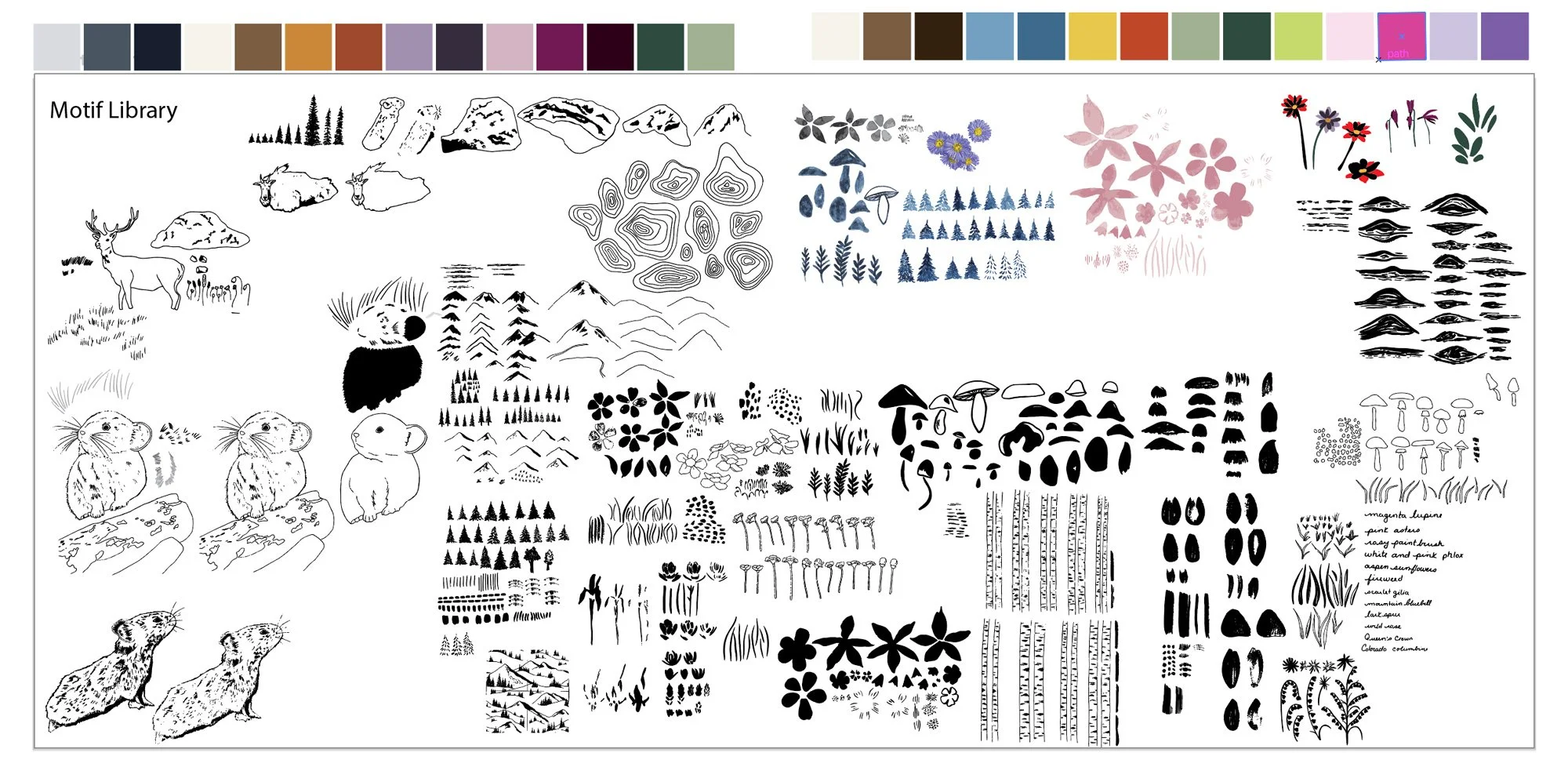
My complete motif library.
🎨 Want a daily peak what I’m creating for Immersion as I create it? Follow me on Instagram for a look at new work, outdoor adventures, and more. I’d love to meet you.
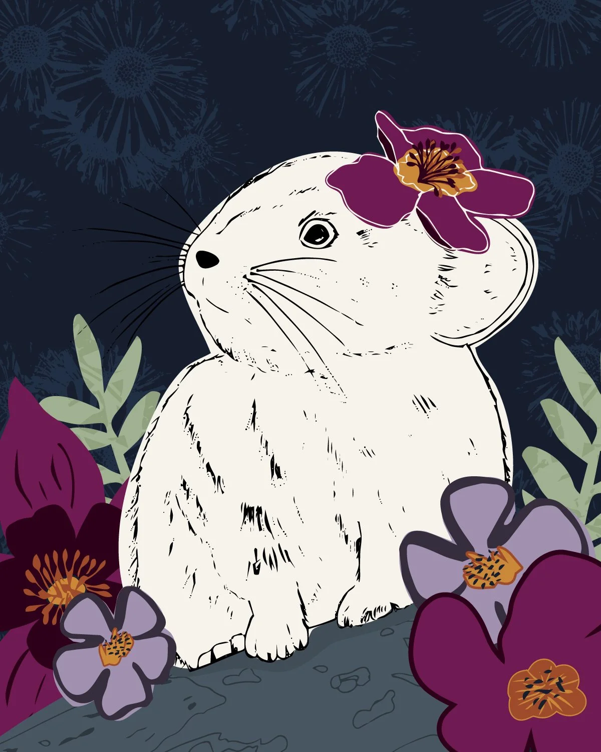
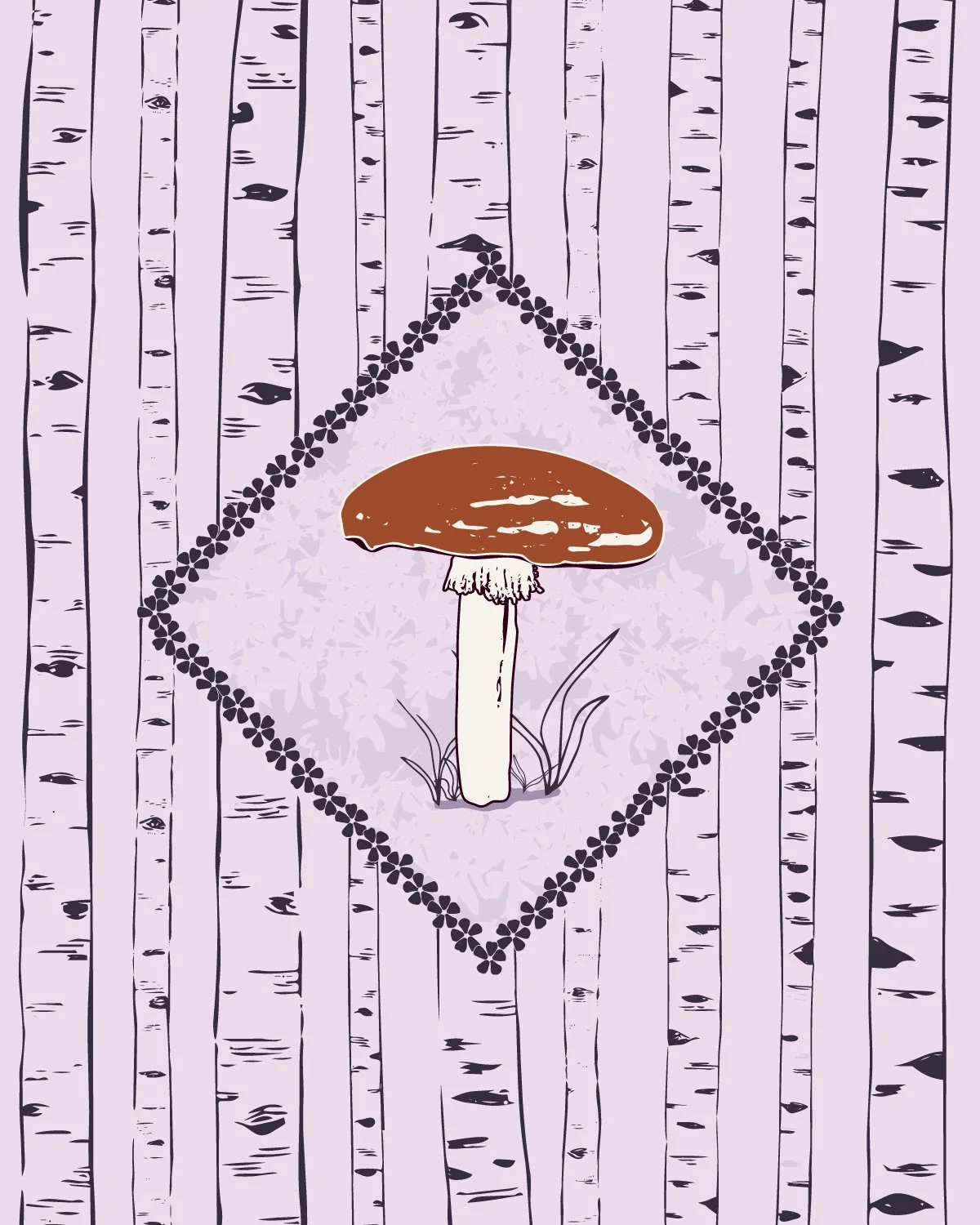
Module 3 Final Project: Three Placement Prints
The Module 3 final project was to create a placement print. I was hesitant to spend too much time on this assignment because I was feeling ready to dive into pattern making, but once I started, I ended up making three different placement prints.
A placement print is a standalone design rather than a repeating pattern. You often find placement prints on products like greeting cards, tea towels, gift bags, clothing items or home decor. They are not always required when designing something like a fabric collection, but they are a related skill that requires you to understand composition in a different way from designing patterns. This exercise is also a way for you to start thinking about how to use your motifs.
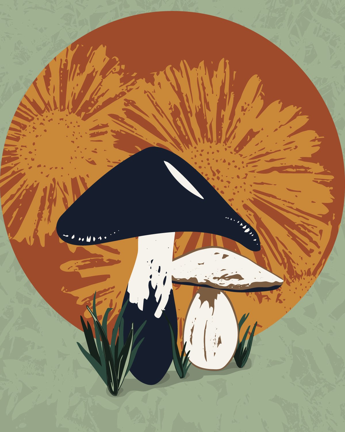
Of the three placement prints I designed, my mushroom sun print (left) feels the most finished. I like the overall composition, I’m happy with how I built out the motifs, I love the use of texture on the sun and the background. It’s good enough that I would probably be happy today hanging on my wall as an art print.
My pika print (middle) is a close second and it also came together well. Again, I really like how I built out the flower motifs and the background texture. I really love the pika, but it feels a bit one dimensional. Some members of the community thought that it was a mouse, which is honestly an easy conclusion to draw if you are not familiar with pikas, but I think the real issue is that a pika is made up of so many more colors: browns, greys, blacks, and whites. I feel like this one needs a bit more work.
My mushroom and trees print (right) feels just ok. I’m happy with the mushroom and the overall composition, but it seems a bit simple. It’s not bad, but I’m not sure it is fully finished either. I'm not sure yet how I'll solve the weaknesses of the second two, but I know that I do not have to have it solved today. This exercise had me starting to build out my more complex motifs and thinking about how I could build out patterns. It was a great warmup exercise.
What's Next
Each module feels a little different. Module 2 was loose and experimental: fill the page, make the marks, and try not to overthink it. Module 3 is about refining the vectors and creating more precise motifs to take into the pattern making stage. I’m starting to add color and build out fully formed ideas. I get to start to see the possibilities.
This module was also a different kind of overwhelming. I have a more sophisticated vision of what I want to create than I did two years ago, and I have more of the technical skills to execute it. I know that this means that I have to be more patient than I might like and that I need to spend dedicated time getting my motifs to where I want them before starting to build out patterns. I also anticipate I’m going to spend time on some ideas that might not work out, where I still do not have the technical skills to accomplish what I want. The messy middle of the collection, when everything isn’t working and the entire collection feels like it was a bad idea, hasn’t happened yet, but it is just around the corner.
Module 4 is next, which is all about pattern making. The workflow from here is straightforward: build out motifs, make a pattern, repeat. The motif library will keep growing as I design and I cannot wait to show you what I create next.
You Might Also Like
On the Blog: Post one of this series Gathering Inspiration: Week 1 of Immersion 2026.
On the Blog: Making A Lot of Artwork: Immersion Module 2
This reel on Instagram: My Immersion Diaries Day 8 From Artwork to Vectors