
The Final(ish) Fabric Collection - Immersion Module 5
The Final Goals
Module Five of Immersion is all about refinement. It’s a time to:
Revisit the story I’m trying to tell with my collection.
Refine individual patterns to make sure they are the best they can be.
Evaluate all of my favorite patterns with a critical eye and determine which will make it into the final collection.
Consolidate and finalize my first colorway and then develop a second colorway.
Finalize the scale of the patterns to fit the intended product (fabric) and the feel of the collection.
Refining the Collection: Kill Your Darlings
When I write it all down like that it feels like a lot. This module: Designing in Collections felt like where all the big decisions needed to be made, the hardest of which was trying to decide which darlings (i.e. patterns) I was going to kill off in service of creating a stronger collection. From the beginning of Immersion, I made the decision that I was going to follow all of Bonnie’s steps, which meant creating a cohesive collection of only 8-12 patterns, which meant narrowing down my list of 30 “pretty good” patterns into the 10ish that were the best.
This meant eliminating a lot of patterns that I really liked, but ones that did not seem to fit nicely with the patterns I knew I wanted to keep. While these patterns will not make it into this final collection that I will add to my portfolio, I will most likely still finalize them for Spoonflower.

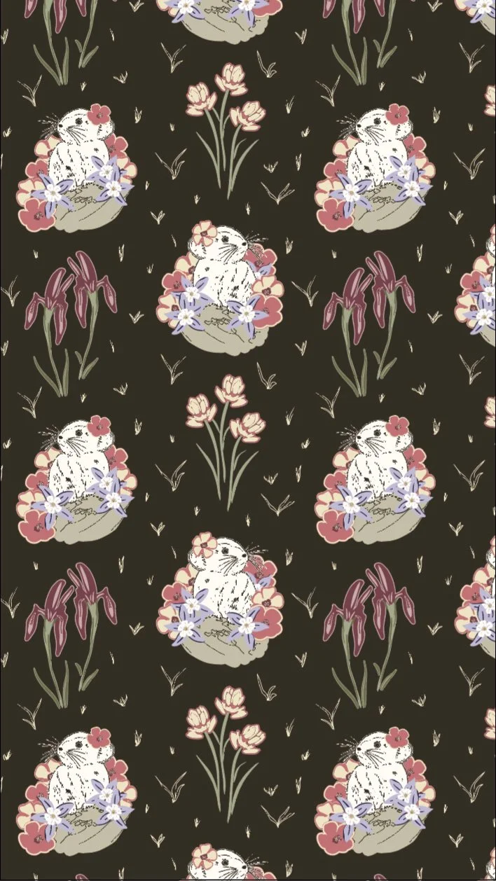
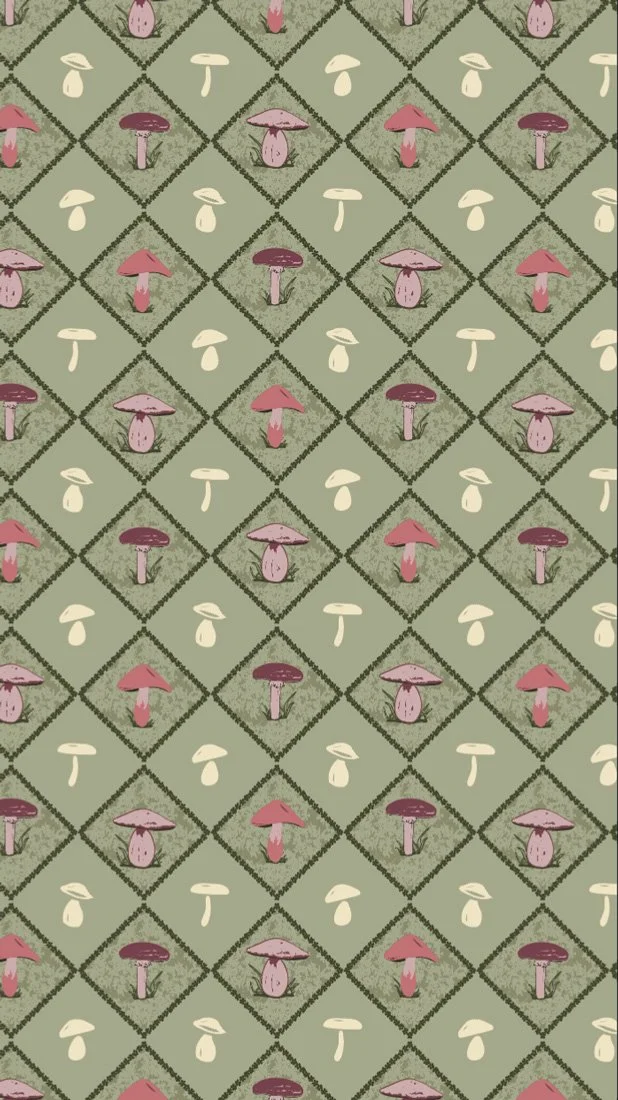
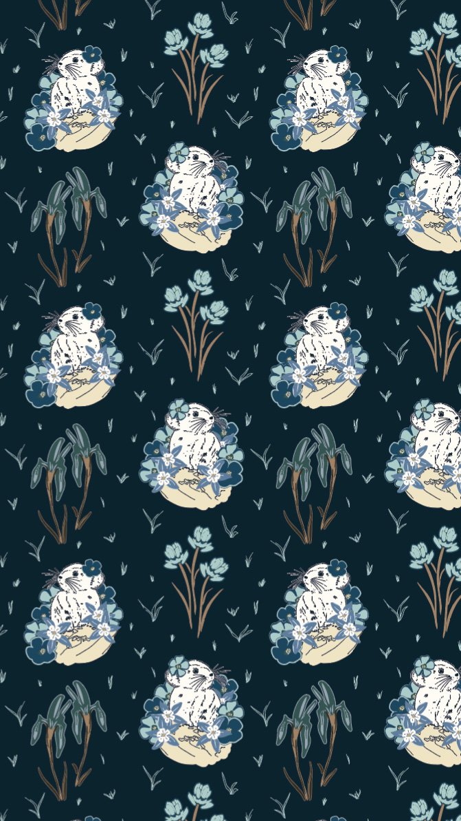
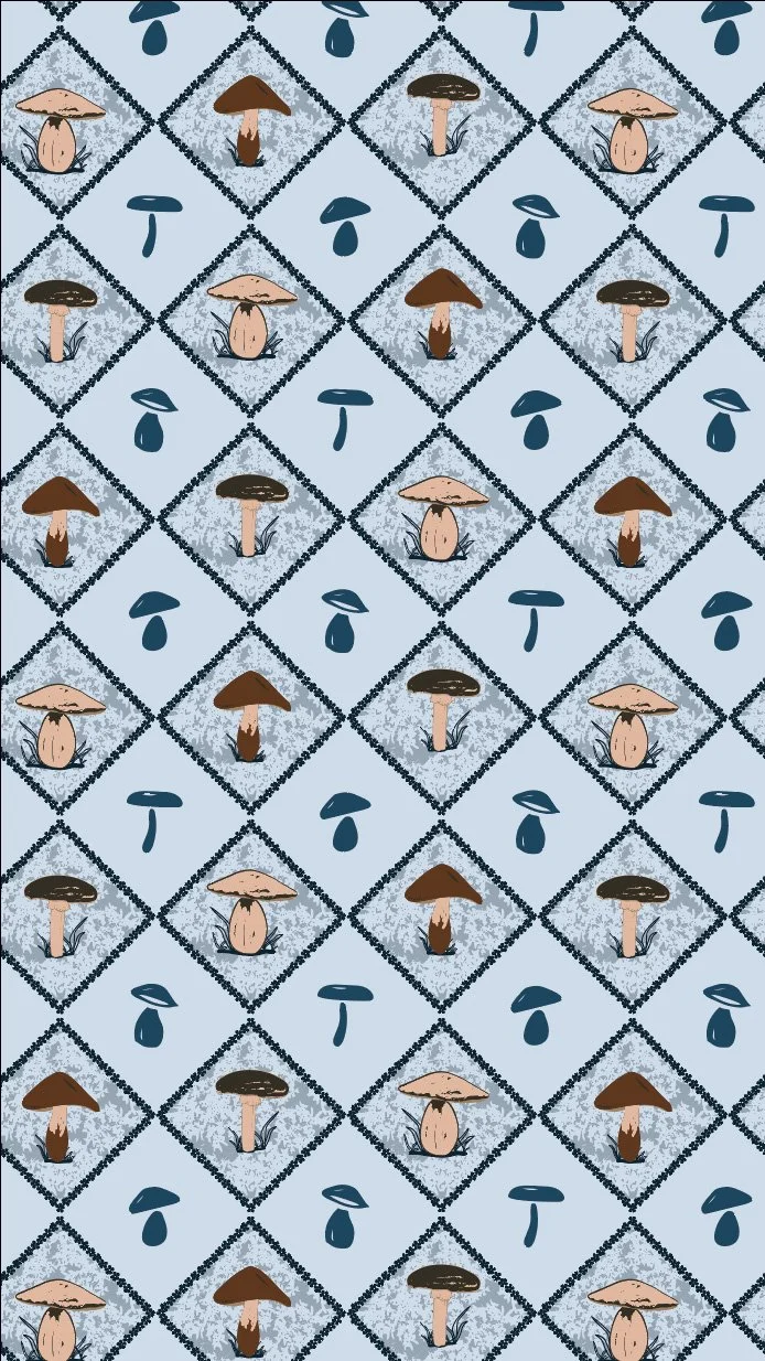
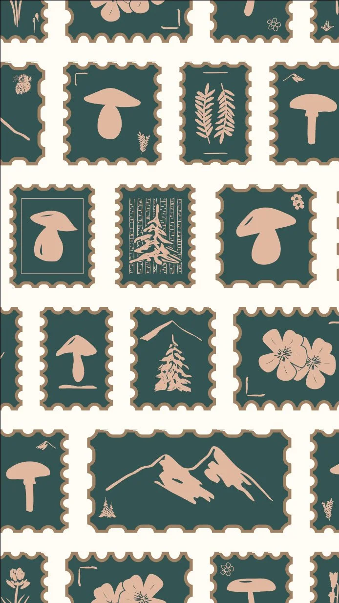
After identifying those patterns that felt like the best from the group, I also had to evaluate them individually to make sure that they were exactly what I wanted them to be. Some, I felt very good about, like my pika print, my mushroom half drop, and my postage stamps.
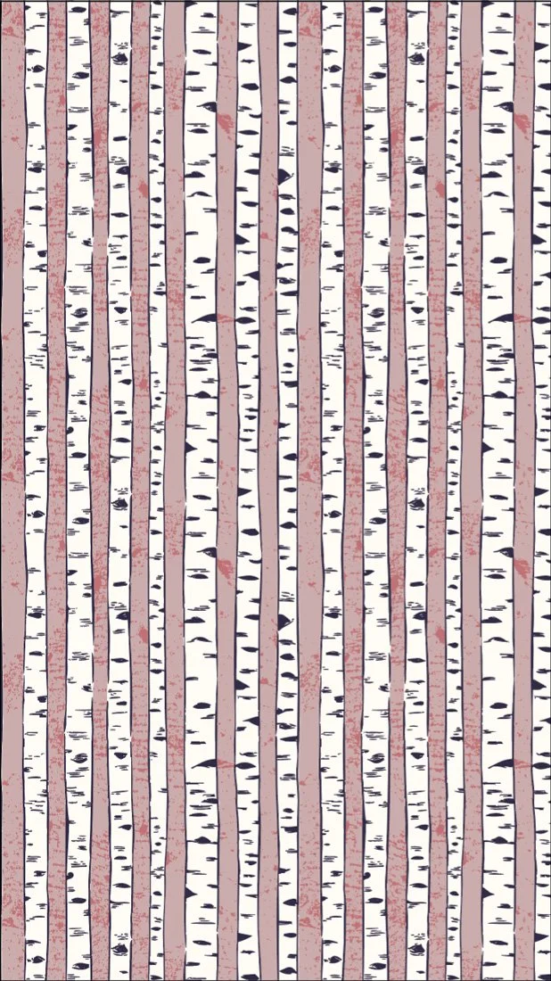
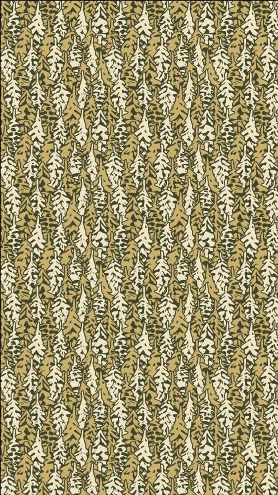
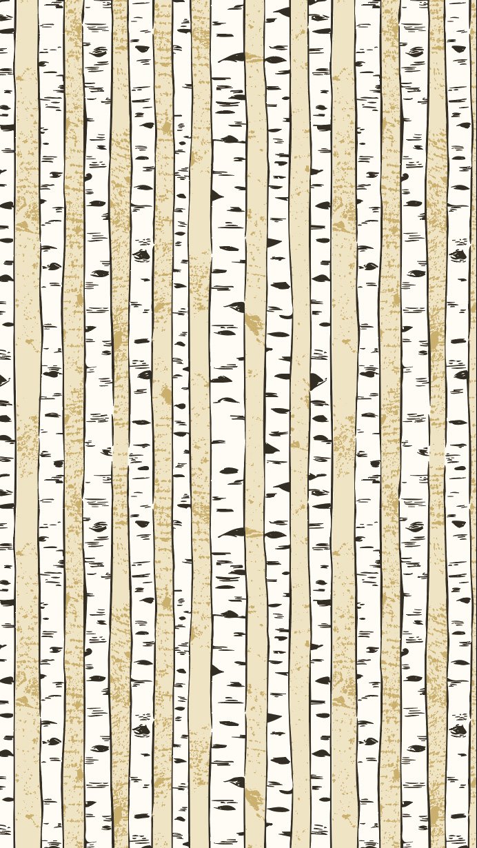
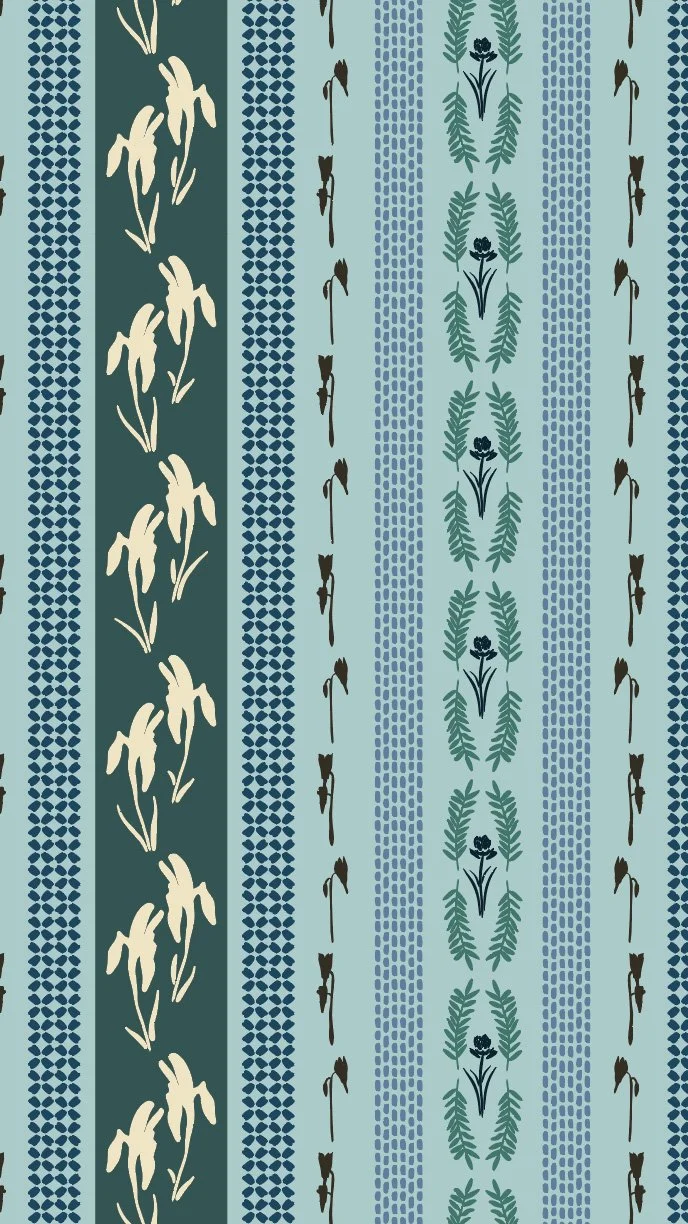
Others felt like they still needed a bit of work. I ended up reworking my aspen tree stripe so that the trees themselves were a solid color, which allowed them to really pop off the background color. It also made the background texture of the pattern, which is a photograph of actual aspen tree bark (!), really pop.
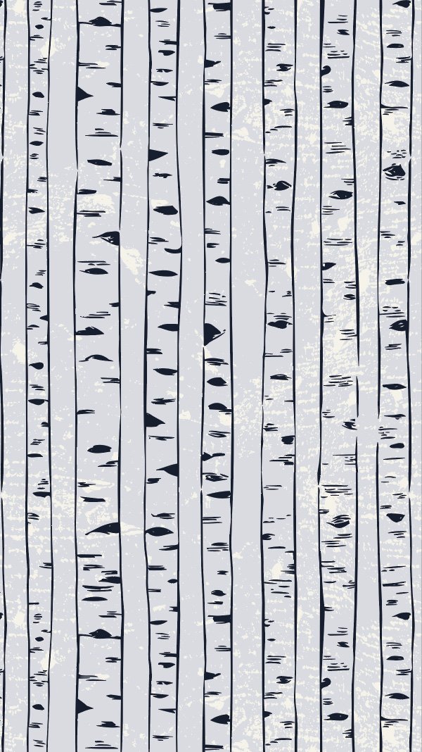
Pattern with transparent tree trunks.

Pattern where tree trunks have a solid background.
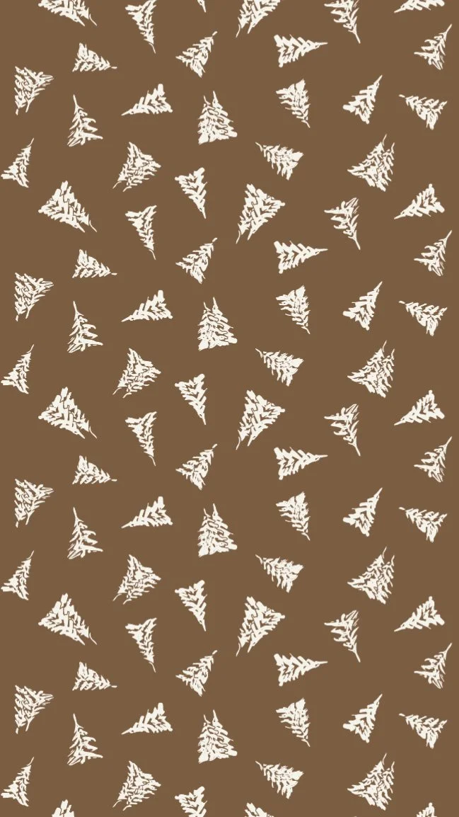
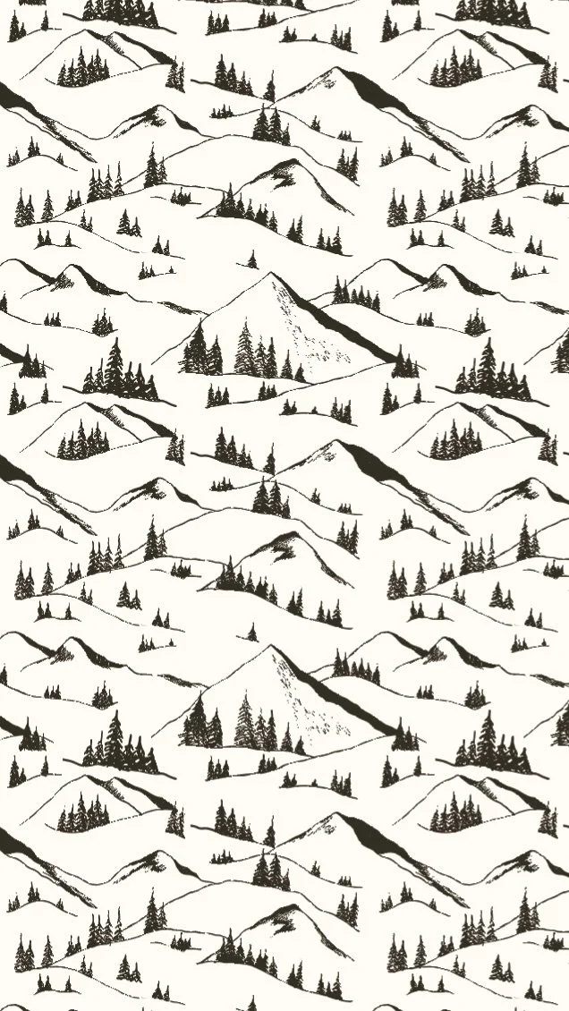
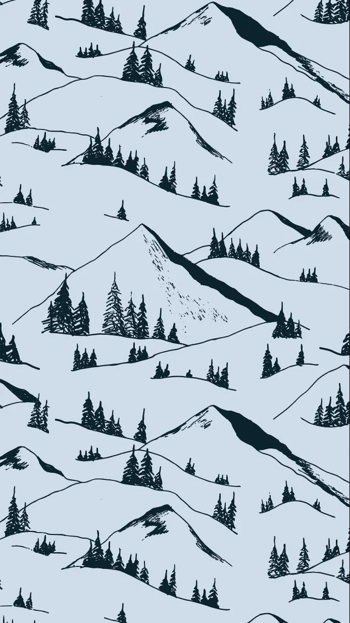
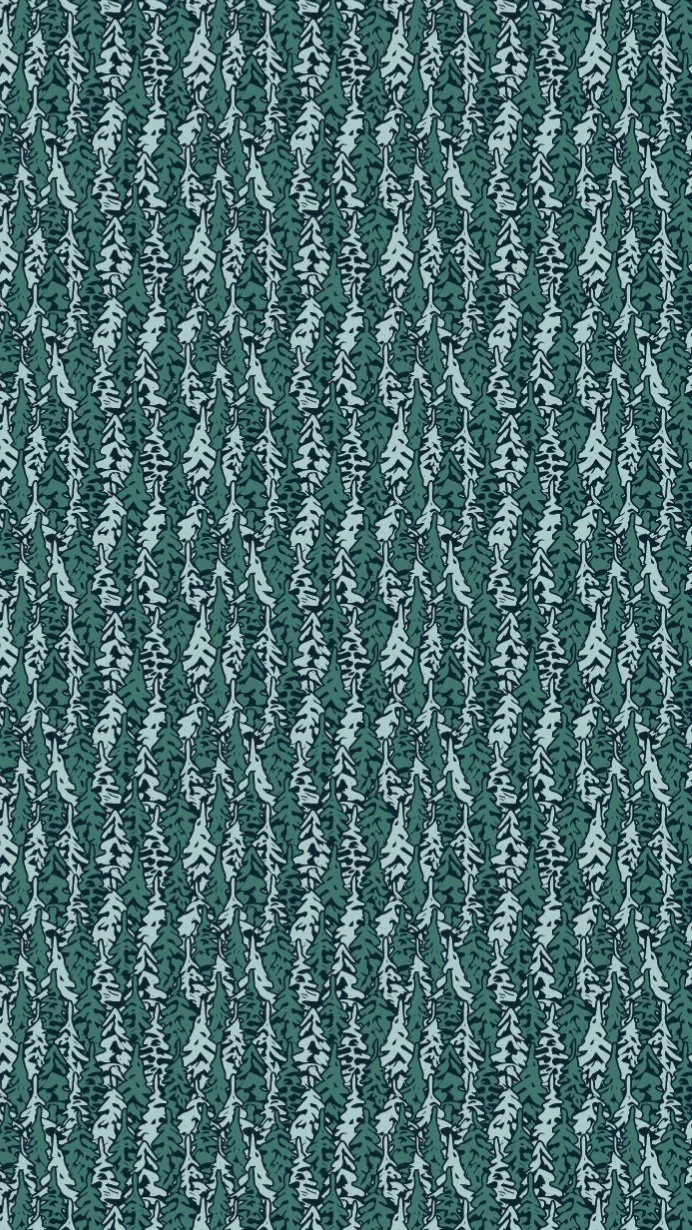
My pine tree pattern also still did not feel right. I wanted to give the feeling of a forest, and the scattered pine trees weren't cutting it. I ended up completely reworking this pattern (for what felt like the 10th time) into something I finally (FINALLY) actually liked.

Join my newsletter list so that you don't miss the next post in this series! This is the second post in my series documenting IRL my experience taking Surface Pattern Design Immersion. Check out the first post Gathering Inspiration.
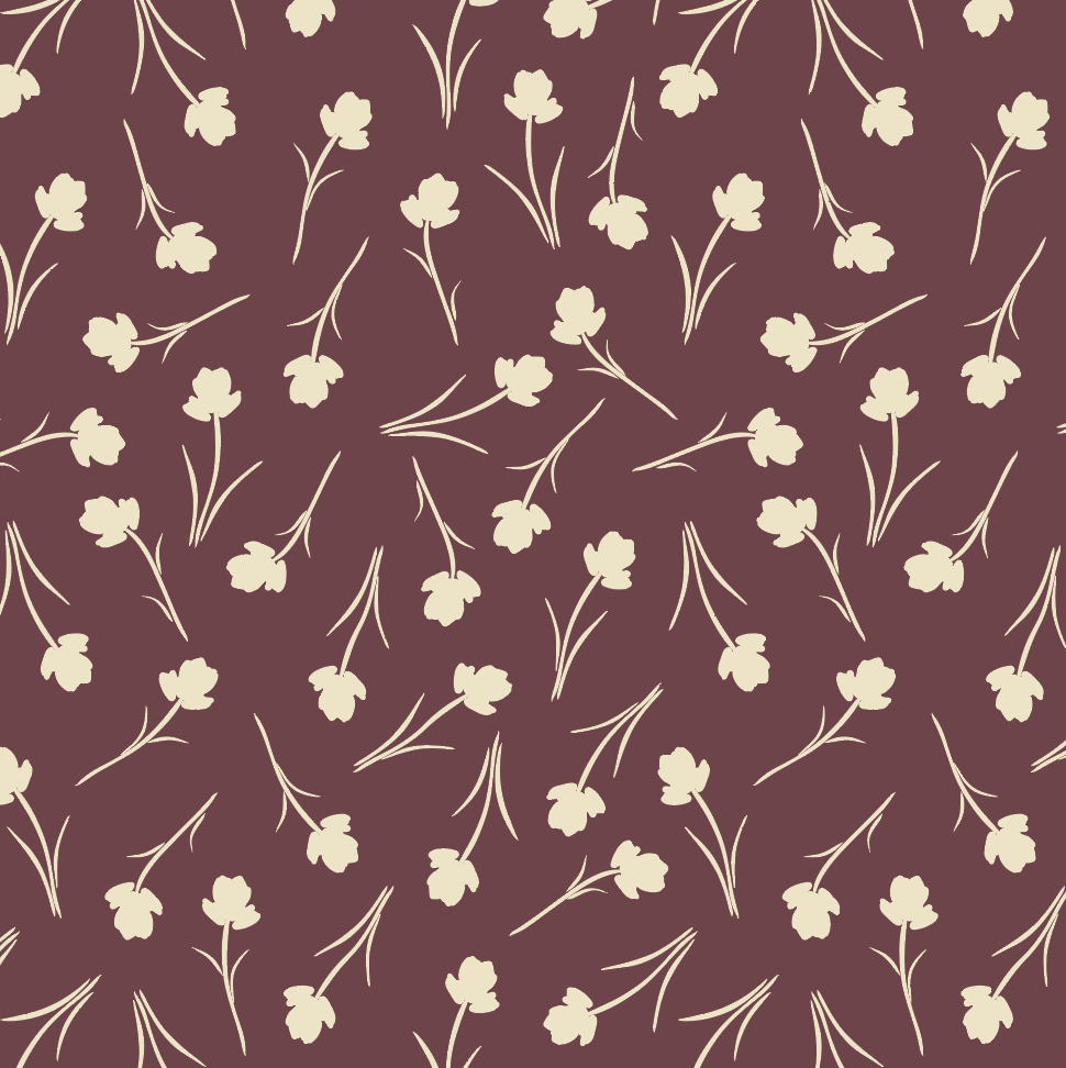
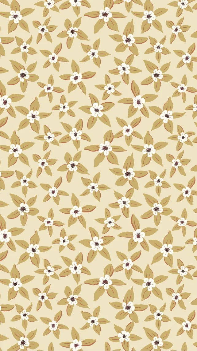
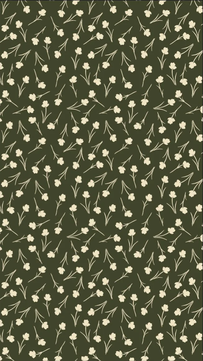
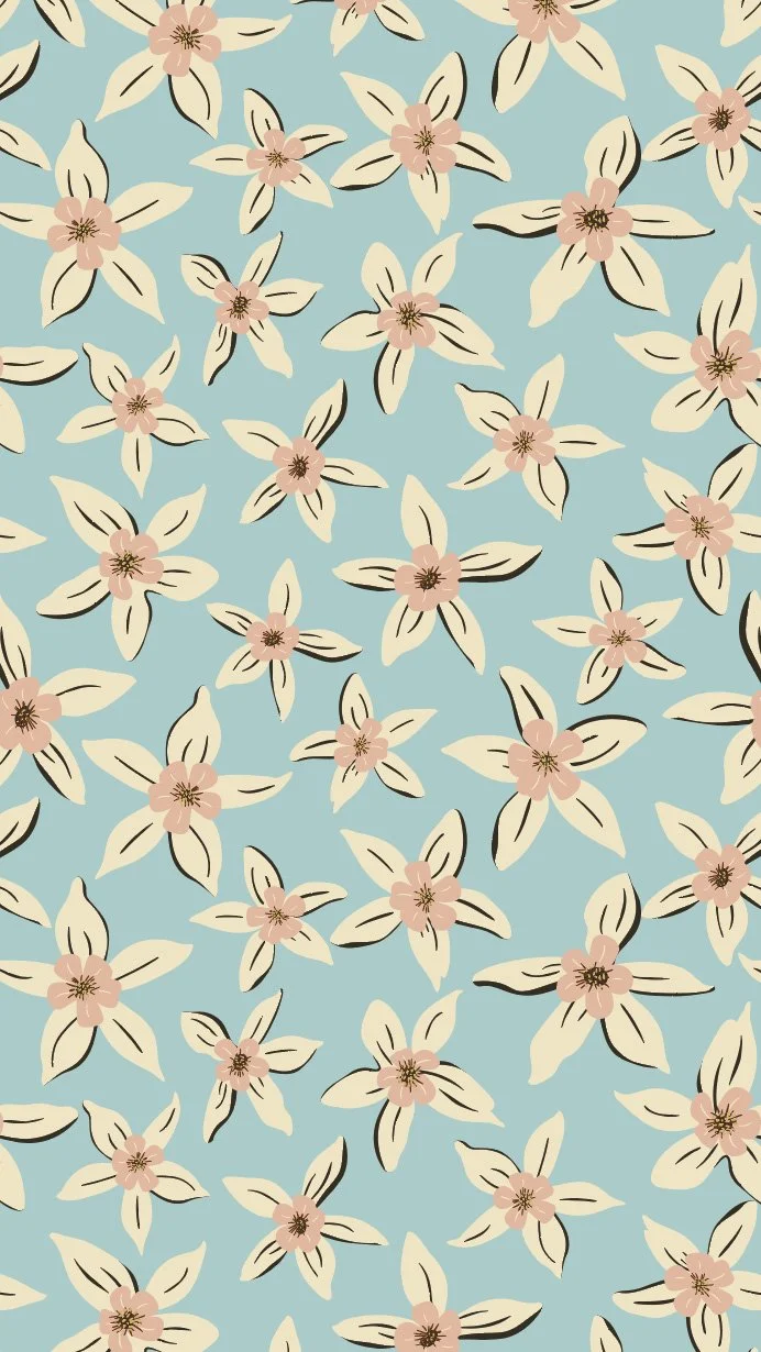
And then I randomly created a brand new very simple tossed flower pattern using a silhouetted version of my Indian Paintbrush flowers, that might be one of my favorite patterns of the whole bunch. (Who am I kidding, I love them all.) But eventually, I landed on 11 patterns (I know, I still need to cut one out to have a nice even 10) that felt like a cohesive collection.
Consolidating Color
I started my collection with a pretty solid color palette, but over the course of creating the collection, my original color palette of 14 had swelled to over 30 colors across all of the patterns that I created. Color is one of the things that I find the most challenging about designing in collections. I can definitely recognize when I like or I do not like something, but creating cohesive color palettes is still something that I still struggle with. I was not particularly tied to my original color palette, so I went back to the drawing board and started to build out a new color palette based on my finalized patterns and how I wanted them to look. To pull colors together, I pulled from my original color palette and color palettes from the Trends Reports I get as part of my surface pattern design membership Pattern+. I settled on two color palettes that hopefully feel similar but different. Bonnie says that you want your two colorways to feel like cousins rather than siblings.
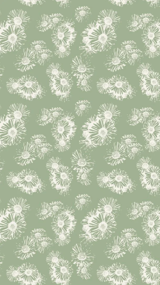
Colorway 1 to me is very earthy. It reminds me of hiking in the mountains and hunting for mushrooms, when you are in the thick of the forest. Everything is a bit darker because of the thickness of the trees, the ground is soft beneath your feet, and you are focused on the browns, greens, and golds of the forest floor.

Colorway 1
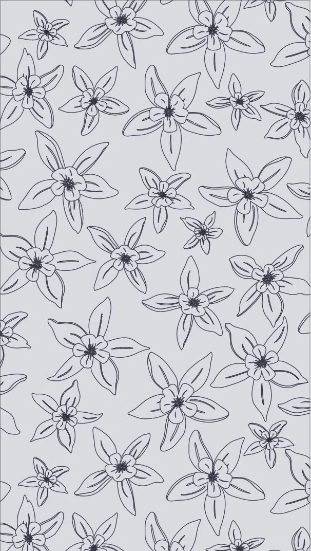
Colorway 2 to me feels cool, calm and collected. The bright blues are balanced out by soft yellows and peachy pinks. Rather than feeling earthy, it feels a bit more surreal, a bit more artsy.

Colorway 2
With two new colorways picked out, I started the somewhat tedious process of consolidating colors and recoloring all of the patterns to fit into the first colorway and then the second. While my fabric designs are currently on Spoonflower, which does not actually limit how many colors you have in a pattern, working in a limited color palette is important if you want the most flexibility when you want to license your work. Spoonflower is a print on demand company, which means they literally print their fabric on giant printers that can print 100s of colors at a time. But many more traditional printing methods, like screen printing, require you to have a max number of colors. If you are screen printing, each screen is a different color, making 100s of colors unrealistic.
Finalizing And Testing Scale
One of the final things to decide is the scale of each pattern or how big or small the designs will be. A big factor that goes into evaluating scale depends on what you envision to be your final product. If you are designing fabric, you want to make sure that scale is large enough to make sense not only when put up on a wall, but to be printed on 24 inch wide rolls of paper. Since my plan for my collection is quilting fabric, I want to think about how a quilter might use the patterns. A quilter is going to cut up the fabric into smaller pieces, sometimes as small as 1 inch, so I want to make sure that the motifs and designs will still hold up even when cut up into smaller pieces.
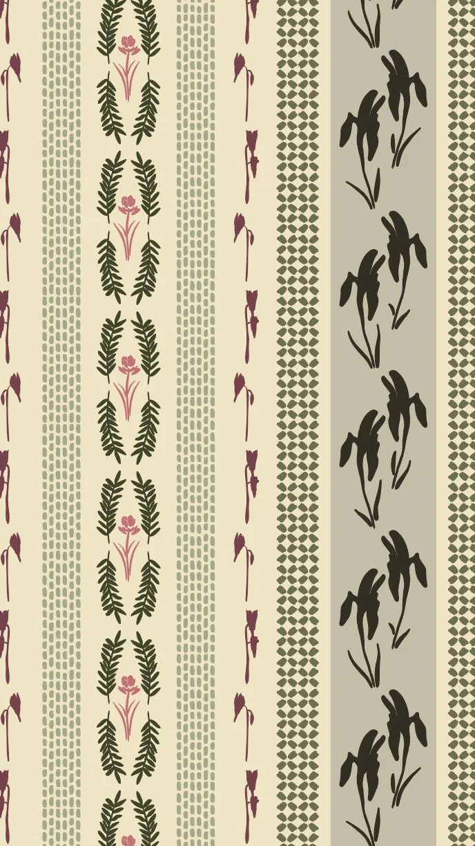
One exercise to test whether you have picked the right scale is to print out all of your patterns on paper at 100% scale to see how they physically look individually and as an entire collection. I printed out all 22 of my patterns and taped them all up on my wall to evaluate them.
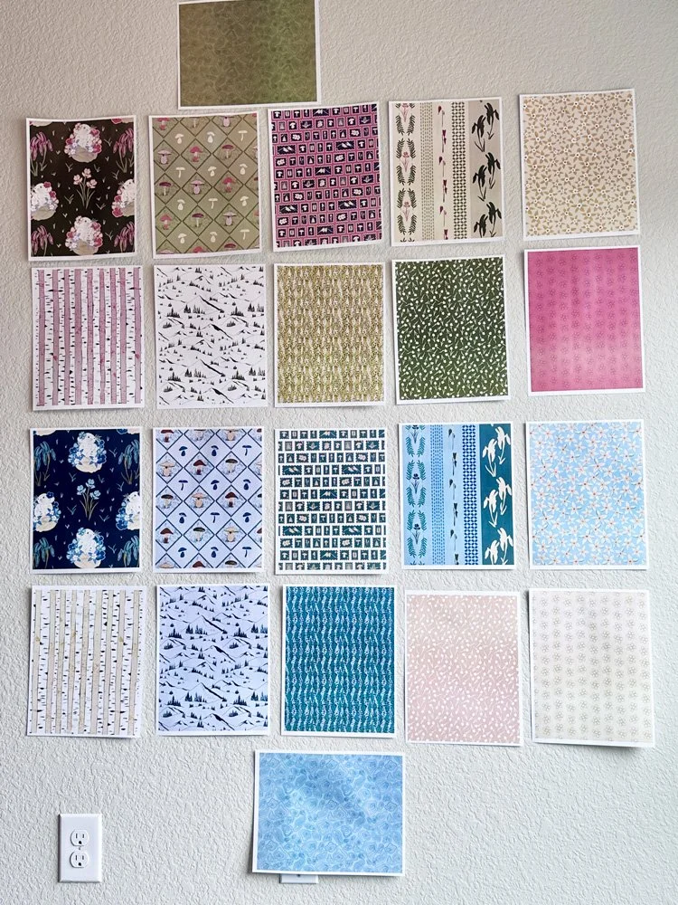
Evaluating printed fabrics at 100% scale.
Overall, I was pretty happy with the results. And, there is nothing like seeing something you designed printed out, even if it is only a test paper version. This exercise also gave me a lot to think about.
🎨 Want a daily peak what I’m creating for Immersion as I create it? Follow me on Instagram for a look at new work, outdoor adventures, and more. I’d love to meet you.
My complex stripe is much too large. If you think about somebody cutting this pattern into smaller pieces, they would most likely lose a lot of the design, so this pattern would need to be scaled down much more. I’m also not entirely sure that I like all of the colors in it. I was pushing for more complexity and contrast, but I wonder if a two-toned color palette might be better. Or perhaps it is a pattern that is better suited for wallpaper than fabric. This is one that I might ultimately cut from the collection.
I love the size of my pika and mushroom print, but I think they might be too large for quilting fabric. I picture both of these prints at this printed scale as something you might use to make a tote bag, but if I want to cut up the fabric and maintain the designs, I think it needs to be smaller.
My postage stamp print felt too small. If you were to cut this design up, you would get a lot of variety of motifs in your fabric pieces, but I think you lose a lot of detail of the actual stamps at this size. I also know that Spoonflower fabric does not handle smaller detail work as well, so this one I decided to take up in scale.
Some patterns felt just right. My tossed flowers and pine tree prints felt like just the right size.
When this article goes to print, all of my patterns are still sitting up on my wall and I keep making notes of what I want to review and evaluate before I really finalize everything for Spoonflower and my portfolio.
The Final(ish) Collection
Colorway 1

Colorway 2
I would love to know in the comments, which pattern is your favorite.
Next Steps
This collection is finished for the purposes of Immersion, but there is still work to be done. One thing I have realized as I have started to create collections more regularly is that my work really improves when I take a break and revisit it. While I am very happy with my collection in its current form, I want to take a step back and give it, and myself, a chance to take a breath. I know that when I come back with fresh eyes, I will be able to evaluate my work a bit more objectively and often solutions to issues I was struggling with for days suddenly seem a lot simpler to solve. I am also still trying to finalize a title for the collection and titles for each of the patterns themselves, so I hope the break will help with that process as well.
Once that final revision is complete, I will begin the somewhat tedious process of creating print ready files for each pattern and getting each pattern added to my Spoonflower account. Then I will be able to order fabric samples and see if there are any more adjustments that still need to be made.
Finishing up Immersion is both exciting and a bit disconcerting. I’ve accomplished what I wanted to: a fabric collection that I am proud of. I’m also really proud of the progress I have made in the last two years. Immersion 2024 was me stumbling my way through Adobe Illustrator, creating my very first patterns, and coming up with my first fabric collection. Immersion 2026 feels like I am really starting to have a signature style and a vision for how I want to work and how I want to develop my artwork.
With the end of the course comes a different kind of overwhelm. I have had a singular focus for the last three months and now I need to determine what my next steps are. I need to take a solid break to refill my creative cup and I need a sustainable plan to continue moving my pattern work forward, especially as I head into my busy summer season at my day job. While pattern-making has taken over the majority of my art practice, I am eager to get back to my more traditional painting practice. I’m ready to pull out my watercolors. I’m eager to start painting landscapes. I’m ready to be back in the mountains and collecting new reference photos. I have so many ideas for new ways to experiment.
I hope that you have enjoyed this series as much as I have enjoyed writing it. If you want to know when this collection goes live on Spoonflower or want to see what I am painting up in my studio, make sure to join my newsletter list, The Collector’s Club, and follow me on Instagram.
You Might Also Like
On the Blog: Post one of this series Gathering Inspiration: Week 1 of Immersion 2026.
On Instagram: This reel where I talk you through all my patterns printed out and hung up on my wall.
Shop Current Collections: Check out what I have available on my Spoonflower shop.