
Making Patterns: Immersion Module 4
At the end of Module 3, I had a working motif library, three placement prints, and honestly I was so excited to dive into the actual pattern making stage. Over the course of gathering inspiration, making art, and starting to digitize my work, I was bursting with ideas. In Module 4, I would start to find out which ideas were actually going to work.
Refining the Motifs
While I really wanted to dive into making patterns immediately as Module 4 dropped, my experimentation with the placement pieces helped me realize that I actually had some more work to do with my motifs. Being really intentional about making my motifs as good as they can be has been one of the biggest shifts during this round of Immersion. First, I tried to be really intentional during the art making stage to create a large volume of work so that I would have plenty of options for making patterns. Now that I was about to begin the actual pattern making stage, I needed to make sure that my motifs were as refined as possible before starting to build patterns with them.
Vectorizing artwork is really just the start of the process. Turning your artwork into vectors means that they are now comprised of thousands, sometimes hundreds of thousands, of tiny anchor points. Sometimes, those anchor points can be a little wonky at the start. The edges of shapes can be rough or textures can look a bit messy. I spent a lot of time cleaning up even my simplest motifs. I used the smooth tool to literally smooth the outside edge of solid shapes. I used the blob brush tool to fill in any holes in my motifs that seemed out of place. I used the eraser tool to remove anything that seemed too messy or in some instances too perfect. For example, I noticed that it was very common for there to be these perfect teeny tiny circles in some of my motifs that I wanted to remove.
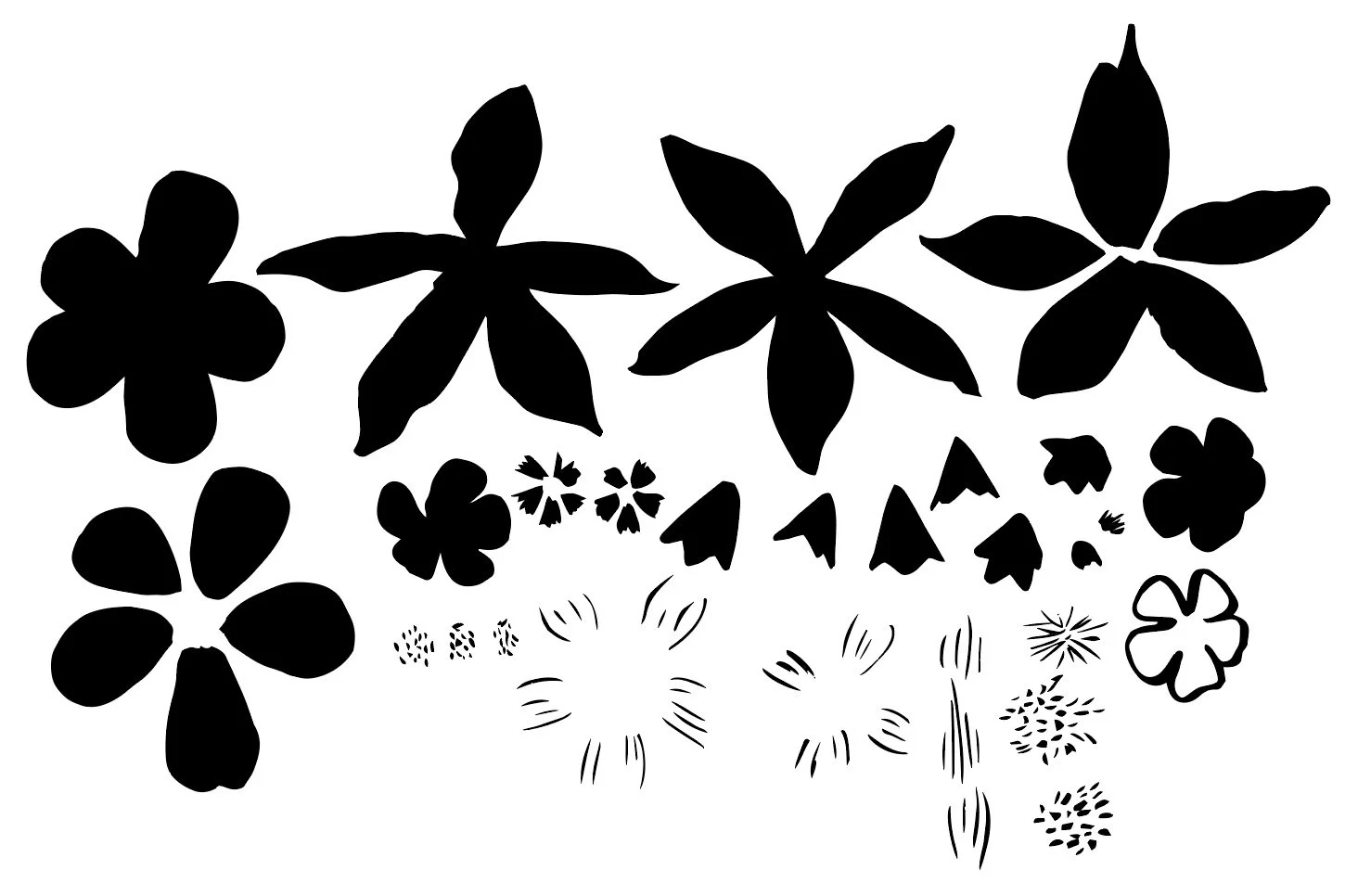
Original Motifs
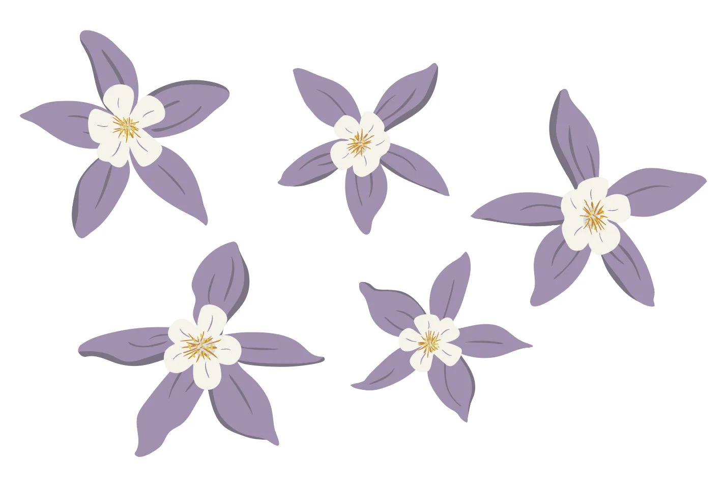
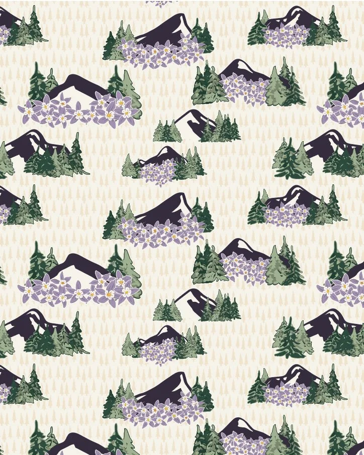
Finalized Columbine flowers.
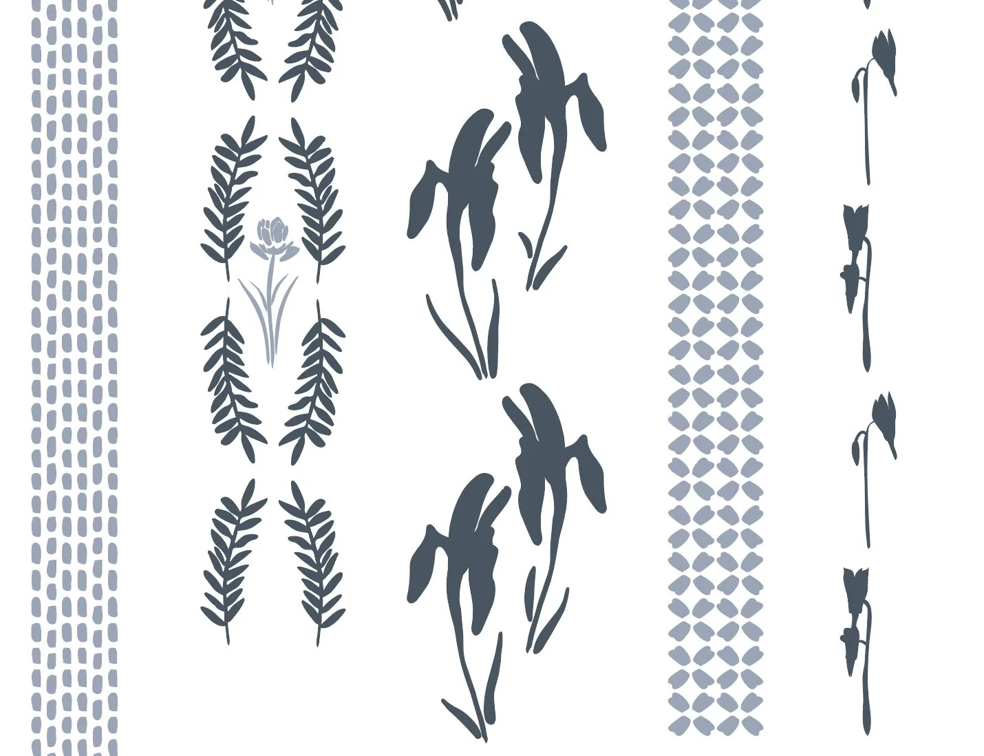
Some motifs I needed to completely build using individual elements from my motif library. These included my Columbine, Indian Paintbrush, and Wild Iris flowers that I wanted to use. When creating my initial artwork, I broke down these flowers into their different parts: petals, petal textures, stems, leaves, etc. I spent time cleaning up each of the individual elements and then started the process of combining them into a larger and more complex motif.
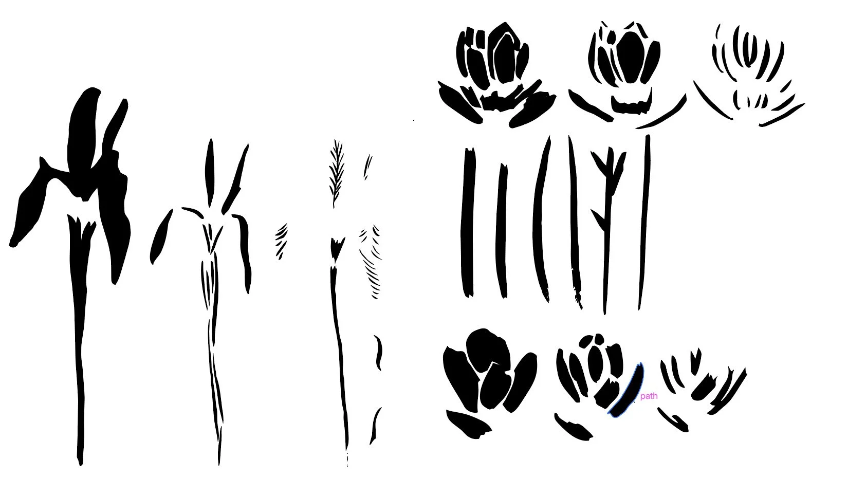
Original motifs.
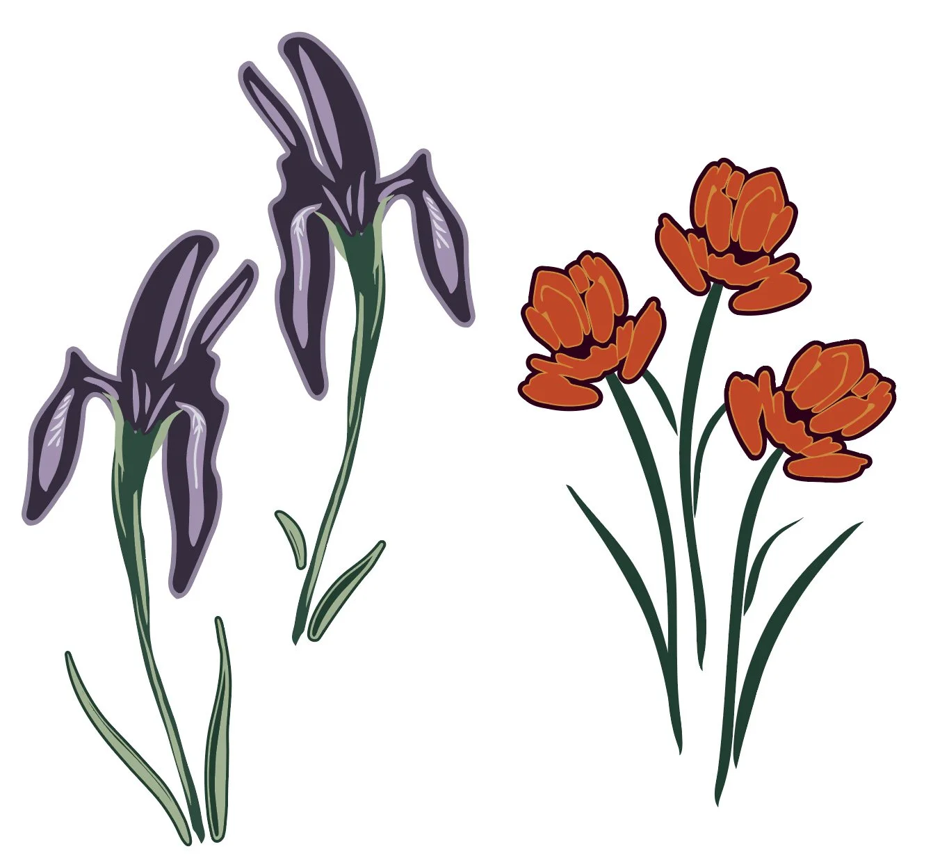
Finalized Wild Iris and Indian Paintbrush.
Join my newsletter list so that you don't miss the next post in this series! This is the second post in my series documenting IRL my experience taking Surface Pattern Design Immersion. Check out the first post Gathering Inspiration.
I knew that I wanted my pika to be in one of my more complex hero prints, but I wanted to do a little bit more cleanup of the motif than I did when I experimented with my placement piece. When zoomed out from this motif, the texture looked pretty good, but once you zoomed in, I noticed that there were areas where the texture seemed a bit too digital and not as organic as I wanted it. I spent a lot of time adjusting the texture of the fur and removing more of those perfect circles.
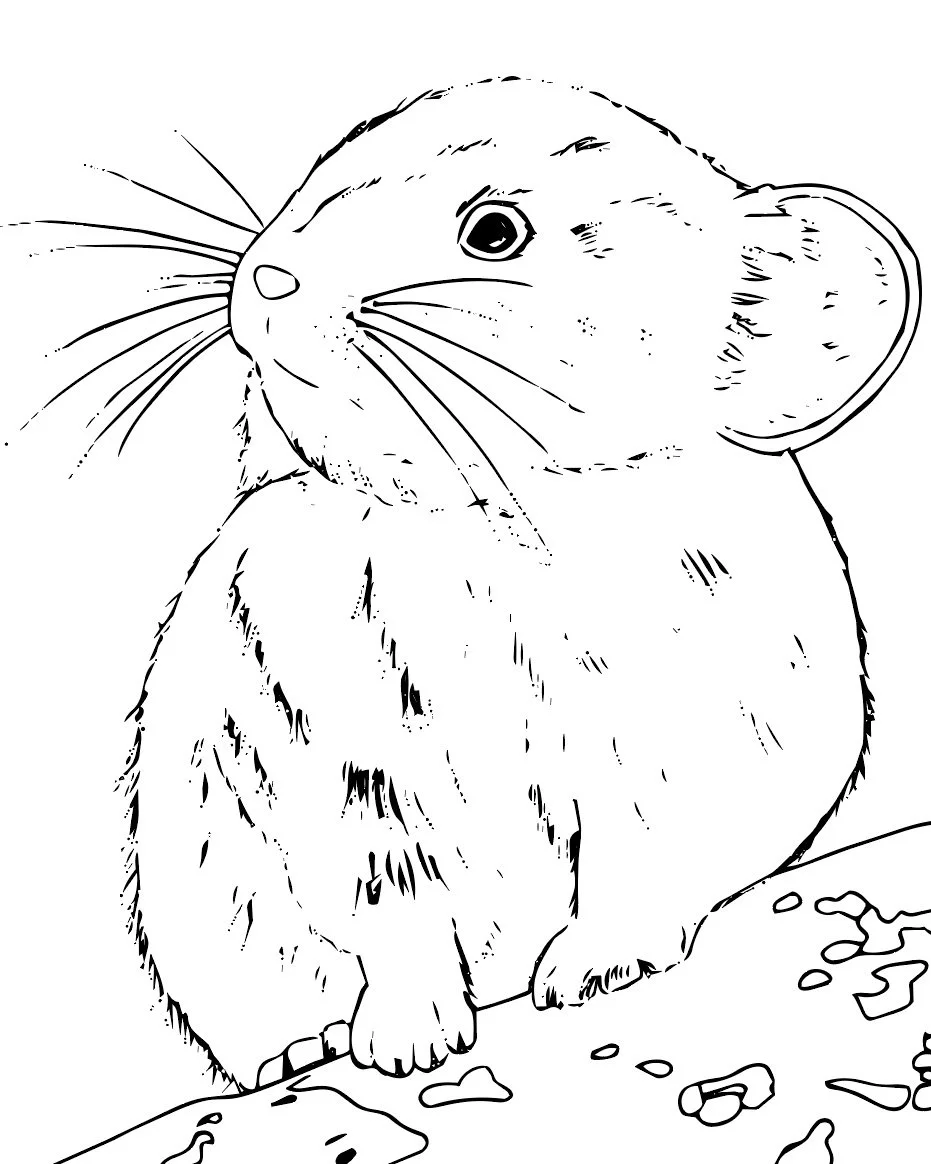
Original pika motif.
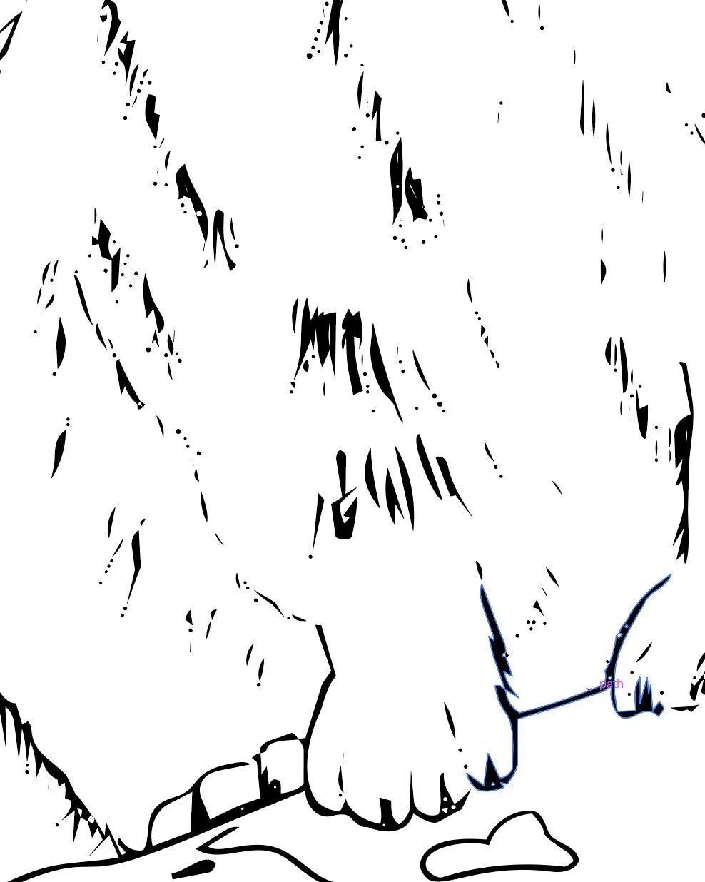
Detail of all the digital bits before clean up.
My pine trees needed the same treatment as my flowers and pika, and I needed to give each of the pine trees a background. Both the painted versions of the trees and the hand-drawn versions of trees are not solid shapes. Similar to when you look at a real tree, you can usually see through the tree’s branches. In a pattern, this transparency is not ideal. It means that if I layered the pine trees, you would be able to see through the motif. To me, this is very distracting to the eye, so I wanted to give each tree a background shape that often matched the background color of the pattern. This eliminated the transparency and gave each tree a subtle outline, which allowed each tree to have a bit of breathing room in the pattern.
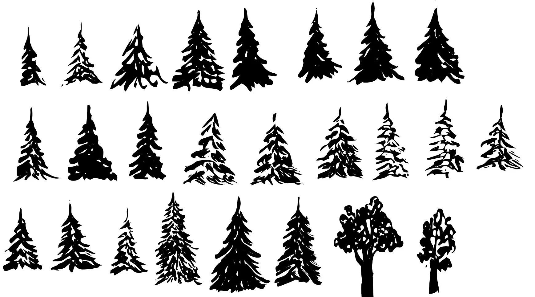
Original tree motifs.

Tree motifs with a background added.
Experimenting with Pattern Structures
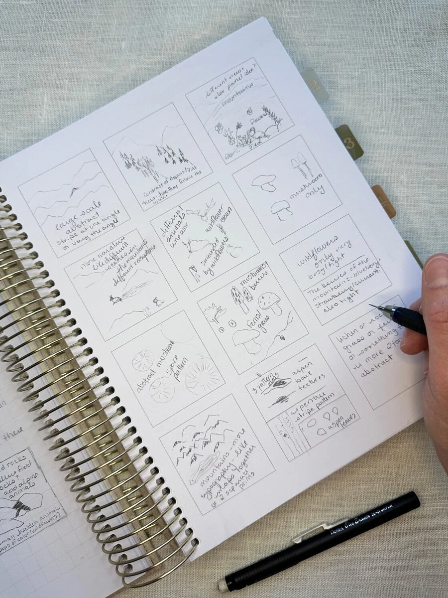
Original thumbnail sketches.
Included in Module 4 was an overview of the different types of structure your patterns could have: tossed, half-drop, stripes, plaids, geometrics, and diagonals. The type of structure you choose for your patterns often depends on what your final product will be. If you are designing for fabric, like I am, you usually want a variety of different pattern structures in a variety of directions because a quilter will most likely be cutting up your fabric into smaller pieces. If you are designing for wallpaper, you want to make sure that all of your patterns go one direction because nobody wants upside down wallpaper.
To start the actual pattern-making stage, my thumbnail sketches were my guide. Sometimes my original ideas matched up with what the lessons were teaching. For example, when Bonnie taught how to make a basic tossed all over pattern, I used my Columbine flowers. When she taught the basics of making stripes, I worked on building out my aspen trees as a stripe. Sometimes a lesson gave me a new idea. New in this version of Immersion was an entire lesson on building out complex stripes. A complex stripe for the exercise, was not just simple repeating lines, but where you might have different elements that you arrange to create different stripes, such as arranging flowers in a line or taking texture bits, like dashes or squares, to create more abstract lines. I ended up creating a stripe that I was quite pleased with that will most likely make it into the final collection.
Draft complex stripe pattern.
🎨 Want a daily peak what I’m creating for Immersion as I create it? Follow me on Instagram for a look at new work, outdoor adventures, and more. I’d love to meet you.
One of my favorite patterns from this whole module was my analog pattern that I built entirely on paper before bringing it into Illustrator. To create an analog pattern, you start with a piece of paper that is either a rectangle or a square. You draw your design, staying away from the edge of the paper. Then you cut your paper into four equal sections, straight down the middle both vertically and horizontally. Next you will take your two pieces from the left and move them to the right and you will take your two pieces from the top and move them to the bottom and tape your paper back together. Finally you fill in the middle of your paper and any blank spaces in the design. This is a physically repeating pattern. If you were to make copies of the paper, you could line them up next to each other. When you bring this into Illustrator, your physical repeat is like a giant motif that you will use to build out your pattern. I loved it because it is so very obviously my drawing style. You could have this design on a piece of fabric and it will look very similar to one of my drawings, because it is one of my drawings. My patterns usually have elements of my fine art style, but they are rarely direct copies. I also really love this type of landscape/ narrative print, but I have struggled to build them out in Illustrator. This was a very useful exercise for physically visualizing how to build the pattern and I love how the actual repeat worked once I brought it into Illustrator.
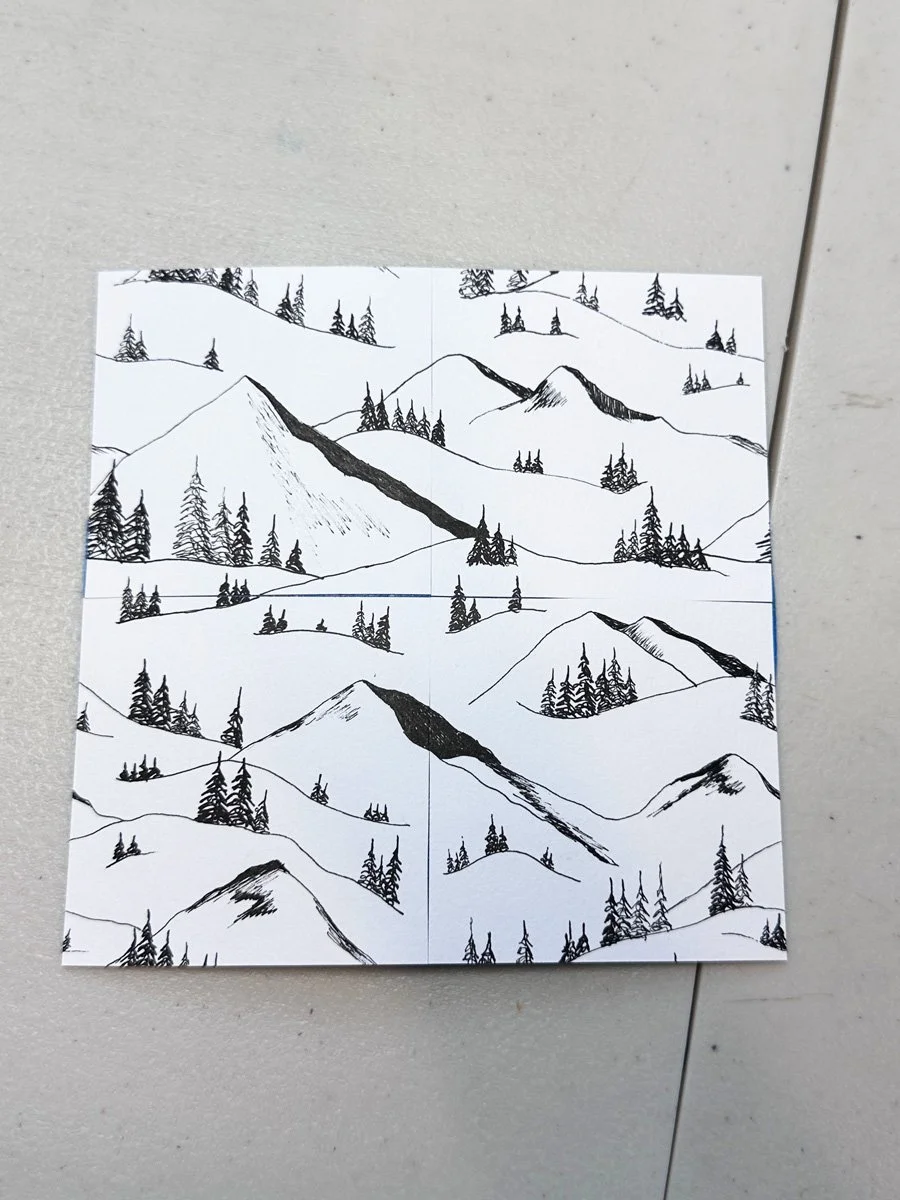
Original analog repeat on paper.
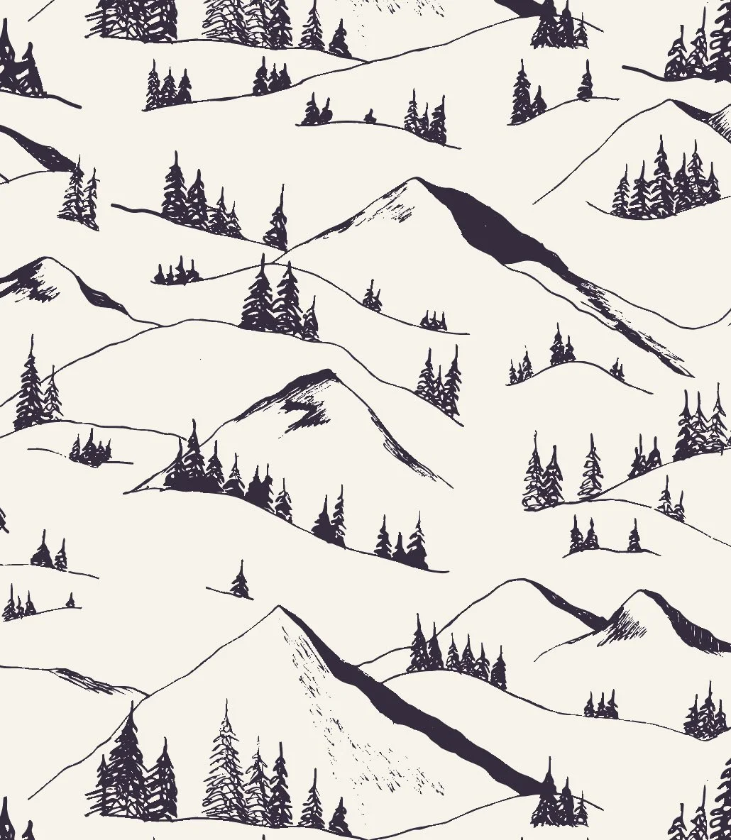
Finalized pattern.
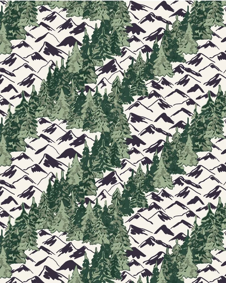
Sometimes patterns came together relatively quickly and sometimes I struggled for hours or even days to create something that technically worked, but was not something I would ever want to buy. This is what happened with my diagonal pattern. This is actually a pattern that I struggled with the first time I took Immersion and it is still one that I find really challenging to create something that is actually aesthetically pleasing. I had a clear idea when I started the pattern. I wanted to mirror what looking at a mountain range looks like. You often have the mountain shape and then there are alternating bands of pine and aspen trees below the mountain peak. I rebuilt this pattern from scratch about four times experimenting with different ideas, different motifs, different scales, different spacing. While I could get the pattern to technically repeat, it just never turned into a pretty pattern. At one point, I even shared a version of the pattern on Instagram and one of my friends said that at first they thought it was killer whales surrounded by flowers. Disappointing, yes, but also kind of hilarious. Now that’s all I see when I look at that pattern.
Version 1

Version 2
Killer Whales?
My diagonal pattern was not ideal, but it also shows how you have to create a lot of patterns and experiment with a lot of ideas and designs in order to land on those patterns that will actually make the cut. I probably created over 200 patterns during Module 4. Sometimes I was making minor tweaks by changing a motif or rearranging certain elements; sometimes I was building the whole pattern again from scratch in a different way. Even when you finish a pattern so that you know it technically works, you might notice that when you scale it up (make it bigger) or scale it down (make it smaller) that your eye catches unintentional stripes or blobs in your pattern based on how you arranged the motifs, which would lead to even more tweaking and adjusting.
It’s a process though that I get completely lost in sometimes. I lost count of the number of times I sat down to try and work on patterns for an hour after work to realize three hours had passed and it was long past my normal quitting time.
But I am getting better.
My patterns almost always technically work, even if I need to refine them to make them better. I work faster; I probably know twice as many keyboard shortcuts than I used to. I know Illustrator better. My workflow is more efficient. I know what kind of designs I like.
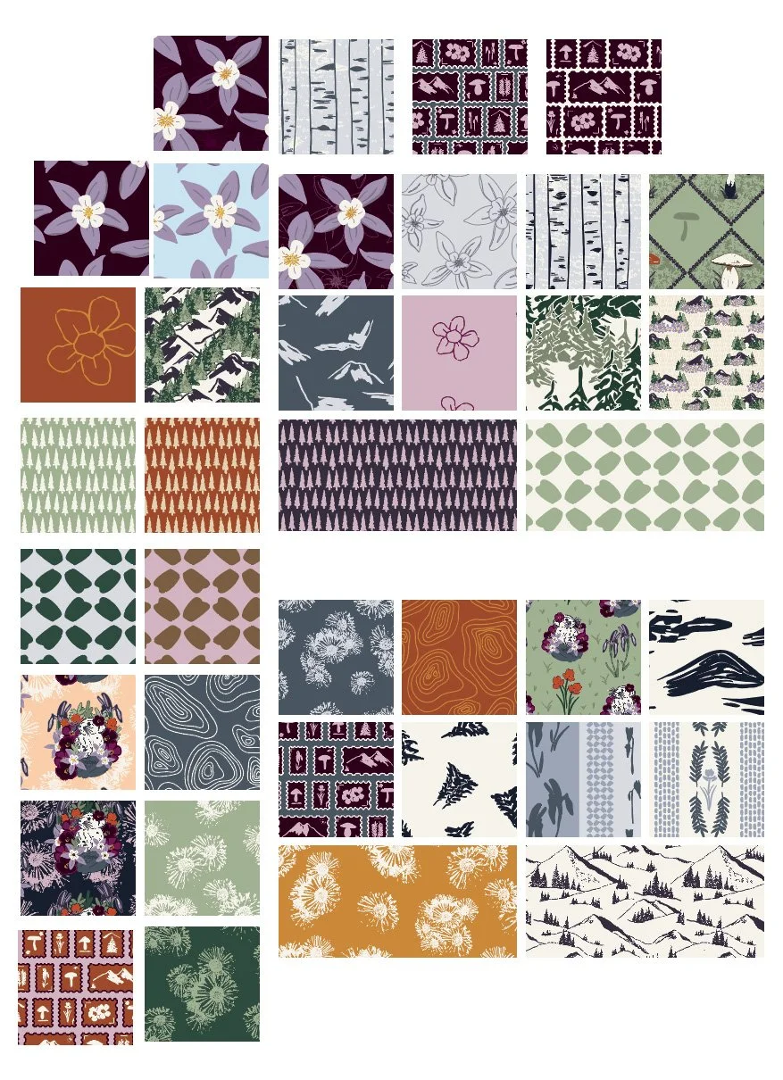
Currently, I have about 30 patterns worth keeping. About half of those feel really strong. My goal is to have a cohesive collection of 8-12 patterns. As Bonnie teaches it, a cohesive collection consists of hero prints (your more complicated patterns that usually consist of the most colors), coordinate prints (slightly less complicated patterns) and blenders (your simplest patterns that also usually have the fewest colors).
A draft list of the “better” patterns I have created during Module 4 and I still have some more ideas to play out.
Next Steps
The next step is further refinement. I need to take a step back, a few days off, and come back to review all my patterns with fresh eyes to see which are the strongest. Then I need to finalize color. Bonnie teaches you to have a limited color palette, meaning less than 18 colors in a colorway. So far I have closer to 25, so I need to narrow down my colors for my first colorway, then build my second colorway and finalize scale. Three weeks left to go!
You Might Also Like
On the Blog: Post one of this series Gathering Inspiration: Week 1 of Immersion 2026.
On the Blog: Making A Lot of Artwork: Immersion Module 2
On the Blog: Digitizing the Work: Immersion Module 3
This reel on Instagram where I talk about how I designed a placement piece.